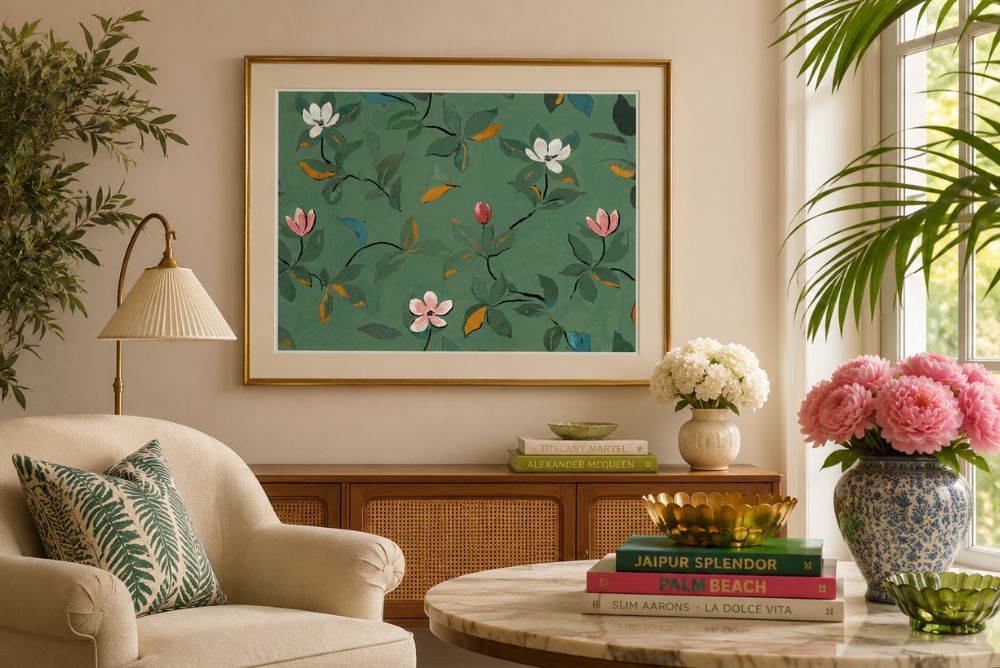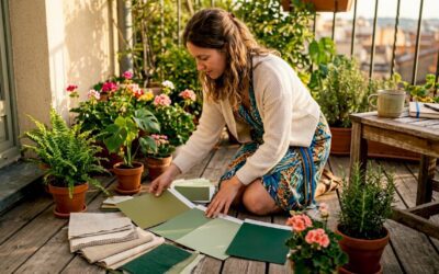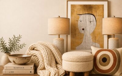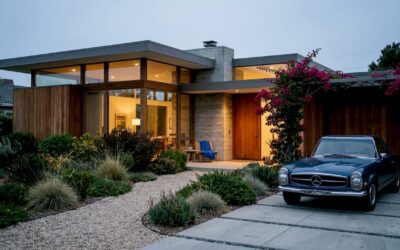
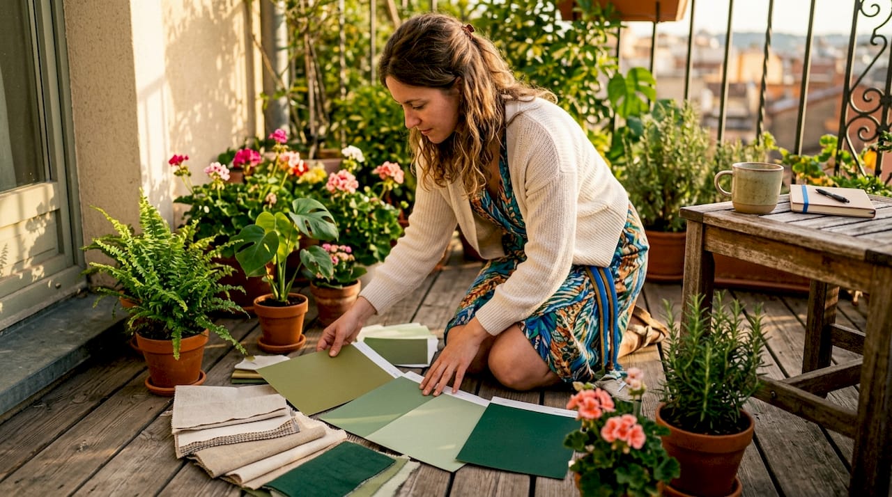
The best color combination for green is determined by the shade’s undertone, not just its name. Warm greens like olive and sage carry yellow, brown, or gray undertones that call for earthy companions. Cool greens like emerald, mint, and forest green lean blue, making them natural partners for crisp neutrals and jewel tones. Understanding this undertone principle is the single most reliable tool for creating green color palettes that feel intentional rather than accidental. Artinlifestyle has curated this guide to walk you through every major green pairing category, with practical room examples and expert advice at every step.
1. Best color combinations for warm greens like olive and sage
Warm greens are the quiet workhorses of interior design. Olive and sage carry yellow, brown, or gray undertones that make them read almost like neutrals in the right light. That quality gives them extraordinary pairing flexibility.
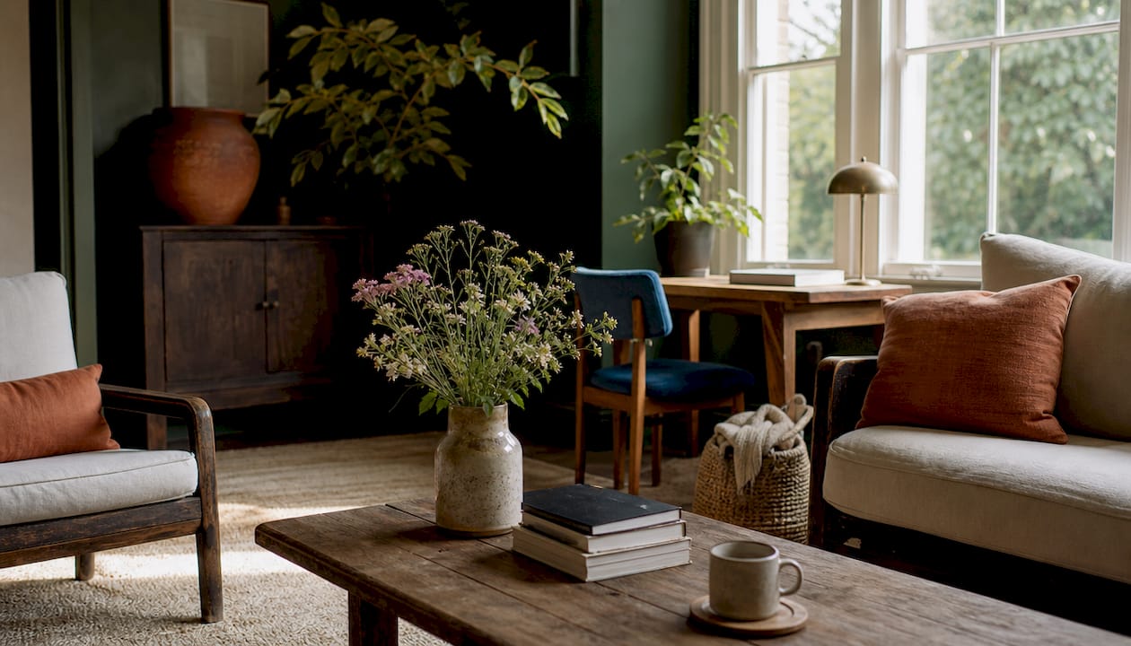
Warm greens pair best with cream, tan, terracotta, mustard, rust, burgundy, dusty pink, and soft gold. Each of these colors shares a warm base tone, so they reinforce rather than fight the green’s natural warmth. The result is a space that feels grounded and inviting without feeling heavy.
Here are the most effective warm green pairings by room type:
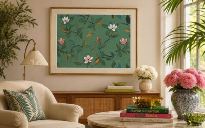
- Living room: Sage walls with terracotta cushions and a soft gold mirror frame create a layered, biophilic warmth.
- Kitchen: Olive cabinetry paired with cream countertops and rust-toned hardware reads as both modern and timeless.
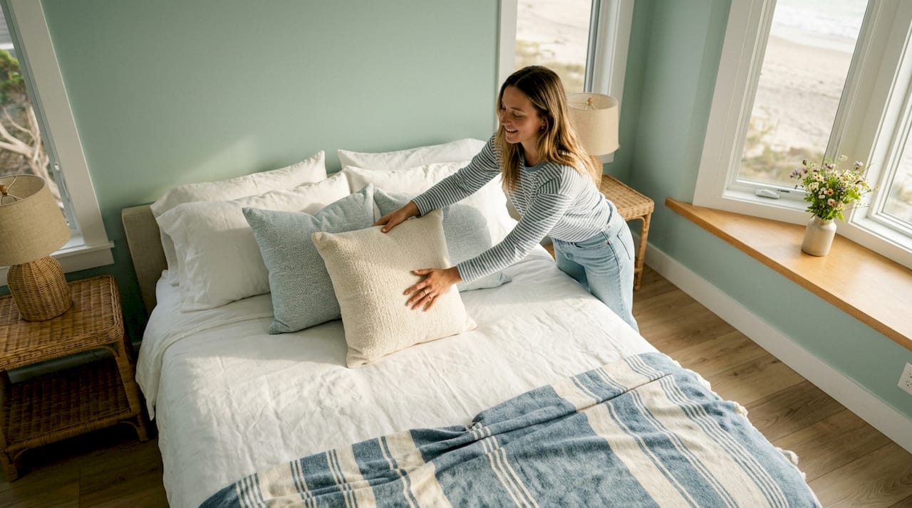
- Bedroom: Sage bedding with dusty pink accents and warm linen textures produces a calm, restorative atmosphere.
- Dining room: Olive walls with mustard upholstered chairs and a dark wood table anchor the space with earthy richness.
Sage green acts as a faux-neutral in design because its gray undertone allows it to anchor warm woods, metallics, and textured fabrics without competing with them. That flexibility makes sage one of the most forgiving shades to work with.
Pro Tip: Test your warm green paint in the actual room before committing. Morning light will pull out its yellow undertones, while evening lamplight will deepen it toward brown. Both readings should feel comfortable with your chosen companions.
Saturation balance matters here. If your green is muted, your accent colors can afford to be slightly richer. If your green is already saturated, keep companions soft and textural rather than bright.
2. Cool color combinations for emerald, mint, and forest green
Cool greens carry a blue undertone that gives them a crisp, sophisticated edge. Emerald reads jewel-like and dramatic. Mint is light and airy. Forest green is deep and grounding. Each shade calls for a slightly different companion, but all three share a preference for cool-toned partners.
Cool greens match beautifully with navy blue, crisp white, metallic silver, blush pink, peach, and light gray. These colors share the same cool base, creating a palette that feels fresh and polished rather than muddy.
Specific pairings that work across room types:
- Emerald: Pairs with gold, navy, and crisp white for a look that feels both luxurious and grounded.
- Mint: Contrasts well with peach and powder blue, producing a soft, airy freshness ideal for bathrooms and nurseries.
- Forest green: Works with warm cream and aged brass to soften its depth, or with charcoal and slate for a more dramatic effect.
Layering shades of green adds dimension that a single tone cannot achieve. A forest green wall paired with a sage throw and a mint ceramic vase creates visual depth without introducing a competing color. Layering green tones prevents the flatness that comes from using only one shade throughout a room.
Pro Tip: When choosing a white to pair with a cool green, reach for Benjamin Moore Chantilly Lace or a similarly cool-toned white. Warm ivory next to emerald will make both colors look muddy rather than crisp.
Metals matter too. Silver and brushed nickel reinforce the cool palette. Warm brass can work with forest green specifically, but it tends to pull emerald and mint toward an unintended warmth.
3. Bold accent combinations with green for dramatic spaces
Green’s complementary color on the color wheel sits in the red family, which includes burgundy, coral, blush pink, and hot pink. Complementary green pairings add visual energy that no analogous combination can match. The key is knowing how much energy you actually want.
Bright reds and hot pinks create maximalist, high-impact rooms. Muted burgundy and blush pink deliver calm sophistication. Both approaches work, but they serve entirely different moods.
Effective bold accent strategies:
- Pillows and throws: A pair of burgundy velvet cushions on a sage sofa introduces contrast without committing to it structurally.
- Artwork: A single large canvas with coral and green tones acts as a textural amplifier, pulling the room’s palette together.
- A single accent chair: One blush pink chair in a forest green room creates a focal point that reads as intentional rather than chaotic.
- Floral arrangements: Fresh or dried flowers in rust and coral tones bring the complementary palette in without permanence.
Bold accents work best when they occupy no more than 10% of the room’s visual field. Green should remain the foundational hue. Accents exist to animate it, not replace it.
Pro Tip: When pairing vibrant colors like coral or ochre with green, introduce an olive-hued element as a mediator. The olive acts as a visual bridge between the two strong tones, keeping the palette elegant rather than jarring.
Avoid distributing bold accents evenly around the room. Cluster them in one zone, such as a reading corner or a styled shelf, to create intentional contrast rather than visual noise.
4. Blue and green combinations for nature-inspired interiors
Blue and green sit side by side on the color wheel, making them analogous color partners that produce natural harmony with almost no effort. Design professionals sometimes call navy and forest green “nature’s own black and white” for their timeless, effortless elegance.
The specific blue you choose shapes the mood entirely. Navy with forest green reads traditional and grounded. Powder blue with mint reads light and coastal. Cobalt with emerald reads bold and contemporary.
| Green Shade | Best Blue Pairing | Ideal Room | Mood Created |
|---|---|---|---|
| Forest green | Navy blue | Library, study | Traditional, grounded |
| Emerald | Cobalt blue | Living room, accent wall | Bold, contemporary |
| Mint | Powder blue | Bathroom, nursery | Soft, airy |
| Sage | Dusty blue | Bedroom | Calm, restorative |
These combinations work especially well in rooms that benefit from a sense of calm depth, including libraries, bathrooms, and nurseries. The blue-green palette suggests water, sky, and foliage simultaneously, which is why it reads as so naturally restful.
For blue-green color harmony in a room, white acts as the essential breathing space. Without a white or very light neutral to separate the two colors, even harmonious blues and greens can feel heavy. Use white on trim, ceilings, or in textiles to keep the palette from closing in.
5. Mixing green shades and pairing with neutrals for depth
Using a single shade of green throughout a room produces a flat, one-dimensional result. Mixing multiple green tones creates richness and dimension that makes a space feel curated rather than painted. The principle works exactly like layering textures: each layer adds something the others cannot provide alone.
A practical layering approach uses three green tones. A midtone green on the walls sets the foundation. A darker green in upholstery or curtains adds depth. A lighter green in accessories or plants provides lift. The result is a room that rewards close attention.
Neutral colors are the quiet heroes of any green scheme. They ground the palette and give the eye a place to rest. The most effective neutrals for green rooms include:
- White: Separates tones, brightens the room, and prevents visual heaviness.
- Beige and cream: Warm the palette and soften the contrast between green and other accents.
- Gray: Adds sophistication and works especially well with cool greens.
- Black: Used sparingly in frames, hardware, or furniture legs, black sharpens the entire palette.
Choosing the right white is a subtlety that many homeowners overlook. Warm whites like ivory or cream soften sage and olive. Cool whites sharpen emerald and hunter green. Mismatching the white tone to the green’s undertone is one of the most common reasons a green room feels off without any obvious cause.
Pro Tip: Paint large swatches of your chosen green and neutral on the actual wall, at least 12 inches square, and observe them at different times of day. Room lighting shifts color perception significantly, and what looks balanced at noon may feel entirely different under evening lamps.
Interior design trends confirm that green paired with warm neutrals and natural materials continues to hold strong across residential design, reflecting the broader move toward biophilic interiors that connect living spaces to the natural world.
Key takeaways
The best color combination for green depends on matching the green’s undertone to its companions, warm greens need warm partners, and cool greens need cool ones.
| Point | Details |
|---|---|
| Undertone determines pairing | Identify whether your green is warm or cool before selecting any companion color. |
| Warm greens need earthy companions | Olive and sage pair best with cream, terracotta, mustard, rust, and soft gold. |
| Cool greens suit crisp neutrals | Emerald, mint, and forest green work with navy, white, blush pink, and metallic silver. |
| Bold accents require restraint | Use complementary reds and pinks in small doses so green remains the dominant hue. |
| Layer greens and choose whites carefully | Mix midtones, darks, and lights of green, and match white warmth to the green’s undertone. |
Green palettes and the light you live in
Working with green color pairings for years has taught me one thing above all else: the room’s light is not a backdrop. It is an active participant in every color decision you make.
A north-facing room strips warmth from every shade it touches. Sage green in that light can read almost gray, which means your warm terracotta accents will need to work harder to keep the palette from feeling cold. A south-facing room does the opposite. It floods the space with warmth, which means a cool emerald can suddenly feel much more alive than it did on the paint chip.
My honest advice is to resist the pull of trend-driven palettes and start with the light you actually have. I have seen beautifully chosen color combinations fall flat simply because the homeowner selected colors under a showroom’s warm artificial light and then installed them in a cool, shadowy room. The colors were not wrong. The context was.
Green is one of the most emotionally responsive colors in the spectrum. It shifts with the hour, the season, and the quality of light in ways that blue or gray simply do not. That responsiveness is what makes it so rewarding to work with. It rewards patience and observation. Test your combinations in real conditions, live with large swatches for a week, and trust what you see over what you planned.
The pairings that last are the ones that feel right at 7:00 AM and still feel right at 9:00 PM. That consistency is the mark of a truly well-chosen palette.
— Nealda
How Artinlifestyle can help you bring your green palette to life
Choosing the right green combination is one thing. Executing it across furniture, textiles, art, and accessories is another challenge entirely.

Artinlifestyle offers an Art Concierge service that connects you with personalized decor advice tailored to your specific space and green palette. Whether you are working with a sage bedroom, an emerald living room, or an olive kitchen, the service helps you select art, accents, and textiles that make the palette sing. For homeowners who prefer a hands-on approach, the DIY home decor ideas section offers practical, budget-conscious ways to implement green color schemes room by room. Artinlifestyle also covers the 2026 bedroom trends shaping how green is used in modern sleeping spaces this year.
FAQ
What is the best color combination for green walls?
The best pairing depends on the green’s undertone. Warm greens like sage and olive work best with cream, terracotta, and soft gold, while cool greens like emerald and forest green suit navy, crisp white, and metallic silver.
What colors go well with green in a living room?
Terracotta, burgundy, and warm neutrals complement warm greens beautifully in a living room. For cool greens, navy blue, blush pink, and light gray create a fresh, sophisticated result.
Can you mix different shades of green in one room?
Mixing multiple green tones, from light to dark, adds depth and prevents a flat, one-dimensional look. Use a midtone on walls, a darker shade in upholstery, and a lighter tone in accessories.
Does white go with green, and which white should I choose?
White pairs well with every green, but the tone matters. Warm whites like ivory soften sage and olive, while cool whites sharpen emerald and hunter green. Mismatching the white’s warmth to the green’s undertone is a common cause of muddy-looking rooms.
What accent colors work with green without overwhelming the space?
Burgundy, blush pink, and coral work as accent colors when used sparingly on pillows, artwork, or a single chair. Bold accents should occupy a small portion of the room’s visual field so green remains the dominant hue.