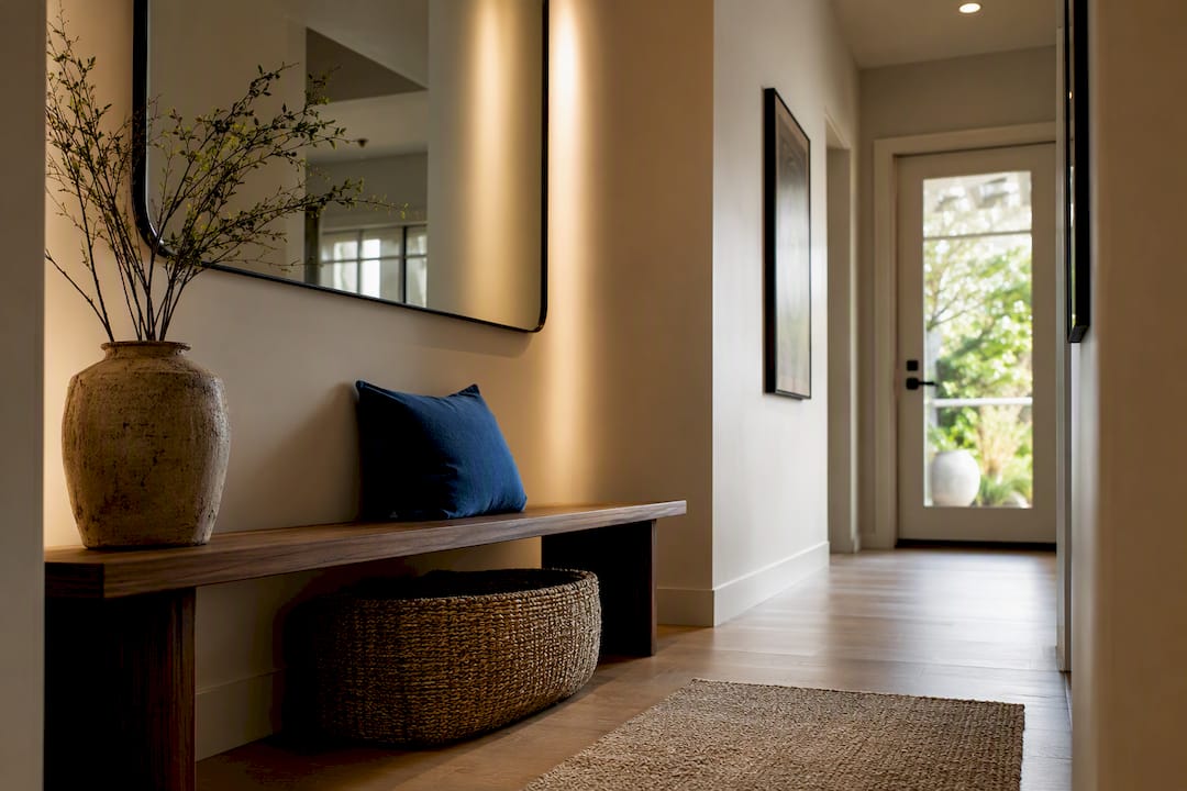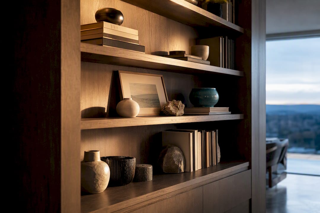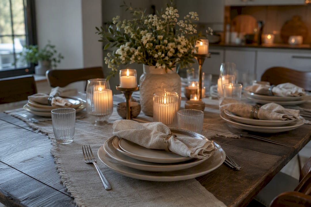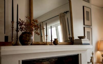
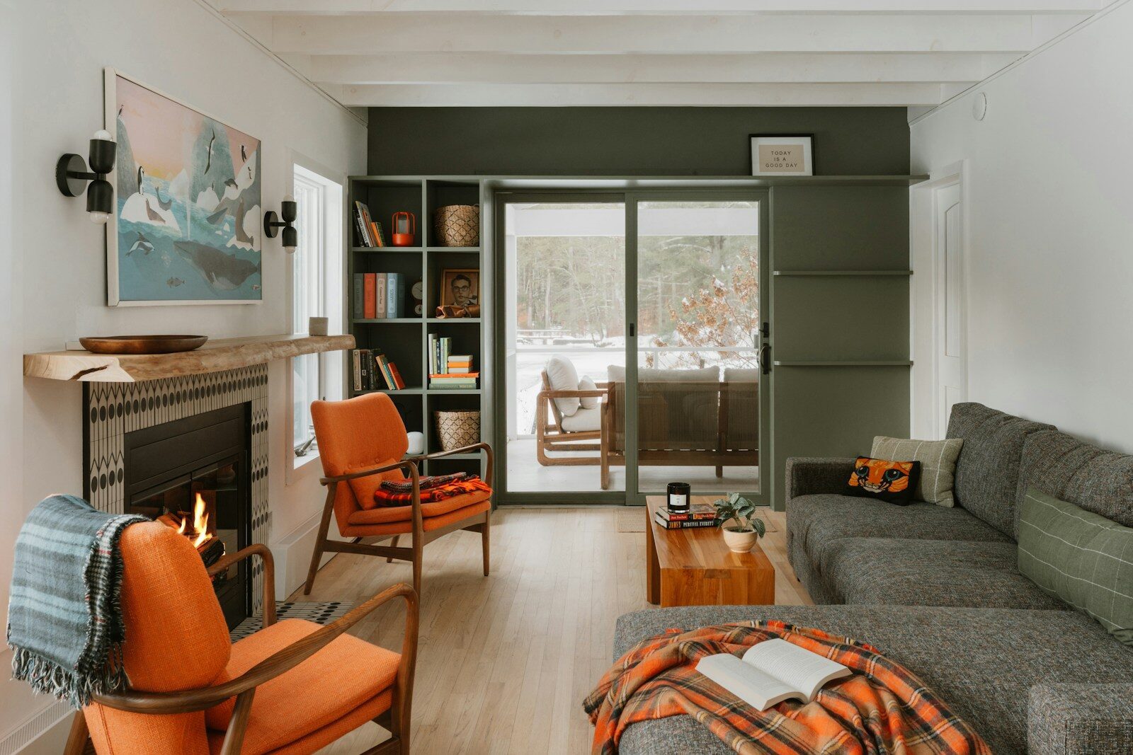
An accent color for blue is a deliberately chosen hue that enhances and complements blue tones in a room, creating visual balance without competing for attention. Blue is one of the most versatile base colors in interior design, appearing in shades from soft powder blue to deep navy to electric cobalt. Each shade responds differently to its companions. Orange sits directly opposite blue on the traditional RYB color wheel, making it the classic complement, while yellow holds that position in the RGB model. Knowing which accent to reach for, and when, is what separates a room that feels pulled together from one that simply feels blue.
1. The best accent colors for blue, ranked by versatility
Not every accent works equally well across all blue shades. The list below moves from the most universally applicable to the more shade-specific, giving you a clear starting point.
- Orange. The true complementary color to blue in traditional color theory. Use it in small doses: a ceramic vase, a throw pillow, or a framed print. At full saturation on large walls, it creates optical vibration and eye fatigue.
- Mustard yellow. Warm, grounded, and rich. Mustard works beautifully against navy and medium blues because it shares a warm undertone without fighting for dominance.
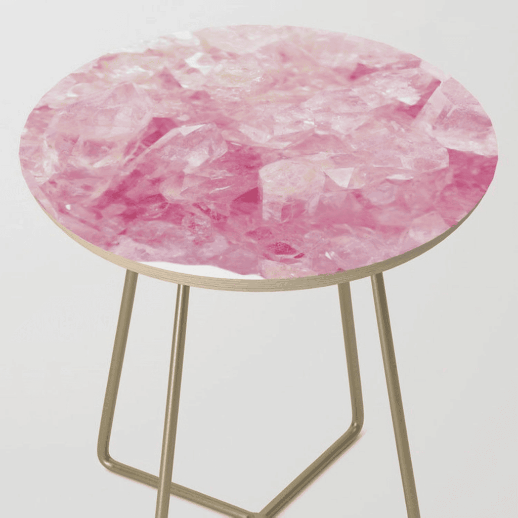
- Blush pink. Soft and romantic. Blush pink brings warmth to cool blues without raising the visual temperature too sharply. It reads as modern and calm alongside navy.
- Gold. A metallic accent that reads as both warm and neutral. Gold hardware, frames, and light fixtures add depth to cobalt and royal blue without clashing.
- Coral. Sits between orange and pink on the spectrum. Coral softens the boldness of blue while keeping the palette lively and fresh.
- Soft white and cream. The quiet anchors of any blue scheme. Cream leans warm, making it ideal for navy and teal. Pure white suits cooler, lighter blues.
- Warm taupe. A grounding neutral that bridges blue and wood tones. Taupe works especially well in rooms where you want blue to feel cozy rather than crisp.
- Lavender. A tonal accent that sits close to blue on the wheel. Lavender creates a serene, layered effect with powder blue and periwinkle.
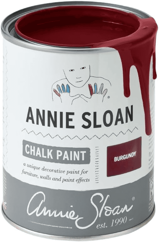
- Burgundy. Deep and dramatic. Burgundy adds richness to navy and dark teal, creating a palette that feels sophisticated and intentional.
- Terracotta. Earthy and unexpected. Terracotta introduces warmth and texture alongside blue, particularly in spaces with natural materials like linen and rattan.
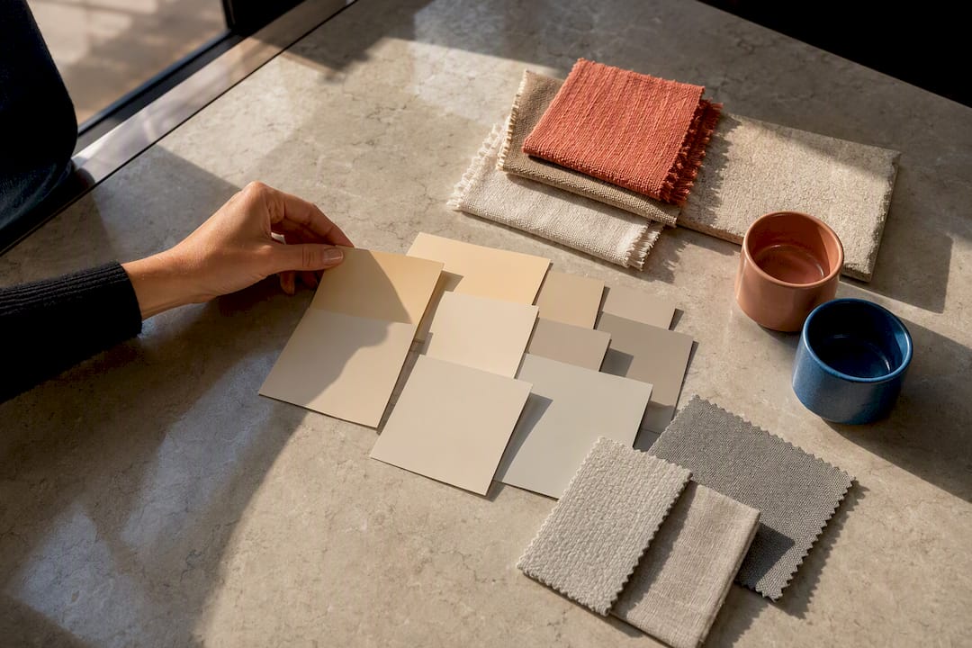
Pro Tip: Test any accent color as a paint swatch or fabric sample in the actual room before committing. Natural and artificial light change how colors read against blue walls or furniture.
2. How to choose the right accent based on your blue shade
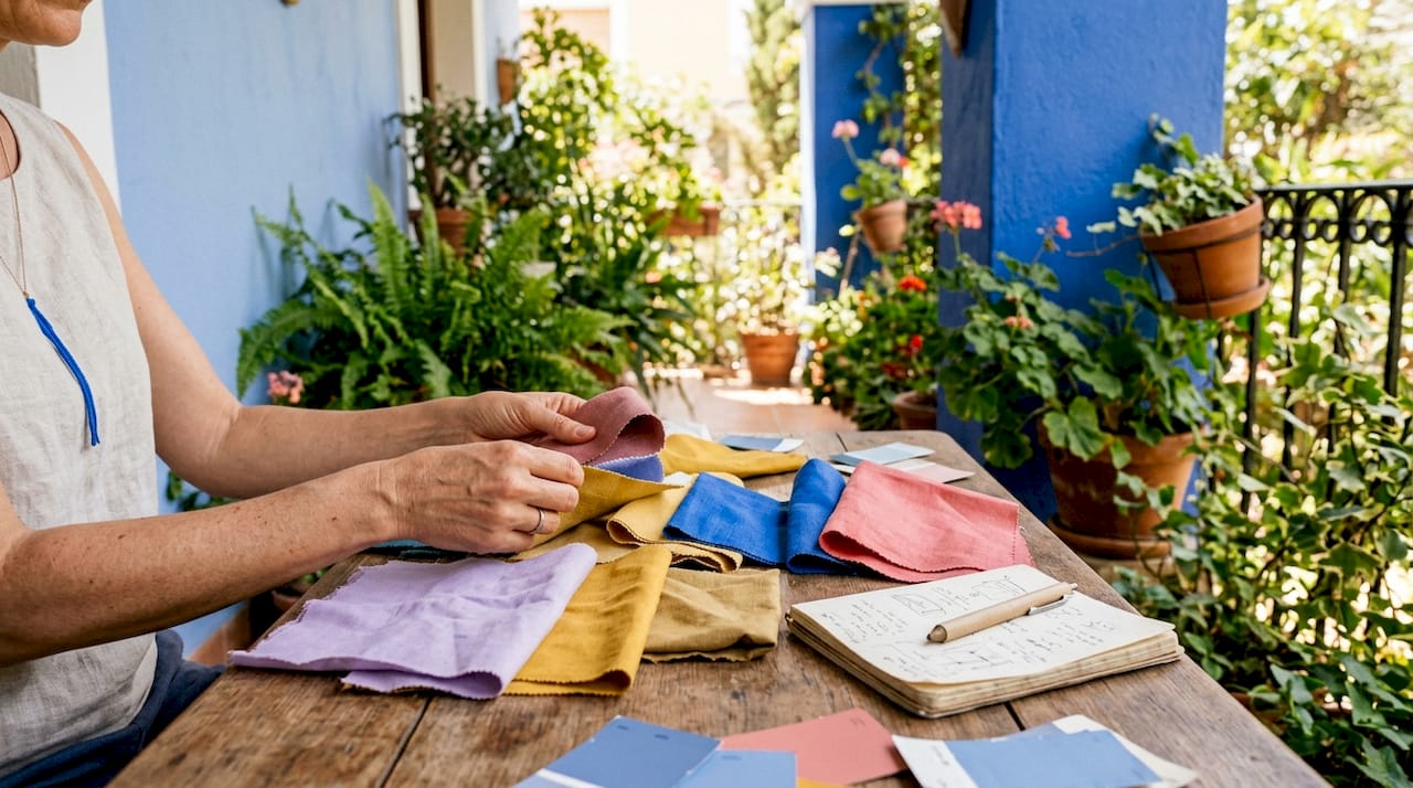
The shade of blue you are working with is the single most important factor in choosing a companion color. Matching intensity and temperature prevents visually random combinations that feel accidental rather than designed.
Navy blue
Navy functions as a modern neutral, much like a richer alternative to black. This versatility means it accepts a wide range of accents without losing balance. Blush pink softens its formality. Mustard yellow adds warmth and energy. Burgundy deepens the palette for a more dramatic, evening-ready feel. Crisp white or warm cream keeps navy feeling fresh and clean.
Powder blue
Powder blue is cool and delicate. It pairs best with accents that share its lightness. Soft lavender creates a tonal, dreamy effect. Warm taupe grounds the palette without overwhelming the blue’s gentleness. Avoid high-saturation accents like cobalt orange or hot pink next to powder blue. The contrast is too sharp and the softer blue gets lost.
Cobalt and royal blue
Bold blues like cobalt demand high-intensity companions to hold their own. Gold is the most reliable choice: it matches cobalt’s intensity while adding warmth. Hot pink creates a maximalist, high-energy pairing that works well in playful or creative spaces. Emerald green is another strong option, creating a jewel-toned palette with real presence.
Pro Tip: Cool blues suit cool neutrals like gray and white. Warm blues, including teal and cerulean, work better with warm neutrals like taupe, cream, and camel. Temperature mismatch causes visual friction and disrupts the harmony of the whole room.
| Blue shade | Best accent colors | Neutrals to anchor the scheme |
|---|---|---|
| Navy | Blush pink, mustard, burgundy | Warm white, cream, camel |
| Powder blue | Soft lavender, warm taupe | Light gray, ivory |
| Cobalt | Gold, hot pink, emerald | Warm white, natural wood |
| Teal | Coral, terracotta, mustard | Warm gray, linen |
| Periwinkle | Soft peach, dusty rose | Cool white, silver |
3. How to apply accent colors without overwhelming the room
Knowing which colors go well with blue is only half the work. Knowing how much of each to use is what makes a scheme feel intentional rather than chaotic.
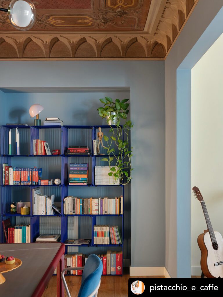
The 60-30-10 rule is the most reliable framework in interior design. Blue takes up 60% of the visual space as the dominant color. A secondary color, often a neutral like warm white or taupe, fills 30%. The accent color occupies just 10%. That 10% is where you place vibrant hues like coral, mustard, or gold to maintain harmony and visual balance.
- Walls and large furniture carry the dominant 60%. A navy sofa or blue-painted walls establish the base.
- Rugs, curtains, and secondary upholstery hold the 30%. A warm cream rug or linen curtains anchor the room without competing.
- Pillows, artwork, ceramics, and small accessories deliver the 10% accent. This is where orange, gold, or terracotta earns its place.
- Avoid full-saturation accents on large surfaces. Complementary colors at full saturation on large areas cause optical vibration and eye fatigue. Keep bold accents small and deliberate.
- Use neutrals as visual rest. A stretch of warm white wall or a natural wood floor gives the eye somewhere to pause between the blue and its accent.
For living room layouts where blue is the dominant wall color, the accent often works best in the textiles: throw pillows, a patterned rug, or a single statement chair in mustard or coral.
4. Creative and unexpected accent colors for blue
The pairings most people reach for first, white, gray, and beige, are reliable but rarely memorable. These less common options create rooms with genuine personality.
- Terracotta. Warm accent colors like terracotta create unexpected moods with blue that feel personal and grounded. The earthiness of terracotta contrasts beautifully with the coolness of blue without creating tension. Use it in pottery, woven baskets, or a single accent wall in a room with blue furniture.
- Mint green. A cool, fresh pairing that works especially well with navy and dark teal. Mint keeps the palette light and airy, making it a strong choice for kitchens and bathrooms.
- Soft peach. Gentler than coral, soft peach brings warmth to powder blue and periwinkle without overpowering them. It reads as modern and approachable.
- Burgundy. Deep and considered. Burgundy alongside navy creates a palette that feels like a well-curated library: warm, rich, and layered. Use it in velvet cushions, a wool throw, or a framed artwork.
- Dusty rose. A muted, sophisticated take on pink. Dusty rose sits comfortably next to both cool and warm blues, making it one of the more flexible unexpected accents on this list.
For a deeper look at how blue-adjacent tones work in real rooms, Artinlifestyle’s guide to indigo color combinations shows how close relatives of blue respond to the same accent principles.
Key takeaways
The most effective accent color for blue depends on matching the shade’s intensity and temperature, then applying that accent at the 10% level to maintain visual balance.
| Point | Details |
|---|---|
| Shade dictates the accent | Navy accepts warm and cool accents; cobalt needs high-intensity companions like gold or hot pink. |
| Temperature matching matters | Cool blues pair with cool neutrals; warm blues need warm neutrals to avoid visual friction. |
| Use the 60-30-10 rule | Blue dominates at 60%, a neutral fills 30%, and the accent color takes just 10% of the space. |
| Keep bold accents small | Full-saturation complementary colors on large surfaces cause eye fatigue; use them in pillows and accessories. |
| Unexpected accents add personality | Terracotta, mint green, and dusty rose create memorable rooms that go beyond the standard gray-and-white formula. |
FAQ
What is the best accent color for blue walls?
Orange is the classic complementary accent for blue based on traditional color theory, but mustard yellow, blush pink, and warm gold are more practical choices for most homes. The best option depends on your specific blue shade and the mood you want the room to carry.
How do I choose accent colors for navy blue?
Navy blue acts as a neutral, so it pairs well with a wide range of accents including blush pink, mustard, burgundy, and warm white. Match the warmth of your accent to the undertone in your specific navy to avoid a mismatched result.
Can I use more than one accent color with blue?
Yes, but keep the total accent presence at around 10% of the room’s visual space. Two accents work well when they share a temperature, for example mustard and terracotta together alongside navy, rather than mixing warm and cool accents in equal measure.
What colors should I avoid pairing with blue?
Avoid pairing warm-toned blues with cool-toned accents, and vice versa. Temperature mismatch is the most common reason a blue color scheme feels off. Also avoid using bold complementary colors like orange at full saturation on large surfaces, as this causes visual strain.
How does the 60-30-10 rule apply to blue color schemes?
Blue takes the dominant 60%, a neutral like cream or warm gray fills the secondary 30%, and the accent color, coral, gold, or mustard, occupies the remaining 10%. This structure keeps the scheme balanced and prevents any single color from overwhelming the space.