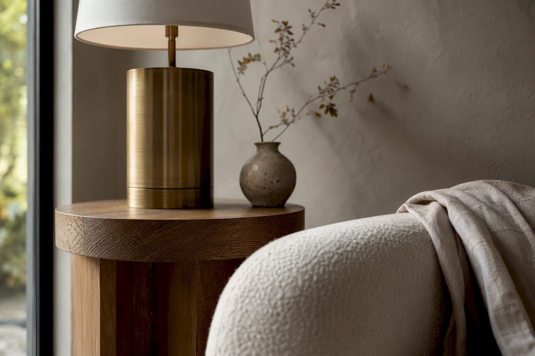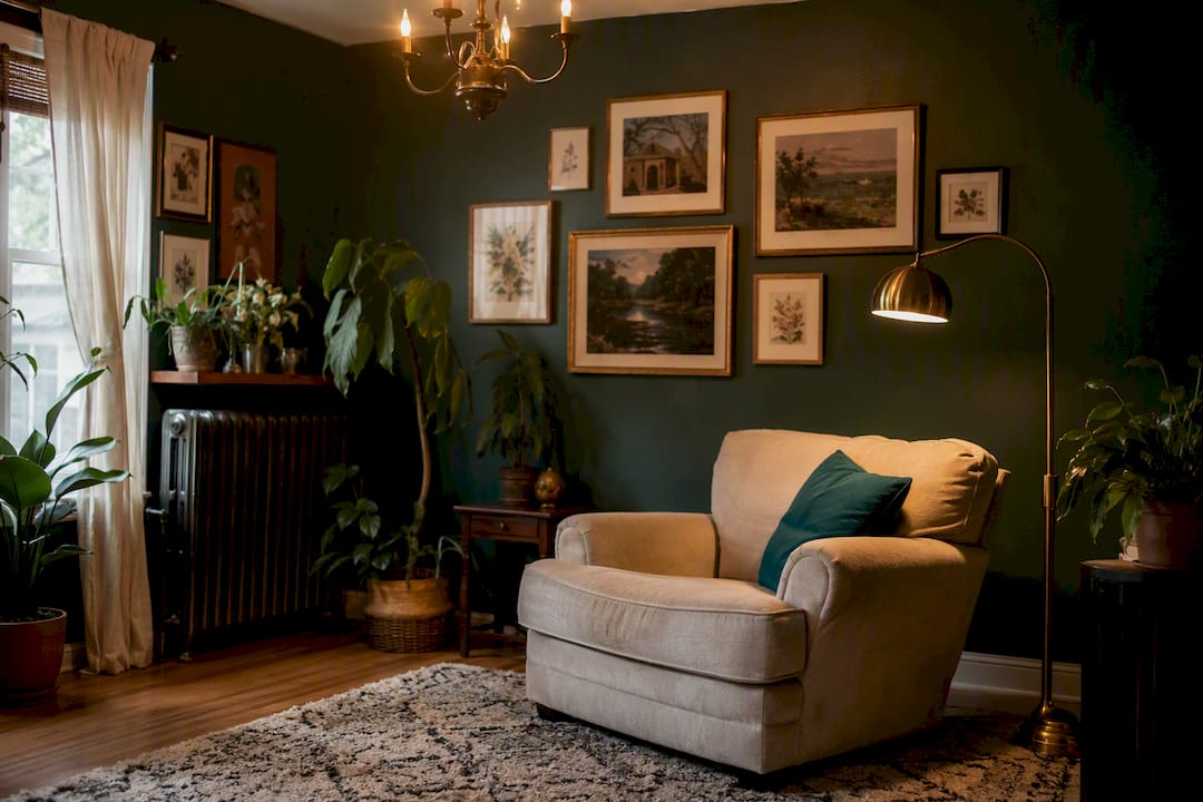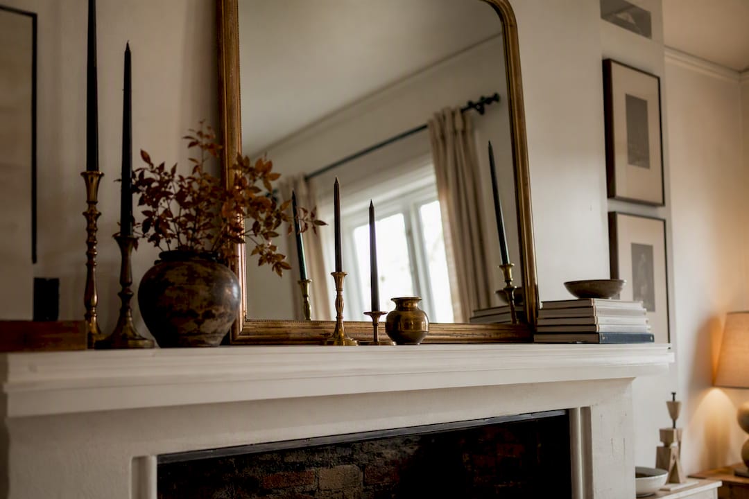
A decided anchor piece, a correctly sized mirror, layered light, and a statement floor are all you need to make any entryway feel designed. Add one object with no job but to look good, and the formula holds whether you’re working with a grand foyer or a three-foot-wide hallway. Scale the pieces, not the plan.
TL;DR:
- The right-sized mirror should cover at least half the width of the furniture it hangs above and be hung 5 to 8 inches above for optimal reflection.
- Layered lighting, including wall sconces at eye level and a table lamp, creates warmth and visual interest, especially with warm bulbs in the 2700K–3000K range.
- Durable, flat-pile rugs or runners that leave a few inches of visible floor enhance both safety and style, with contrasting materials or patterns making a deliberate design statement.
- Small entryways benefit from slim-profile furniture, vertical mirrors, and wall-mounted hooks, with space-saving decor options that maximize limited floor space.
- A simple, intentional nonfunctional object, like a sculptural piece or oversized vase, significantly elevates the overall style and feels of the entry without cluttering.
Table of Contents
- Five Foolproof Entryway Styling Formulas To Copy
- How To Style A Console Table With Intention
- Mirror Rules And Layered Lighting That Make The Entry Feel Designed
- Treat The Floor As A Statement: Tile, Runners, And Rug Durability
- Storage Solutions That Look Intentional, Not Improvised
- Mix Materials And Textures To Create Warmth And Editorial Interest
- Practical Strategies For Narrow Or Tiny Entryways
- A 20 To 30 Minute Styling Checklist You Can Follow Now
- Art In Lifestyle’s Design Approach And Author Credentials
- Color Schemes And Paint Recommendations For Entryways
- Incorporating Greenery And Decorative Plants
- Wall Decor Ideas Beyond Mirrors: Artwork, Wallpaper, And Paneling
- Seasonal And Holiday Entryway Styling Tips
- Tips For Creating A Welcoming Atmosphere
- Safety Considerations In Entryway Design
- What Small, Intentional Choices Actually Change
- Bring The Formulas To Life With Curated Help
- Sources
Five Foolproof Entryway Styling Formulas To Copy
Designers don’t reinvent the entry every time. They reach for a small rotation of foolproof formulas that flex to fit the furniture on hand and the square footage available, which is exactly why they work as a starting template rather than a rigid rulebook. Each formula below solves for a different home type. Pick the one that matches your layout first, then adjust the details.
1. Bench, basket, and oversized mirror
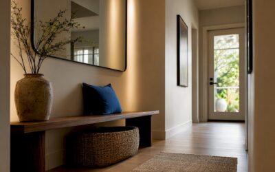
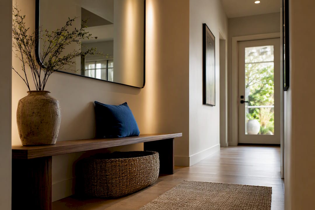
This is the workhorse formula for narrow entries and busy, casual households. A bench of suitable width gives you a place to sit while pulling off boots, a woven basket underneath swallows loose shoes and mittens, and a mirror hung above, sized to at least half the bench’s width, opens up the sightline. Skip the console entirely if floor space is tight. This trio does the job a full furniture suite would, at a fraction of the footprint.
2. Console, lamp pair, and centered tray
Formal and traditional entries lean on symmetry to feel composed. Center a console against the widest clear wall, flank it with a matching pair of small lamps, and anchor the middle with a low tray for keys and mail. The repetition of the lamps does the visual heavy lifting here. It reads as intentional the moment you walk in, even with almost nothing else on the surface.
3. Sideboard, large-scale art, and single lamp
Wide foyers with real storage needs call for a sideboard rather than a slim console. Because a sideboard already carries visual weight, keep the tabletop restrained: one substantial piece of art leaning or hung above, and a single lamp off to one side instead of a pair. The asymmetry keeps a big piece of furniture from feeling like a wall of storage. A gallery-style grouping can stand in for the single large artwork if you’d rather build a cluster than hang one statement piece.
4. Narrow console, wall hooks, and slim mirror
Rentals and tight hallways rarely have room for a bench and a console both. Choose a console no deeper than 12 to 16 inches, mount a row of hooks at coat height on the wall beside it, and hang a slim, vertical mirror rather than a wide one. Vertical lines read taller and narrower than they measure, which matters when the hallway itself is doing the same trick.
5. Round pedestal table and one sculptural object
Grand or open foyers with room to walk around furniture on all sides benefit from a round pedestal table set toward the center, topped with a single striking object: an oversized vase, a piece of sculpture, a dramatic floral arrangement. There’s no wall anchor here because there’s often no single dominant wall. The object itself becomes the focal point, and it needs to be substantial enough to hold that role alone.
None of these formulas require matching furniture sets or a full room redesign. They require one correct-scale piece per role: something to anchor, something to reflect, something to light, and something with no function at all.
How To Style A Console Table With Intention
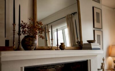
A console table earns its keep by having a wall anchor first and a tabletop plan second. Start with what hangs above it: a mirror or artwork should span roughly half to three-quarters of the console’s width, never the full length and never a fraction that leaves the console looking orphaned underneath.
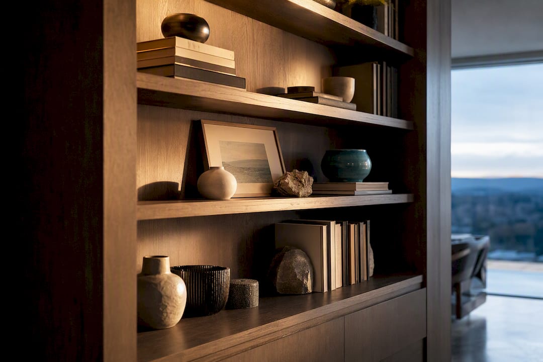
Once the wall anchor is set, build the tabletop in three heights. Console styling holds together when you layer tall, medium, and low objects rather than lining up several pieces of the same size, which is the single most common mistake in an entry console styling attempt.
- Tall (16 to 24 inches): a table lamp, a tall vase with branches, or a slim framed print leaning against the wall
- Medium (8 to 14 inches): a stack of two or three hardcover books, a small sculptural bowl, or a short vase
- Low (2 to 6 inches): a dish for keys, a small candle, or a single trinket tray
- Negative space: leave at least a third of the surface bare so the eye has somewhere to rest
Whatever sits beneath the console depends on how much you’re already asking the tabletop to do. A woven stool or low basket adds warmth and a place to set down mail without competing with the layered vignette above it. If the tabletop composition is already busy, leave the space underneath empty. Console tables read as more expensive when they’re not fully loaded top to bottom.
Pro Tip: Before adding anything permanent, group your tall, medium, and low pieces on the floor first and look at them from across the room. It’s much easier to edit a pile than to keep rearranging on the actual surface.
Standard console depth runs about 12 to 16 inches, and you’ll want at least 30 to 36 inches of clear walking path in front of it for door swing and normal foot traffic. Measure that clearance before you fall for a console online. A beautiful table that blocks the closet door gets moved to storage within a month.
Mirror Rules And Layered Lighting That Make The Entry Feel Designed
Mirror sizing is not a matter of taste. A mirror should generally fill at least half the width of the furniture it hangs above, and scale outranks shape every time. A perfectly round mirror that’s too small for its console will always look like an afterthought, while a slightly oversized rectangular mirror in the wrong shape still reads as deliberate.
Height matters just as much as width. Hang the bottom edge of a mirror or piece of art roughly 5 to 8 inches above the furniture beneath it, and check that the mirror’s center sits close to eye level for an average adult, generally 57 to 60 inches from the floor.
Lighting is where most entries fall flat, because a single overhead fixture creates flat, shadowless light that makes even well-chosen furniture look like a showroom display. Layered lighting, meaning an overhead fixture plus a wall sconce or table lamp, transforms an entry by adding warmth and a secondary point of visual interest.
- Mount wall sconces at approximately eye level, roughly between 170 and 175 centimeters from the finished floor, to align with the average adult sightline
- Place a table lamp on the console or sideboard rather than relying on overhead light alone
- Choose bulbs in the 2700K to 3000K range for a warm, welcoming glow instead of the bluish cast of daylight bulbs
- Use a dimmer on the overhead fixture where wiring allows, so the entry can shift from bright morning light to soft evening ambiance
Statistic Callout: The sconce height guideline of roughly 170 to 175 centimeters isn’t arbitrary. It lines up light with the average sightline, so the fixture itself becomes part of the visual composition rather than a fixture you notice only when it’s off.
Treat The Floor As A Statement: Tile, Runners, And Rug Durability
Most entries stop at furniture and lighting and forget the floor is doing half the visual work. Treating the entry floor as a design statement with patterned tile, a contrasting material, or a striking runner signals intention the moment someone steps through the door.
Checkerboard tile, encaustic patterned tile, or a strip of a different material laid into hardwood all read as deliberate design decisions rather than default flooring. If a full tile swap isn’t realistic, a runner does the same visual job for a fraction of the cost and effort.
- Choose a low or flat pile for entry rugs. High pile traps grit and shows wear far faster underfoot
- Consider a washable flatweave rug in busy households with kids, pets, or frequent muddy boots
- Size runners to leave 4 to 6 inches of visible flooring on each side, rather than a rug that spans wall to wall
- Layer a small accent rug over a jute or sisal base for texture without sacrificing durability
Whether to contrast the entry floor with the adjoining room or let it flow through comes down to how the spaces connect. An open-concept entry that spills directly into a living room usually benefits from continuity, one material, one tone, so the transition feels seamless. A defined entry with its own walls or a change in ceiling height can support more contrast, since the boundary is already established architecturally.
Storage Solutions That Look Intentional, Not Improvised
Clutter kills an otherwise well-styled entry faster than any design mistake, but hiding storage well is a solvable problem. The right pieces do double duty as both function and decor.
- Choose a bench based on what it needs to hide. A bench with a lift-top or hinged seat works for households that want shoes and gear out of sight entirely. An open bench with a shelf underneath works better if you’d rather grab shoes quickly without lifting anything.
- Add a slim shoe cabinet for larger shoe collections. A cabinet just 8 to 10 inches deep with tilted internal drawers fits along a narrow wall and holds far more pairs than its footprint suggests, which matters in households where everyone owns three pairs of sneakers.
- Install hooks at two heights. Mount one row around 60 inches high for adults and a second row around 36 to 40 inches for kids. Choose hooks in a finish that matches your lighting or hardware so they double as decorative hardware rather than an obvious utility add-on.
- Use baskets as the flexible catchall. Woven baskets absorb whatever doesn’t have an assigned spot, mittens, dog leashes, mail you haven’t opened, and they look intentional even when what’s inside them isn’t.
- Build a 60-second nightly reset into the routine. Clear the console tray and put stray shoes back into the basket or cabinet before bed. A styled entry only stays styled if the daily habit matches the design.
Mix Materials And Textures To Create Warmth And Editorial Interest
An entry built from a single material, all wood, all metal, all glass, tends to read as flat no matter how well the pieces are chosen. Three materials working together create the kind of textural depth that makes a space feel finished rather than furnished.
- Modern entries: pair a matte black metal console with a woven jute runner and a hand-blown glass vase for a mix of hard, natural, and reflective surfaces
- Cottage entries: combine a whitewashed wood bench, a chunky wool basket, and a ceramic pitcher or jug for softness without looking staged
- Rustic entries: layer reclaimed wood, aged leather (a bench cushion or strap detail), and raw brass hardware for warmth with some edge
- Transitional entries: mix a lightly finished wood console, a linen or cotton runner, and a single stone or marble object for a palette that reads timeless rather than trend driven
The finishing move in nearly every well-styled entry is one object that has no function at all, a sculptural form, an oversized vase, a piece of pottery, something chosen purely because it’s beautiful. Look for these pieces at local ceramic studios, art fairs, or a curated home decor guide rather than a big-box aisle, since the whole point is that it doesn’t look mass-produced.
Practical Strategies For Narrow Or Tiny Entryways
Small entryways punish bulky furniture choices fast, so prioritizing vertical solutions and slim-profile pieces matters more here than almost anywhere else in the home.
- Keep console or bench depth under 12 inches, and confirm at least 30 inches of clear walking path remains for doors and traffic
- Hang a tall, vertical mirror rather than a wide one; height reads as more spacious than width in a narrow footprint
- Install a peg rail or floating shelf instead of a full cabinet when floor space is nonexistent
- Skip the rug entirely, or use a slim runner, if a full rug narrows the visual walkway further
- Limit tabletop styling to two or three objects maximum. A tight circulation zone can’t absorb a full three-height vignette without looking cramped
A space-saving decor guide is worth a look if your entry is closer to a hallway than a room, since dual-purpose pieces solve the scale problem better than shrinking down full-size furniture.
A 20 To 30 Minute Styling Checklist You Can Follow Now
Most entries don’t need a renovation. They need thirty focused minutes and a plan you actually follow through on.
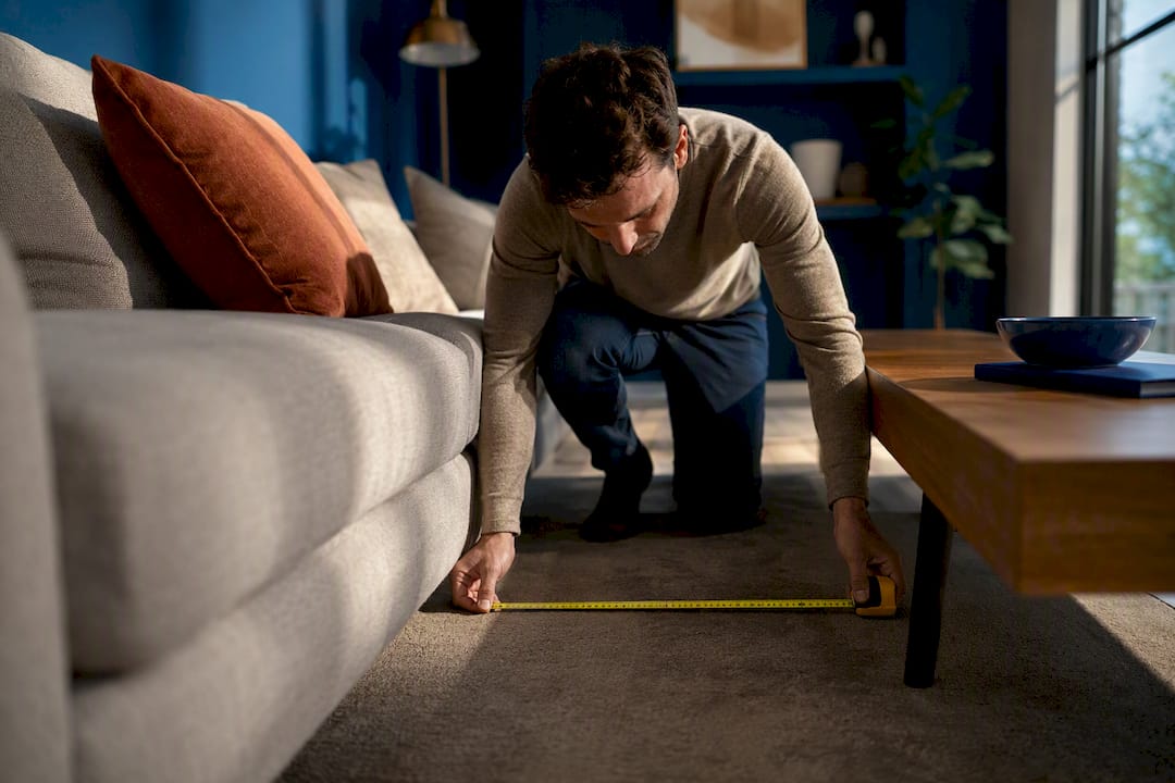
- Measure first (5 minutes). Note the width of your console, bench, or sideboard, then mark where a mirror or art piece should hang using its width as the half-to-three-quarter guideline.
- Fix the light (5 minutes). Swap a harsh overhead bulb for a warm 2700K to 3000K bulb, or add a small table lamp to the console if one isn’t already there.
- Build the tabletop by height (10 minutes). Set your tall piece first, then medium, then low, checking that at least a third of the surface stays bare.
- Add the floor piece (5 minutes). Lay the runner or rug, leaving a few inches of floor visible on each side.
- Place storage and the finishing object (5 minutes). Set the basket or bench cushion, then add one object with no function purely because you love it.
- Photograph the vignette and adjust. Taking a photo flattens perspective and reveals balance issues, like uneven heights or a lopsided grouping, that are hard to spot standing in the room itself.
Pro Tip: Take the photo from the exact spot where guests will first see the entry, usually the front door looking in. That’s the vantage point that actually matters, not the straight-on shot most people default to.
Art In Lifestyle’s Design Approach And Author Credentials
Art in Lifestyle covers interior design through an art-forward lens, treating decor decisions as creative choices rather than checklist items. Every formula in this piece draws on principles designers repeat because they hold up across styles and budgets, not trends that fade by next season.
This piece was written by Nealda, drawing on established entryway design rules and current styling practice. For related reading, see the guide to gallery wall arrangements for wall-anchor inspiration and the 2026 home trends overview for broader material and color context.
Color Schemes And Paint Recommendations For Entryways
Entryways get less natural light than most rooms in the house, which makes color choice a functional decision as much as an aesthetic one. Deep, saturated tones, navy, forest green, charcoal, actually work well in small or dim entries because they stop demanding the space feel bigger than it is and instead lean into coziness.
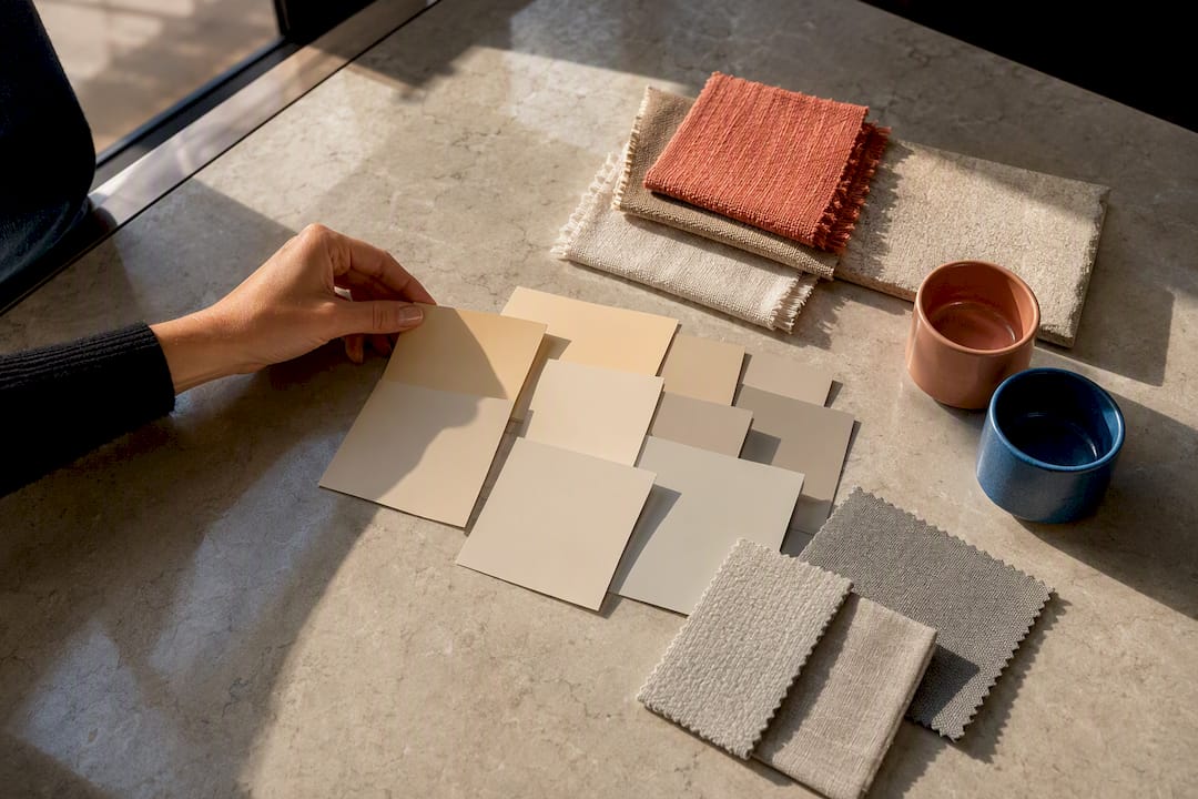
If your entry opens directly into a brighter room, a soft neutral, warm white, greige, pale oat, creates a gentle transition rather than a jarring color break at the threshold. Save the boldest paint choice for entries that function as their own enclosed space rather than a pass-through, since a bold color needs a wall or two of separation to read as intentional rather than accidental.
A durable, washable paint finish matters more here than in almost any other room. Entryways take scuffs from bags, shoes, and foot traffic daily, so an eggshell or satin finish holds up better than flat matte. For readers coordinating the entry with adjoining rooms, a living room color palette guide offers a useful starting point for choosing tones that carry through rather than clash at the doorway.
Warm metallics, brass, aged gold, warm bronze, tend to read better against deep entry colors than cool chrome or nickel, since they echo the same warmth the layered lighting is already working to create.
Incorporating Greenery And Decorative Plants
A plant is often the fastest way to make an entry feel alive rather than staged, and it solves the “one nonfunctional object” requirement in a single move. Tall, structural plants, a fiddle leaf fig, a snake plant, an olive tree, work well on the floor beside a console or bench where there’s room for the pot to sit without crowding foot traffic.
Low light is the real obstacle in most entries, since many sit away from windows entirely. Snake plants, ZZ plants, and pothos tolerate dim conditions far better than flowering plants or anything that needs direct sun. A faux version is a completely reasonable substitute in a genuinely dark hallway. A well-made faux olive branch in a good vase reads as intentional, while a dying real plant reads as neglect.
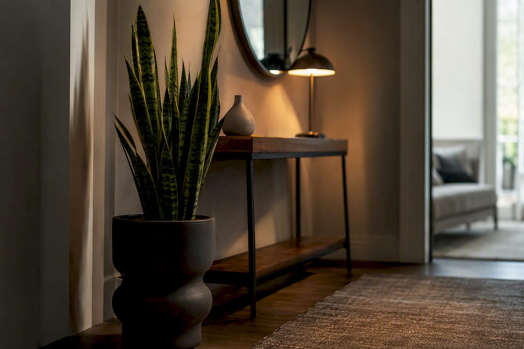
Smaller entries can still work greenery in without floor space. A trailing plant on a wall-mounted shelf, or a single stem in a bud vase on the console tabletop, adds the same organic note at a fraction of the footprint. A potted house plant guide is worth checking for options suited to lower-light conditions specifically.
Keep the plant count to one strong specimen rather than several small pots scattered around. A single well-placed plant reads as styled; a cluster of small ones often reads as clutter that happened to be green.
Wall Decor Ideas Beyond Mirrors: Artwork, Wallpaper, And Paneling
A mirror isn’t the only option for the wall above your anchor furniture, and in sideboard or wide-console formulas, art often does the job better. A single oversized piece, or a tight gallery wall grouping of smaller framed pieces, gives the same visual weight a mirror provides without the reflective surface competing with your lighting plan.
Wallpaper is having a real moment in entries specifically because the space is small enough to commit to a bold pattern without it overwhelming an entire room. A grasscloth texture, a botanical print, or a graphic geometric pattern on just the entry walls creates drama that would feel like too much in a living room but reads as confident in a transitional space guests pass through quickly.
Paneling, whether traditional wainscoting, board-and-batten, or a more modern vertical slat treatment, adds architectural texture to entries that otherwise have flat, featureless walls. It pairs particularly well with the transitional and cottage material palettes covered earlier, since the paneling itself becomes one of the three textures in the mix.
Whatever you choose, keep the scale in proportion to the wall. A tiny piece of art on a large blank wall looks lost the same way an undersized mirror does above a console. When in doubt, size up rather than down.
Seasonal And Holiday Entryway Styling Tips
The core formula, anchor, mirror, light, floor, one nonfunctional object, doesn’t need to change season to season. What changes is which objects fill those roles temporarily.
Swap the console’s tall object for a seasonal branch arrangement in fall (magnolia, eucalyptus, or dried wheat), and switch the low tray’s contents to match, a small pumpkin or gourd instead of a candle, for instance. Winter holidays call for restraint rather than excess: one well-chosen wreath on the door or above the mirror, a single string of warm-toned lights woven through a garland on the console, and perhaps a bowl of ornaments in the low tabletop position rather than covering every surface.
Spring and summer suit a lighter touch, fresh florals in the tall vase position, a lighter-weight runner swapped in for a heavier winter rug, and the return of a live plant if you’ve been running faux greenery through the darker months.
The mistake to avoid is layering seasonal decor on top of the existing vignette instead of swapping into it. An entry with a permanent tabletop arrangement plus a full seasonal display on top reads as cluttered no matter how nice each individual piece is. Rotate objects out; don’t just add more in.
Tips For Creating A Welcoming Atmosphere
Sight isn’t the only sense doing work at the front door. Scent arrives first, often before a guest has even registered the mirror or the runner, which makes it one of the highest-impact, lowest-effort additions to the whole formula.
A reed diffuser or a simple candle on the console’s low tabletop tier does double duty as both scent and object. Choose something warm rather than sweet for entries, woody or amber notes tend to read as sophisticated rather than cloying in a space guests pass through briefly. A home fragrance option placed at the entry sets a tone for the whole house before anyone reaches the living room.
Texture matters just as much once someone actually steps inside. A rough jute runner underfoot, a soft basket liner, the cool weight of a ceramic vase, these small tactile details register even when a guest isn’t consciously noticing them. Combined with the warm 2700K to 3000K lighting covered earlier, the layered effect of scent, texture, and warm light does more to make an entry feel welcoming than any single decor purchase could.
Sound plays a smaller role but still matters: a hard-surfaced entry with no rug or runner at all can feel echoey and cold underfoot, which is one more reason the flooring statement covered earlier isn’t purely visual.
Safety Considerations In Entryway Design
A beautiful entry that causes a fall isn’t a successful entry, and a few safety checks matter more here than in almost any other room, since entries handle wet shoes, uneven light transitions, and the highest foot traffic in the house.
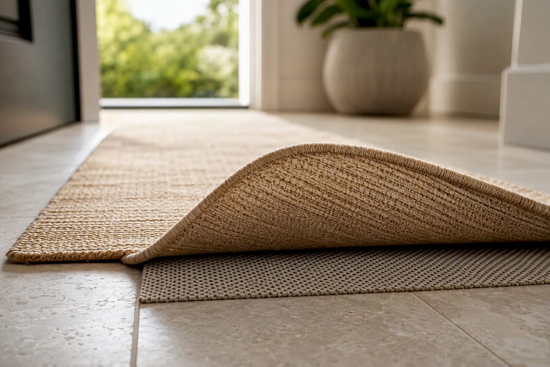
Choose a non-slip backing or rug pad under every entry rug and runner, particularly on hardwood or tile where a loose rug becomes a genuine hazard the moment someone’s shoes are wet. Low-pile and flatweave rugs, already recommended earlier for durability, also sit flatter and trip less than a high-pile rug with curling edges.
Lighting intensity needs a second look through a safety lens, not just an aesthetic one. The warm 2700K to 3000K bulbs recommended for ambiance still need to be bright enough to clearly see steps, thresholds, or a change in flooring level. If your entry has even a single step down or up, add a stronger light source directly at that transition rather than relying on ambient warmth alone. A dimmer switch lets you keep the cozy setting for everyday use while giving you a brighter option on hand for guests unfamiliar with the space.
Keep any decorative object placed at floor level, baskets, low stools, plant pots, tucked close to a wall rather than in the direct walking path. It looks intentional in photos and it prevents the exact kind of nighttime stubbed toe that turns a well-styled entry into a liability.
What Small, Intentional Choices Actually Change
The formulas in this piece work because they force a decision at every step, anchor, mirror, light, floor, object, rather than letting an entry accumulate items over months until it looks cluttered by accident. My honest recommendation is to spend real time on the one nonfunctional object. It’s the piece people skip because it doesn’t “do” anything, and it’s almost always the piece that makes a styled entry feel like a home instead of a showroom.
Treat every formula here as a starting point, not a rulebook. Swap the materials, break the symmetry, and let the space tell you when something’s working.
— Nealda
Bring The Formulas To Life With Curated Help
DIY styling gets you most of the way, but sourcing the right mirror scale, the right sculptural object, or a cohesive gallery wall can eat an entire weekend of scrolling. Art in Lifestyle’s Art Concierge service exists for exactly that gap: a curated sourcing option for readers who know the formula they want but would rather skip the hunt for the specific pieces that pull it together.
If you’re building the sideboard-and-art formula from earlier, the gallery wall guide walks through arrangement options in more depth than a single article section can cover. And if color coordination between your entry and the rooms it opens into is the sticking point, the living room color palette guide offers direction for keeping the transition seamless. Either resource pairs naturally with the formulas above: use them to fill in the details once you’ve picked your anchor, mirror, and lighting plan. Start with the client’s page to see how the sourcing option works, or browse a shopping guide directly if you already know which piece you’re missing.
Sources
- Nina Takesh: The 5 Entryway Design Rules I Follow on Every Project
- The Anatomy Of An Entryway: 5 Foolproof Formulas AND Our Favorite Shoppable Picks
- How to Style a Console Table That Actually Looks Intentional | Hobby Rig
- 27 Entryway Design Ideas for 2026 That Make Guests Think You Hired a Designer
- 13 Small Entryway Ideas You Can DIY – Architectural Digest