Quiet luxury decor is understated, texture-rich design that reads as expensive because of restraint and material quality, not visible branding or ornament. The single-step starting point: pick a tight three or four color palette and invest in one anchor piece per room before buying anything else. From there, the look builds through material choices, layered lighting, room-specific recipes, and smart budget allocation.
TL;DR:
- Limit each room to three or four tonal colors to emphasize texture and proportion over contrast.
- Prioritize high-quality, natural materials like linen, marble, and solid wood that age well and feel honest to the touch.
- Invest in one key anchor piece per room, such as a sofa or dining table, and build the look around it with layered textures and subtle lighting.
- Use layered, dimmable lighting—ambient, task, and accent—to create mood variations and enhance material qualities.
- Shop secondhand for well-made accessories and save by focusing spending on furniture and textiles that users touch daily.
Table of Contents
- What Is Quiet Luxury Decor, Really?
- How to Bring Quiet Luxury Into Every Room
- Where to Spend and Where to Save on Quiet Luxury
- The Quiet Luxury Styling Checklist
- The Four-Point Room Audit: Art in Lifestyle’s Framework
- Quiet Luxury vs. Minimalism: What’s the Real Difference?
- The History Behind Quiet Luxury Decor
- The Emotional Case for a Quieter Home
- Common Mistakes That Undercut a Quiet Luxury Room
- Why This Approach Outlasts Every Trend Cycle
- Get Personalized Help From the Art Concierge
- Sources
What Is Quiet Luxury Decor, Really?
Quiet luxury decor rejects logos, gloss, and visual noise in favor of texture, proportion, and material honesty. Designer Kerrie Kelly frames it as “curated simplicity,” where quality materials and thoughtful details build effortless sophistication rather than ostentation. That single idea, restraint over display, drives every decision in the sections ahead.
The style traces its name to fashion (the “stealth wealth” wardrobes of old-money families), but in interiors it long predates the term. What’s new is the vocabulary. What’s constant is the discipline behind it: fewer colors, better materials, and light that behaves like it was planned rather than switched on.
Palette discipline comes first. Limit any room to three or four tonal colors, usually variations on a warm neutral base like alabaster, oatmeal, or greige, with one deeper tone for grounding. Fewer colors force the eye to notice texture and proportion instead of contrast, which is exactly why restrained palettes read as intentional rather than cheap.
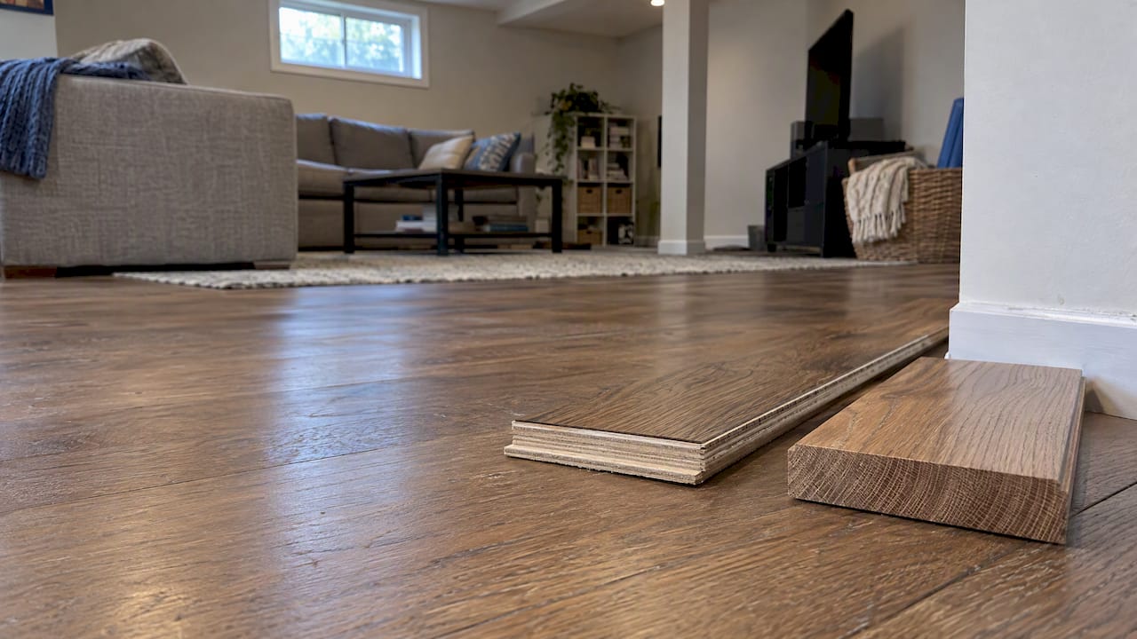
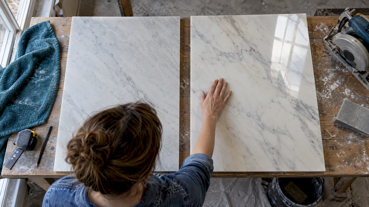
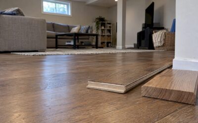
Material canon matters more than paint chips. The materials that consistently signal quiet luxury include heavyweight Belgian linen, bouclé, honed marble or travertine, rift-cut oak or walnut, plaster or limewash wall finishes, and matte metals like unlacquered brass, according to Renovate & Plan’s designer research. These materials age well and feel different under the hand than their synthetic equivalents, and that tactile honesty is what separates the look from a merely neutral room.
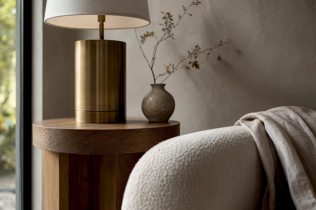
Texture layering is what keeps a monochrome scheme from going flat. Stack a nubby wool rug under a smooth leather chair, add a linen throw, then finish with a single polished object, a brass lamp base or a lacquered tray. Each surface catches light differently, and that variation does the visual work color would otherwise handle.
Lighting needs three distinct layers: ambient (ceiling or cove), task (reading lamps, under-cabinet), and accent (picture lights, sconces on art). Put every layer on a dimmer. Layered lighting on dimmers is one of the highest-impact, lowest-cost moves in the entire style, because it lets a single room shift mood from morning to evening without anyone touching a switchplate twice.
Pro Tip: Test your palette under both daylight and lamp light before committing. A greige that looks perfectly neutral at noon can turn muddy or pink under warm bulbs, and that mismatch is one of the fastest ways to undercut an otherwise disciplined room.
- Choose 3 to 4 tonal colors and stop there
- Prioritize materials with visible grain, weave, or hand-feel
- Layer at least three textures in any single seating area
- Install dimmers on every lighting layer before buying new fixtures
How to Bring Quiet Luxury Into Every Room
Each room needs its own version of the same rules: one anchor piece, a tight texture stack, and intentional light. Here’s how that plays out room by room.
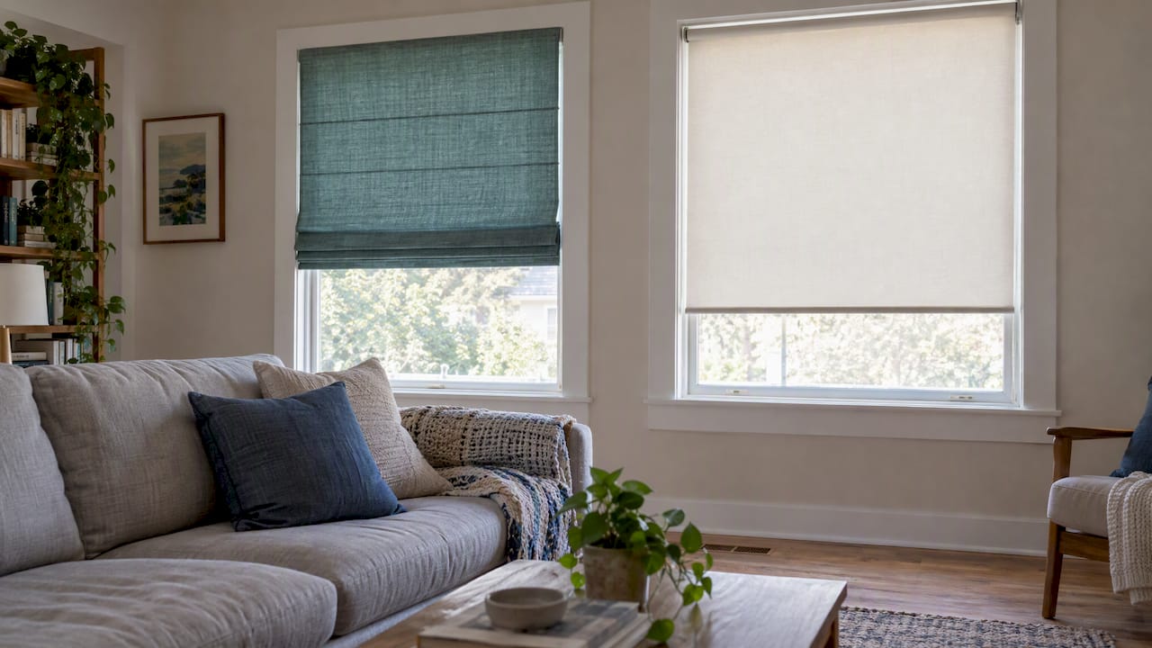
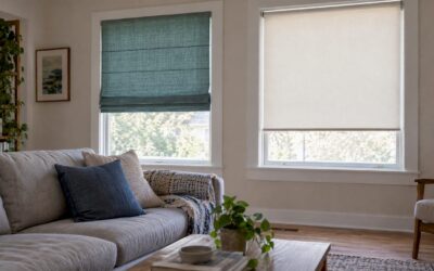
- Living room. Anchor the space with one substantial piece, a linen sofa or a stone coffee table, then build a texture stack around it: bouclé throw pillows, a wool rug, a leather ottoman. Add one polished material, a brass floor lamp or a lacquered side table, as punctuation against all that softness. Browse living room color palettes if you need a starting point for the tonal base.
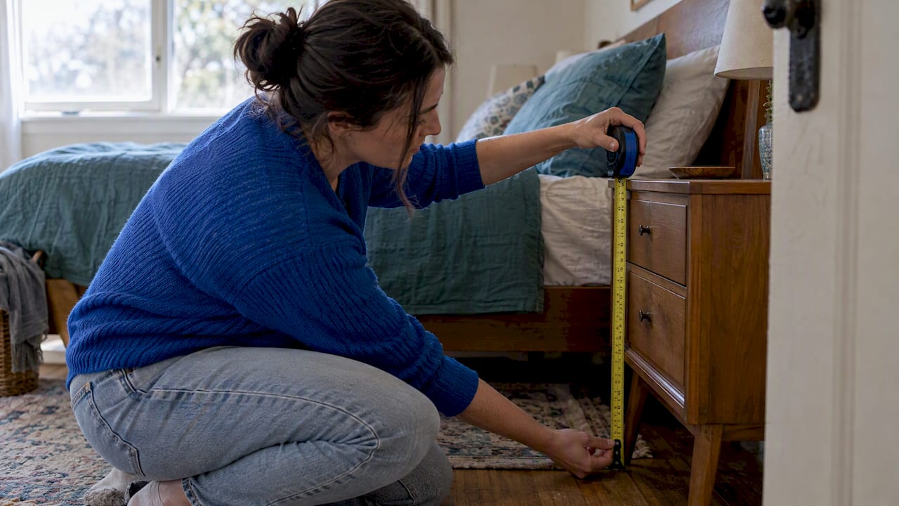
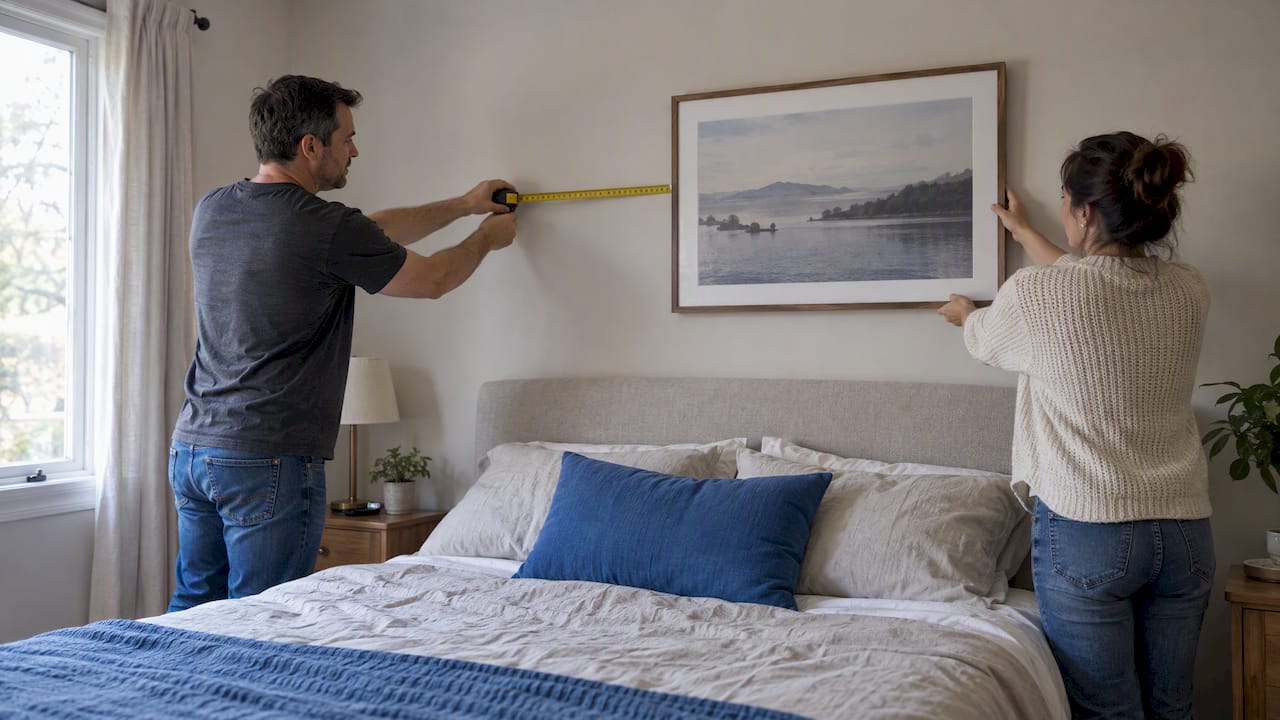
- Bedroom. Hotel-quality linens do more for a bedroom’s perceived value than any headboard. Pair high thread count sheets with a textured coverlet, keep nightstands pared down to a lamp and a single object, and layer bedding in at least two weights, a lightweight duvet plus a woven throw at the foot. For deeper guidance, see these hotel bedroom styling ideas and calming bedroom color options.
- Dining room. Invest in one great table, solid wood or stone, and let everything else stay quiet. Style it minimally: a low centerpiece, matte stoneware instead of glossy porcelain, and linen napkins rather than printed ones. Full luxury dining room ideas cover investment-worthy lighting choices for this exact setup.
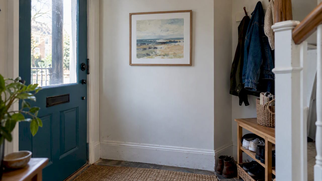
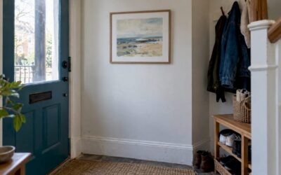
- Entry. A small entry has room for one architectural detail, a molding upgrade, a stone threshold, plus a three-object rhythm on a console: a lamp, a bowl, a small sculpture. Light it with a single targeted fixture rather than an overhead flood.
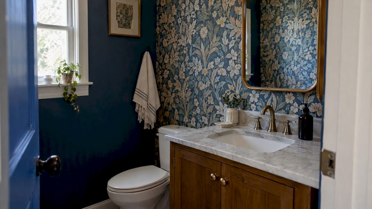
- Small spaces. Scale down furniture proportions before you scale down color. One muted accent, a plaster pink wall or a deep blue-green cabinet, can carry a small room the way a full neutral scheme carries a larger one, since a confident single accent color reads as architectural rather than decorative. An oversized rug, sized to reach within a few inches of every wall, makes a tight room feel intentional instead of cramped.
Where to Spend and Where to Save on Quiet Luxury
Quiet luxury doesn’t require an unlimited budget. It requires knowing exactly where the money matters. Designers consistently describe this as “spending more on less,” putting real money into fewer, better pieces rather than chasing trend items, and that approach lets the look scale across almost any budget with enough planning.
Spend on what you touch every day: the sofa, the bed, the rug underfoot. These pieces carry the most tactile weight in a room, and cheap versions announce themselves through fabric pilling or foam that flattens within a year. Save on accessories, vases, trays, small objects, since these are exactly the items worth hunting for secondhand.
Estate sales, thrift stores, and vintage dealers are where quiet luxury gets genuinely affordable. Shop by silhouette and finish rather than brand name; a $40 estate-sale lamp with real brass and good proportions will outperform a $200 new fixture with a plastic base every time, according to sourcing guidance from Better Homes & Gardens.
Apply the one-anchor rule per room: a single foundational piece, a great sofa, a stone table, a well-made bed frame, lifts everything placed around it. Once that anchor is in place, matte ceramics, linen textiles, and solid wood accents deliver an expensive feel at moderate prices.
Pro Tip: Before buying anything new, walk through your home and identify which single piece in each room is doing the least work. Replacing that one item, rather than adding five new accessories, is almost always the faster route to a room that reads as considered.
- Spend on sofas, rugs, and bedding first
- Shop estate sales and vintage dealers for silhouette and finish
- Apply one investment piece per room, then build around it
- Swap glossy accessories for matte ceramics and solid wood
The Quiet Luxury Styling Checklist
Before calling a room finished, run it against a short set of rules designers use to catch the details that break the illusion of restraint.
Limit any room to three or four colors, and choose exactly one accent metal, brass, nickel, or blackened steel, rather than mixing several. Texture count should scale with room size: a small bedroom needs three or four textures, while a larger living room can support five or six without feeling busy. Style objects in odd numbers, leave visible negative space on shelves and tabletops, and avoid combining more than one finish type (matte plus polished, never matte plus polished plus brushed) within the same vignette.
That four-part audit, palette, texture count, lighting, and negative space, functions as a repeatable diagnostic tool designers apply regardless of a home’s price point. A styled shelf with one sculptural object and open space around it consistently reads more expensive than a shelf packed with matching decor, since proportion and negative space, not object count, signal intentional editing.
- 3 to 4 colors maximum per room
- One accent metal, chosen and applied consistently
- 3 to 6 textures depending on room size
- Odd-numbered groupings with visible negative space
The Four-Point Room Audit: Art in Lifestyle’s Framework
Artinlifestyle applies a simple four-point read to any room before recommending changes: palette discipline, texture count, lighting plan, and negative space. It works whether the budget is $500 or $15,000, because the diagnostic targets composition, not price tag.
A room with three colors, four textures, three lighting layers, and visible breathing room around its objects will read as quiet luxury whether the sofa cost $800 or $8,000. The formula scales. The materials and finish level are what change with budget, not the underlying structure.
A low-budget living room might hit all four points with a linen slipcover, a thrifted wool rug, a $30 dimmer switch, and one edited shelf. A high-budget version swaps in a bouclé sectional and a stone side table, but the same four checkpoints govern both.
Both moves are inexpensive, and pairing decluttering with a single lighting change tends to shift how a room feels faster than any single furniture purchase.*
Quiet Luxury vs. Minimalism: What’s the Real Difference?
Quiet luxury and minimalism get confused constantly, but they solve different problems. Minimalism removes objects to create visual silence, stripping a room down to function and negative space. Quiet luxury keeps that same low object count but pours the saved visual budget into material depth instead of emptiness, and that distinction in intent is what separates the two styles.
A minimalist living room might have a single gray sofa, a glass table, and bare walls. A quiet luxury living room might have that same restrained object count, one sofa, one table, but the sofa is bouclé, the table is honed travertine, and the walls carry a limewash finish with visible texture. Both rooms look uncluttered. Only one feels warm.
That’s the practical test: minimalism can feel cold or clinical if taken too far, because its priority is subtraction. Quiet luxury never treats subtraction as the goal, it treats subtraction as the mechanism for making better materials more visible. Fewer objects means each one gets scrutinized, so every remaining piece needs to earn its place through texture, craftsmanship, or proportion rather than pure geometry.
If your home already leans minimalist but feels sterile, the fix usually isn’t adding more decor. It’s upgrading what’s already there, swapping a laminate table for solid wood, a polyester throw for linen, a stark white wall for a plaster finish, without adding a single new object to the room.
The History Behind Quiet Luxury Decor
Quiet luxury as a decorating term is recent, gaining traction alongside “stealth wealth” fashion trends, but the aesthetic principles behind it are old. Old-money interiors across Europe and the American Northeast have favored inherited furniture, worn leather, and unbranded craftsmanship for generations, precisely because that understatement signaled security rather than aspiration.
The mid-century modern movement contributed the discipline around proportion and negative space that quiet luxury borrows heavily from today. Scandinavian design contributed the material honesty, solid wood, natural fiber, and a general suspicion of anything purely decorative. Japanese wabi-sabi principles contributed the comfort with imperfection: a hand-thrown ceramic bowl or a naturally grained wood surface reads as more valuable than a flawless synthetic equivalent precisely because it shows evidence of a human hand or a living material.
What accelerated quiet luxury’s current popularity is partly a reaction against the maximalist, logo-forward decorating of the previous decade, and partly economic. As homeowners became more budget-conscious, a style built around fewer, better purchases rather than constant trend-chasing became genuinely practical advice, not just an aesthetic preference. The timing wasn’t accidental. Quiet luxury offered a way to spend less overall while still landing on something that felt finished and considered.
That history matters because it explains why the style photographs so consistently across price points. It was never really about money. It was about restraint, and restraint has always been available regardless of budget.
The Emotional Case for a Quieter Home
A home built on quiet luxury principles tends to feel calmer to live in, and that’s not incidental. Reducing visual noise, fewer colors, fewer competing patterns, fewer glossy surfaces demanding attention, lowers the cognitive load of simply existing in a space. Rooms with high object density and clashing textures require more visual processing every time you walk through them, even if you never consciously register that effort.
Texture plays a specific psychological role here that pure minimalism doesn’t offer. A room with nothing to touch can feel like a waiting room. A room layered with linen, wool, and honed stone gives the eye and the hand something to settle on, which creates a sense of groundedness that flat, glossy surfaces rarely deliver. That’s part of why hospitality designers lean so heavily on natural materials in spaces meant to feel restorative, hotels, spas, high-end offices.
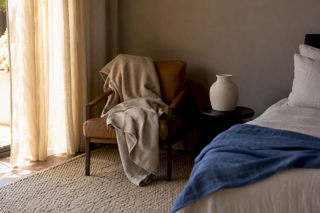
There’s also a quieter benefit around decision fatigue. A disciplined three or four color palette means fewer choices every time you add something new to a room, a lamp, a throw, a piece of art. You’re not asking “does this match the seventeen other colors already in here.” You’re asking whether it fits within a palette you’ve already committed to, and that clarity removes a surprising amount of low-grade friction from everyday home life. Homeowners who commit to the restraint upfront often report that the ongoing decorating becomes easier, not harder, precisely because the rules are already set.
Common Mistakes That Undercut a Quiet Luxury Room
The most common mistake is confusing “neutral” with quiet luxury decor mistakes to avoid. A beige room with builder-grade finishes and no texture variation is just a beige room. Without material depth, honed stone, real wood grain, natural fiber, a neutral palette reads as unfinished rather than restrained. Color discipline only works when texture layering carries the visual interest that color would otherwise provide.
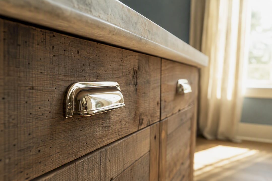
Mixing too many metals is another frequent misstep. Brass hardware, chrome fixtures, and blackened steel accents in the same room compete with each other and break the sense of a single, considered decision. Pick one accent metal and apply it consistently across a space.
Over-decluttering into sterility is the mirror-image mistake. Some homeowners hear “restraint” and strip a room down to almost nothing, landing on something closer to minimalism than quiet luxury, which loses the warmth the style is actually built on. The goal isn’t emptiness. It’s editing down to fewer, richer objects.
Buying trend pieces defeats the entire premise. A curved bouclé chair or a fluted side table can look wonderful, but if it’s chosen because it’s currently everywhere, it will look dated the moment the trend passes. Quiet luxury pieces should be chosen for timeless proportion and material quality, not visibility on social media.
Finally, skipping the lighting plan is easy to overlook and costly to ignore. A room with perfect furniture and palette but a single harsh overhead fixture will never feel as composed as one with layered, dimmable light, no matter how much was spent on the sofa.
Why This Approach Outlasts Every Trend Cycle
Quality and restraint age well because they were never chasing a moment. A well-made linen sofa and a limewash wall don’t look dated in five years the way a trend-driven print or a viral shape inevitably does, and that durability is the real return on investment behind quiet luxury.
Sourcing sustainably fits naturally here: buying less but better, restoring a found piece instead of replacing it, and choosing solid materials that can be refinished rather than discarded all extend a room’s life well beyond a typical decorating cycle.
Start small. One room, one anchor piece, one disciplined palette. The rest follows from there.
— Nealda
Get Personalized Help From the Art Concierge
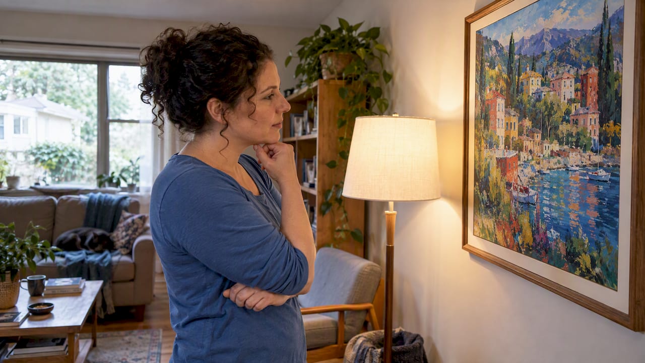
Reading your own living room for palette, texture, and light is harder than reading someone else’s, which is exactly the gap Artinlifestyle’s Art Concierge was built to close. Instead of guessing which anchor piece or accent metal will pull a room together, you get direct guidance shaped around your actual space, not a generic mood board.
The Art Concierge service pairs you with curated art and styling recommendations suited to your home’s proportions and existing palette, while Artinlifestyle’s broader home trends guide covers room-specific direction if you’d rather browse first. If your budget favors DIY, the site’s budget-friendly decor projects apply the same one-anchor, texture-first logic covered above. Ready to move past guesswork on your own walls? Book a session with the Art Concierge and get a plan built around the room you’re actually standing in.
Sources
For deeper designer perspective, see Martha Stewart’s coverage of the quiet luxury trend and the full styling guide from Renovate & Plan.
- How Quiet Luxury Is Shaping Interior Design | Martha Stewart
- How to achieve quiet luxury interior design | Better Homes & Gardens
- Quiet Luxury Interior Design Guide | Renovate & Plan