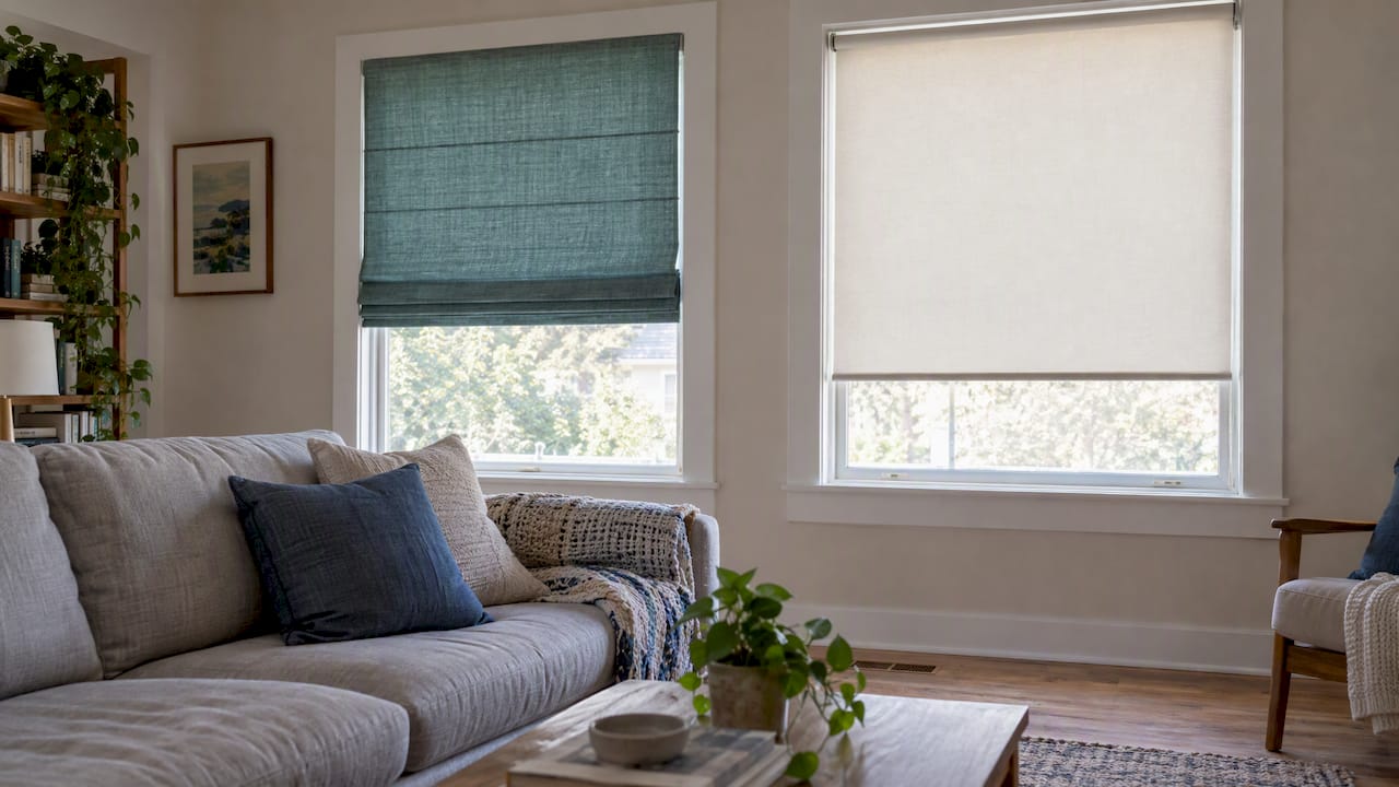
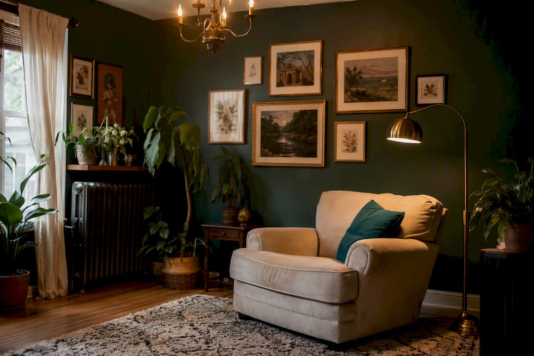
Charcoal, deep navy, forest green, plum, and warm clay all work as moody living room colors, but only when you follow one rule: layer your lighting and mix your textures. Skip either step and even the most gorgeous deep hue reads flat and cave-like. Start small. A single accent wall or a painted-to-match trim gives you the drama without the risk of a full-room commitment gone wrong.
TL;DR:
- Warm charcoal improves in moderate natural light and pairs well with brass and oak, but may appear cold or dull in dim or overly bright rooms.
- Deep navy shifts to a warmer tone under incandescent lighting but can show purple undertones with cool LED bulbs, requiring careful testing.
- Layering lighting with ambient, task, and accent sources is crucial; specific bulb temperature and high CRI help avoid muddy textures in dark rooms.
- Test paint colors on large swatches in different lighting conditions, focusing on LRV values below 20 for full-room coverage, not just chips.
- Pair dark walls with contrasting furniture, artwork, and metallics to prevent flatness, and use textured accessories to add visual depth.
Table of Contents
- Moody Living Room Colors Worth Considering
- Pairing Moody Walls With Wood, Metal, and Fabric
- Lighting and Texture: The Real Secret to Moody Rooms
- How to Test Moody Colors Before You Commit
- Where This Guidance Comes From
- What Moody Colors Actually Do to Your Mood
- Keeping Moody Walls in Balance With Furniture and Art
- Mistakes That Make Moody Rooms Feel Wrong
- Adjusting Moody Colors Across the Seasons
- The Editorial Take on Committing to Moody Color
- Sources
Moody Living Room Colors Worth Considering
Choosing among moody living room colors comes down to matching undertone to your room’s light, not just picking a shade you like on a chip. A north-facing room with limited afternoon sun behaves completely differently from a sun-drenched corner unit, and the wrong undertone turns a rich, inviting wall into something that just looks dim.
Here are ten directions worth your consideration, organized by how they perform in real living rooms rather than in a showroom under gallery lighting.
- Warm charcoal (like Silhouette AF-655): Benjamin Moore’s 2026 Color of the Year blends burnt umber into soft charcoal, which keeps the gray from turning cold. Best for rooms with moderate natural light; pairs beautifully with brushed brass and oak.
- Deep navy: A classic for a reason. It reads sophisticated in both bright and dim rooms because its blue undertone shifts warmer under incandescent light. Watch for a purple cast under cool LED bulbs.
- Forest green: Grounding and organic, this works exceptionally well in living rooms with houseplants or wood floors. Avoid pairing with cool gray stone, which fights the earthy tone.
- Oxblood or deep plum: A bold, jewel-toned choice for a formal or library-style living room. Best kept to an accent wall unless the room gets strong afternoon light.
- Warm cognac or clay: Softer than true black, this direction suits low-light rooms because the warm base reflects more of the available light than a cool gray would, a principle Sherwin-Williams points to when explaining why undertone should follow your room’s light conditions.
- Espresso brown: Rich and enveloping, ideal for open-plan spaces where you want the living area to feel visually separate from a lighter kitchen or dining zone.
- Slate blue-gray: A middle ground for readers nervous about full commitment. It reads moody in the evening and calmer during the day.
- Deep olive: Trending alongside forest green but with a more muted, tobacco-adjacent quality. Works well with camel leather and unlacquered brass.
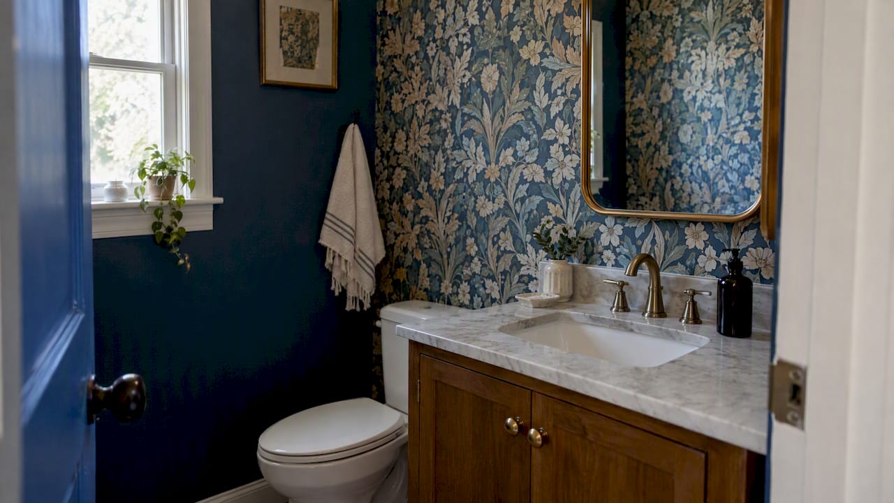
- True black (used sparingly): Reserve this for trim, a fireplace surround, or a small powder room off the living area. Full walls of true black need serious ceiling height and strong task lighting to avoid feeling oppressive.
- Aubergine: An underused option that behaves like a warm plum in the evening and a cool gray-purple in daylight, giving the room two distinct moods across the day.
In low-light rooms, warm-based darks consistently outperform their cool-toned cousins. Cooler darks tend to shine in rooms that already get generous sun, where they read crisp rather than flat.
Pairing Moody Walls With Wood, Metal, and Fabric
Getting the supporting cast right matters as much as the wall color itself. Certain pairings show up again and again in designer work for good reason: charcoal walls with oak flooring and brass fixtures, navy with warm walnut and a mustard throw, forest green with cognac leather and woven rattan.
- Apply the 60-30-10 rule. Let your moody wall color anchor roughly 60% of the room’s visual weight, with secondary furniture tones at 30% and true accent colors (a pillow, a vase, a piece of art) at 10%. This keeps a dark room from turning monochrome and lifeless.
- Match metals to warmth, not trend. Warm charcoal and clay tones want brass or aged gold. Cooler navy and slate tones pair better with brushed nickel or matte black hardware.
- Decide on trim deliberately. Painting trim the same color as the wall (a color drench) creates an enveloping, editorial look, while white or cream trim adds contrast and makes the room feel more traditional. Neither is wrong. It depends on whether you want the walls to disappear into the architecture or frame it.
For a deeper breakdown of proportioning primary and accent tones, Artinlifestyle’s guide to living room color palettes walks through additional combinations worth testing against your own furniture.
Lighting and Texture: The Real Secret to Moody Rooms
A dark wall without layered light just looks dark. Plan for three light types: ambient (overhead or cove lighting), task (reading lamps near seating), and accent (picture lights or a sconce that washes the wall). Aim for bulbs in the 2700 to 3000K range with a CRI of 90 or higher so your velvet sofa and wood grain render true rather than muddy, and target roughly 300 to 500 lumens per square meter of ambient light, with more concentrated lumens at reading spots.
Finish choice matters just as much as color. Matte or eggshell walls absorb light softly and hide imperfections, while satin or gloss trim bounces light and adds definition around doors and moldings.
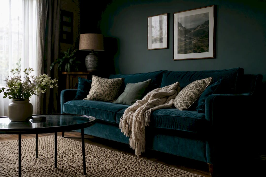
Texture is what keeps a dark room from reading flat. Mix at least three distinct textures per seating area: something soft (velvet upholstery or a wool throw), something reflective (a brass lamp base, a mirrored tray), and something natural (a rattan chair, a jute rug, unlacquered leather).
- Velvet throw pillows or an accent chair add depth without adding pattern.
- A leather ottoman or ceiling-height leather headrest chair reads warm under low light.
- Rattan or woven baskets introduce organic texture that keeps a dark palette from feeling heavy.
Pro Tip: Put at least one lamp at seated eye level in every major seating zone, and put it on a dimmer. The difference between a moody room and a gloomy one often comes down to where the light sits relative to your eyeline, not how much of it you have.
How to Test Moody Colors Before You Commit
Testing on a 3×5 inch swatch card tells you almost nothing about how a color will actually behave on your wall. Do this instead:
- Paint sample patches at least 2 feet by 2 feet, on at least two different walls, since light hits each wall differently throughout the day.
- Observe the patches at three points in the day: morning, midday, and evening under your lamps. A color that looks perfect at noon can shift dramatically once the sun goes down.
- Check the LRV (light reflectance value) printed on most paint chips or available from the manufacturer. This number, not the color name, is the most reliable predictor of how dark a wall will actually read.
- Decide accent wall versus full drench based on ceiling height and room size. Smaller or lower-ceilinged rooms often do better with one accent wall; larger rooms with good natural light can handle a full-drench treatment.
Deep, moody paint colors typically fall in the 4 to 20 LRV range, compared to the 70 to 90+ range of standard off-white walls. Anything under 10 LRV will read nearly black in a room without strong supplemental lighting, so pair those choices with the layered lighting plan above rather than relying on daylight alone.
A tone-on-tone approach, painting trim to match the wall, is a low-risk way to test the enveloping look before committing to a full room, according to designer notes from Dreamy Home Studio.
Where This Guidance Comes From
Artinlifestyle’s editorial team curates paint direction by tracking annual Color of the Year announcements, cross-referencing designer portfolios, and testing practical staging techniques like accent walls and tone-on-tone trim before recommending them. Our 2026 home trends guide tracks how grounded dark neutrals moved from niche to mainstream this year, and it’s a useful companion piece if you want the bigger picture beyond the living room.
We favor sourcing that combines major paint manufacturer color programs with hands-on styling advice, rather than relying on a single trend report. If you’re building out a full room, our guide to living room color palettes covers proportion and pairing in more depth than we can fit here.
What Moody Colors Actually Do to Your Mood
Color psychology in interior design isn’t just marketing language. Deep blues and greens tend to lower perceived arousal, which is part of why navy and forest green show up so often in bedrooms and studies as well as living rooms. They read as calming rather than energizing, which suits a space meant for winding down at the end of the day.
Warmer darks like clay, cognac, and oxblood do something different. They tend to feel more social and enveloping, better suited to a living room that hosts dinner parties or regular gatherings than one meant purely for solitary reading. Plum and deep burgundy specifically carry associations with richness and formality, which is why they’ve long been a favorite for libraries and formal sitting rooms.
True black and near-black charcoal walk a finer line. Used well, with enough light and texture, they read as confident and grounded. Used poorly, in a small room with a single overhead bulb, the same color reads oppressive fast. The emotional effect of a moody color depends enormously on execution, not just the hue itself.
This is worth remembering when you’re standing in a paint aisle: the swatch doesn’t tell you how a color will feel at 8 p.m. with the lamps on and a fire going. Your lighting plan and your furniture do that work.
Keeping Moody Walls in Balance With Furniture and Art
A dark wall needs contrast to avoid swallowing the room, and that contrast has to come from somewhere. Furniture is your first lever. Light or mid-tone wood furniture, a cream sofa, or a pale rug creates the visual breathing room a moody wall needs to avoid feeling like a box.
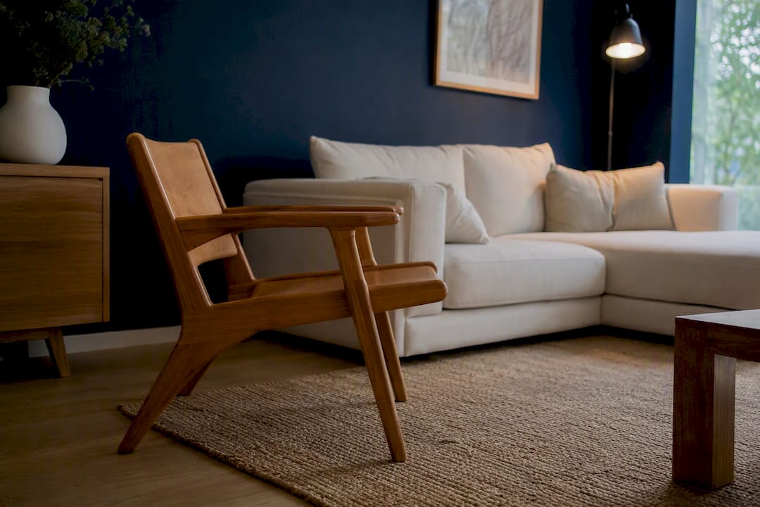
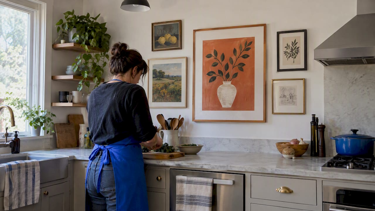
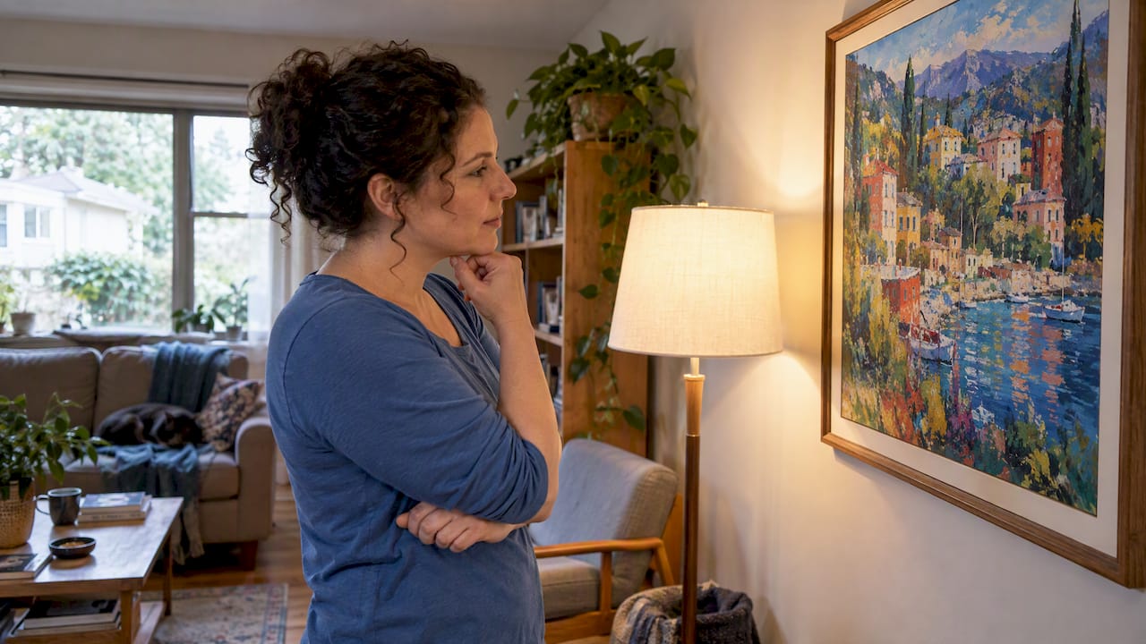
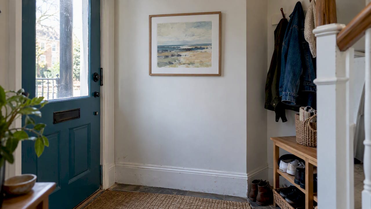
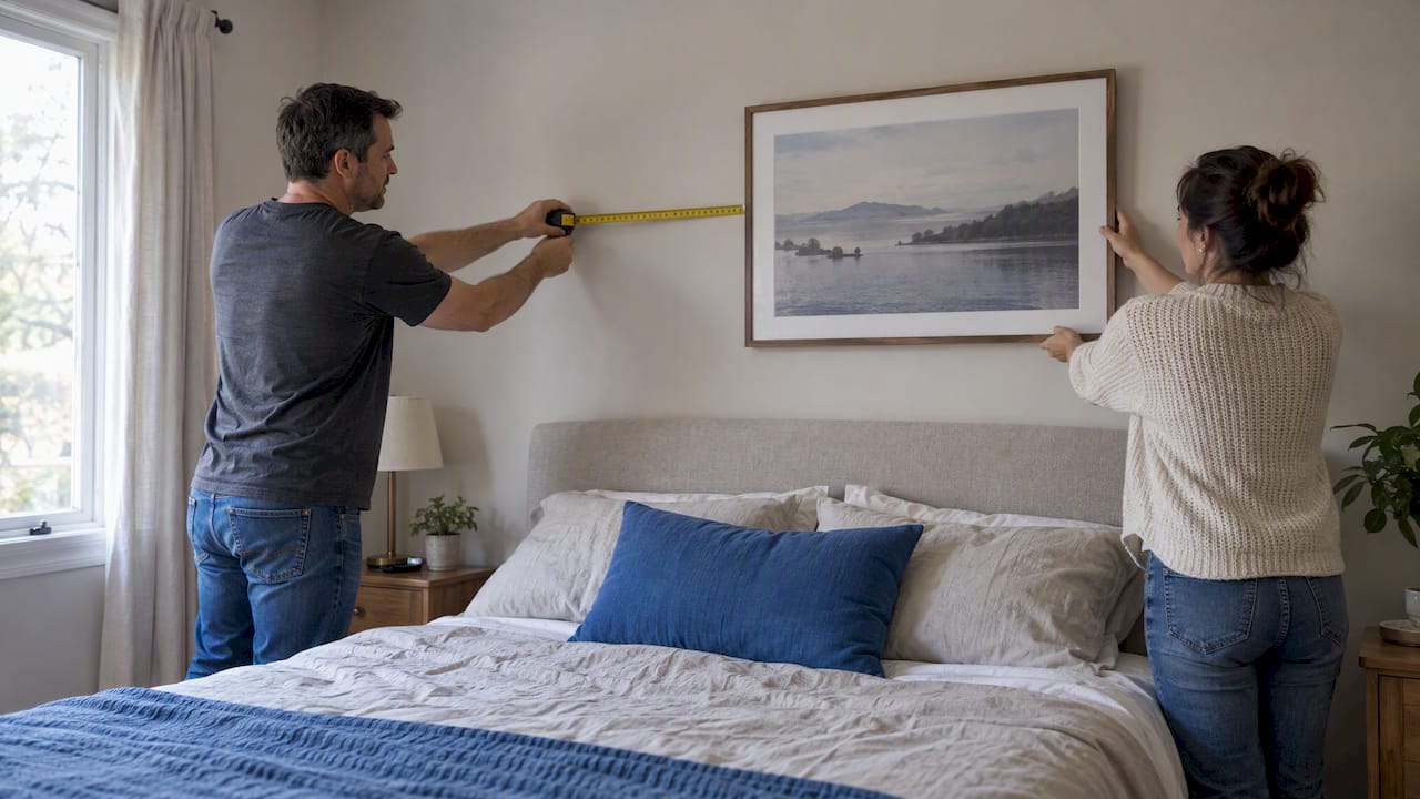
Artwork does even more work here than most homeowners expect. A gallery wall or a single large-scale piece against a dark backdrop reads as intentional and gallery-like rather than accidental, because dark walls naturally recede and let framed pieces pop the way a museum’s dark accent walls do. Artinlifestyle’s living room art ideas guide covers scale and placement if you’re staring at a blank dark wall wondering where to start.
Metallics and mirrors also earn their keep against moody backdrops, bouncing available light back into the room rather than absorbing it the way the wall color does. A single oversized mirror opposite a window can noticeably brighten a dark room without touching the paint color at all.
The mistake to avoid is over-matching. A room where every piece of furniture and every accessory sits in the same tonal family as the wall loses depth fast. Aim for at least one piece, a chair, a rug, an art frame, that reads clearly lighter or brighter than everything else in the room.
Mistakes That Make Moody Rooms Feel Wrong
The single most common mistake is choosing a color under daylight bulbs at the paint store and never testing it under your own lamps at home. A navy that looks crisp and blue in a showroom can read nearly black and lifeless under warm household bulbs, or shift purple under cool LEDs.
The second mistake is skipping texture entirely. A dark room with smooth walls, a smooth sofa, and no natural materials reads flat no matter how good the color choice is. Texture is what separates a moody room from a merely dark one.
Underlighting is the third trap. Homeowners often assume a dark room needs less light because it already feels cozy, but the opposite is true. Dark walls absorb more light than pale ones, which means you generally need more fixtures, not fewer, to keep the room from sliding into gloom once the sun sets.
Committing to a full-drench treatment without testing an accent wall first is a fourth common misstep. It’s a bigger financial and labor commitment to reverse than a single wall, and testing first costs almost nothing beyond a quart of paint.
Finally, ignoring undertone in favor of the color name alone causes plenty of regret. Two paints labeled “charcoal” from different brands can carry entirely different undertones, one leaning blue, one leaning brown, and that difference becomes obvious the moment the paint dries on your specific wall.
Adjusting Moody Colors Across the Seasons
One advantage moody living room colors have over pale, trend-driven palettes is that they don’t need to change with the seasons the way a stark white or pastel room might. A deep forest green or charcoal wall reads cozy in December and grounded in July, which makes the investment more durable than a seasonal accent color would be.
What should shift seasonally are your soft furnishings and lighting choices, not the wall itself. Swap in heavier textiles, wool throws, and warmer-toned accent pillows for fall and winter, then lighten the mix with linen and cotton in warmer months to keep the room from feeling too heavy once the windows are open and natural light stretches longer into the evening.
Lighting warmth can flex too. Dimmers make this easy: push toward warmer, lower light in winter evenings, and rely more on natural daylight with brighter accent lighting in summer when the room gets more use during daylight hours. Houseplants also do quiet seasonal work against a dark backdrop, adding a living green note that shifts subtly with the light. Artinlifestyle’s guide to potted houseplants is a useful next stop if you want to soften a moody wall with foliage rather than another textile.

The versatility of a well-chosen moody color is one of its most underrated qualities. It’s a wall that works with a Thanksgiving table setting and an open-window summer evening equally well, without a repaint in between.
The Editorial Take on Committing to Moody Color
Most advice on moody living room colors treats the paint choice as the hard part and lighting as an afterthought. That’s backward. Getting the lighting layered correctly, at the right color temperature, at the right height, on a dimmer, is what determines whether a charcoal wall reads like a design magazine spread or like a room where someone forgot to change a burned-out bulb.
The conventional advice to “just paint an accent wall and see” is fine as a starting point, but it undersells how much a single afternoon of moving lamps and swapping bulbs can transform the same color. If you can only do one thing before repainting, do the lighting test first. Put a warm bulb in a floor lamp at seated height, dim it low, and stand in the doorway at 8 p.m. That fifteen minutes will tell you more about whether a color will work than any swatch card ever could.
Prioritize texture second, color third. The order feels counterintuitive until you’ve stood in a beautifully painted, terribly lit, texture-flat room and understood exactly why it doesn’t work.
— Nealda
Sources
- Benjamin Moore names Silhouette AF-655 as 2026 Color of the Year — Interior Design
- How to create a dark living room — Sherwin-Williams
- Dark living room ideas — Homes & Gardens — Published 2021-06-27