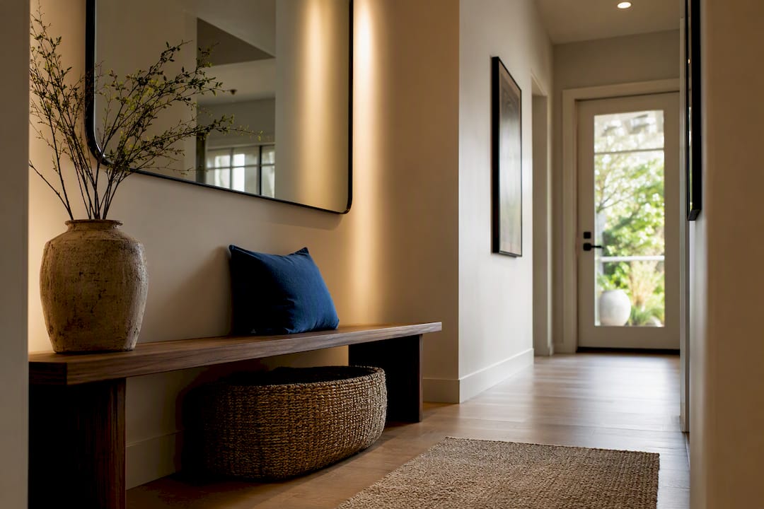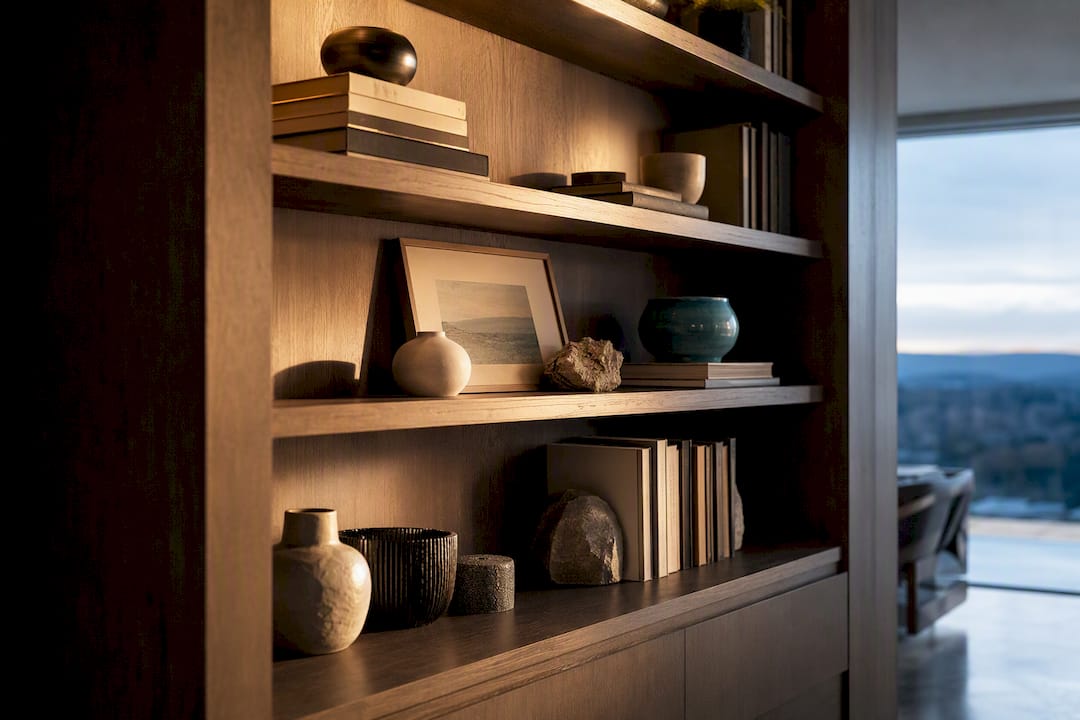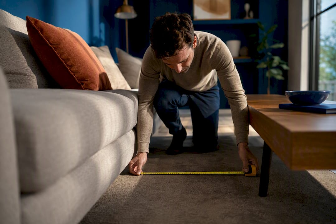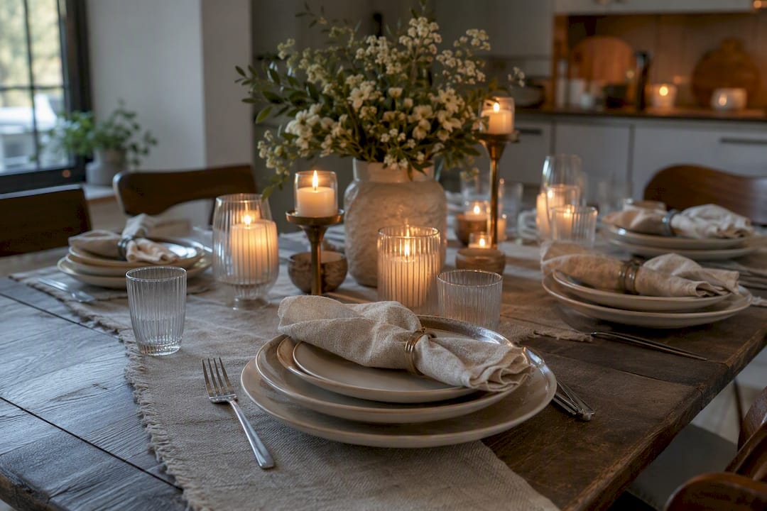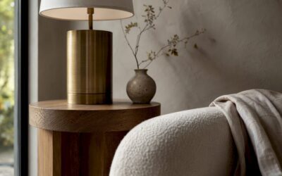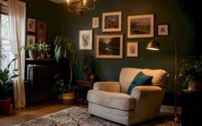
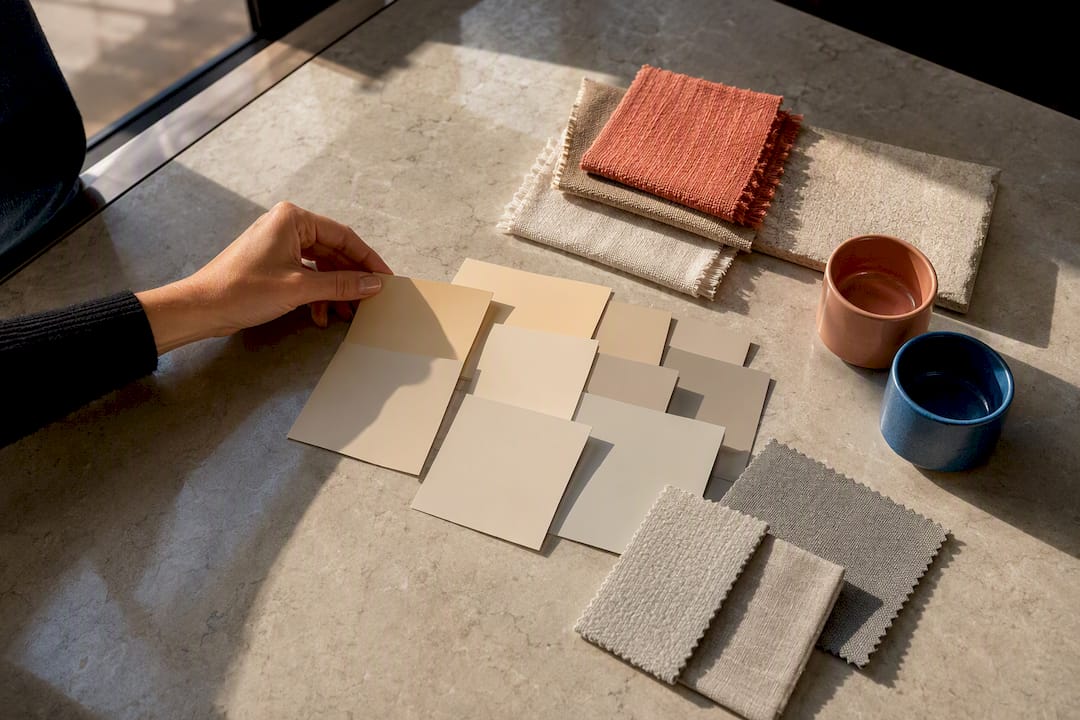
Navy, sage, terracotta, blush, mustard, and brass rank among the most dependable accent colors for beige, but no single color works for every room. The right choice depends on whether your beige leans warm and golden, cool and gray, or somewhere in between. Get the undertone right first, then use it to narrow your options for sofas, pillows, trim, or hardware.
TL;DR:
- Beiges with warm undertones pair best with terracotta, rust, and mustard accents, while cool beiges work better with navy, sage, or slate gray.
- Testing color swatches in natural light and matching undertones are essential to choose accent colors that won’t fall flat when scaled up.
- High-contrast palettes with navy or burgundy suit rooms for entertainment, while softer, tone-on-tone schemes create calming bedroom environments.
- Material finishes like brass or walnut make beige appear warmer, whereas chrome and ash tones give a cooler appearance.
- Layering textures and choosing a confident single accent color enhances beige rooms, avoiding the mistake of isolated color choices that clash or fade.
Table of Contents
- Accent Colors for Beige: 14 Pairings Worth Trying
- How to Match an Accent Color to Your Exact Shade of Beige
- Room-by-Room Accent Color Ideas for Beige
- Ready-to-Copy Beige Palettes and How to Balance Them
- How Materials and Finishes Change the Way Color Reads
- What Beige Gets Wrong (and Why It’s Actually the Easiest Neutral to Style)
- Find Your Next Accent Piece on Artinlifestyle
- Sources
Accent Colors for Beige: 14 Pairings Worth Trying
Beige rewards a light hand and a clear plan. Group your options by temperature and intensity, then pick two or three to actually use rather than throwing every trend at one room.
Neutrals and near-neutrals
- Charcoal or black. Anchors any beige scheme and reads as intentional rather than accidental. Use it on window frames, a coffee table base, or picture frames to keep beige from floating.
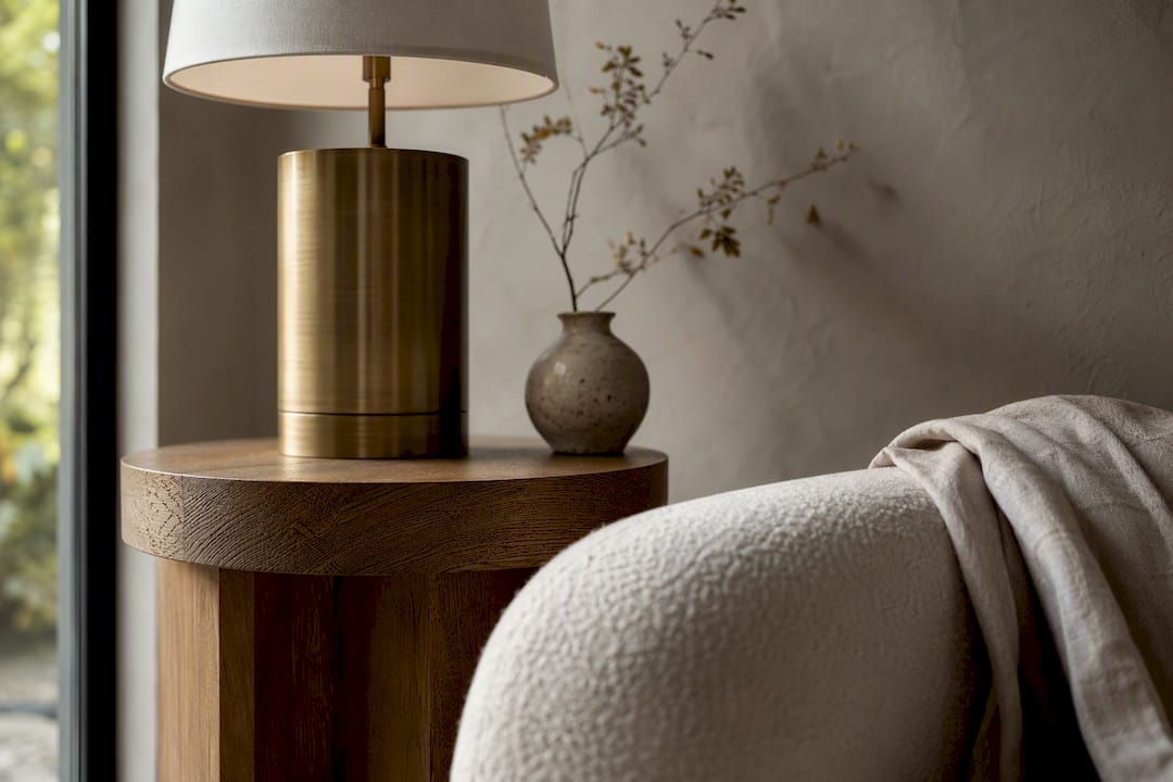
- Chocolate brown or walnut. Warms cooler beiges and grounds the room the way a rug or a wood dining table already does. Walnut is edging out charcoal as the go-to dark neutral in current warm neutral palettes.
- Cream or off-white. Softens contrast when you want a tone-on-tone look. Best on trim, bedding, or a slipcovered sofa against a slightly deeper beige wall.
- Taupe or mushroom. A near-twin to beige that adds depth without introducing a new color family, ideal for a bench cushion or a set of curtains.
Cool tones
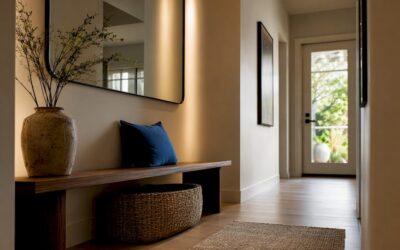
- Navy. The most reliable bold pairing for beige, especially the grayer shades. Works as a sofa, a front door, or a set of dining chairs.
- Dusty blue. Softer than navy and flattering to cooler, ashier beige. Try it on throw pillows or a headboard.
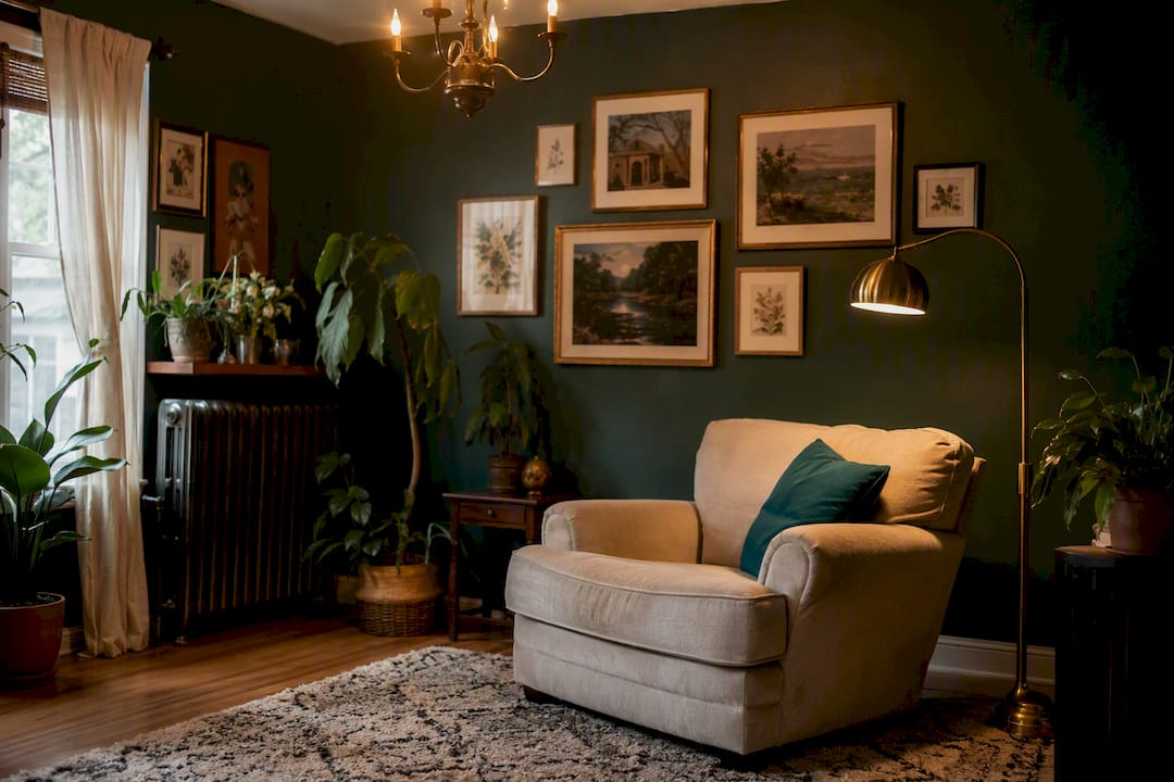
- Sage or olive green. Echoes beige’s earthy roots and pairs naturally with wood tones. A sage armchair or olive drapery reads calm rather than cold.
- Slate gray. Best with grayish beige; use sparingly on a rug border or lamp base so it doesn’t flatten the room’s warmth.
Warm tones
- Terracotta or rust. One of the strongest matches for golden beige, since warm beiges pair naturally with terracotta and olive. A terracotta vase or accent chair adds instant warmth.
- Mustard or ochre. A confident, sunny counterpoint that works well in small doses, think a single throw pillow or a piece of pottery.
- Blush or dusty pink. Particularly good with pink-leaning beige, softening the palette without competing for attention.
Bold statements
- Cobalt blue or chartreuse. Designers use these sparingly as focal points, on a single lamp, a piece of art, or a vase, rather than across upholstery.
- Burgundy or brick red. A rich, grounding accent for golden beige, best in velvet drapery or a single accent chair.
Metallics
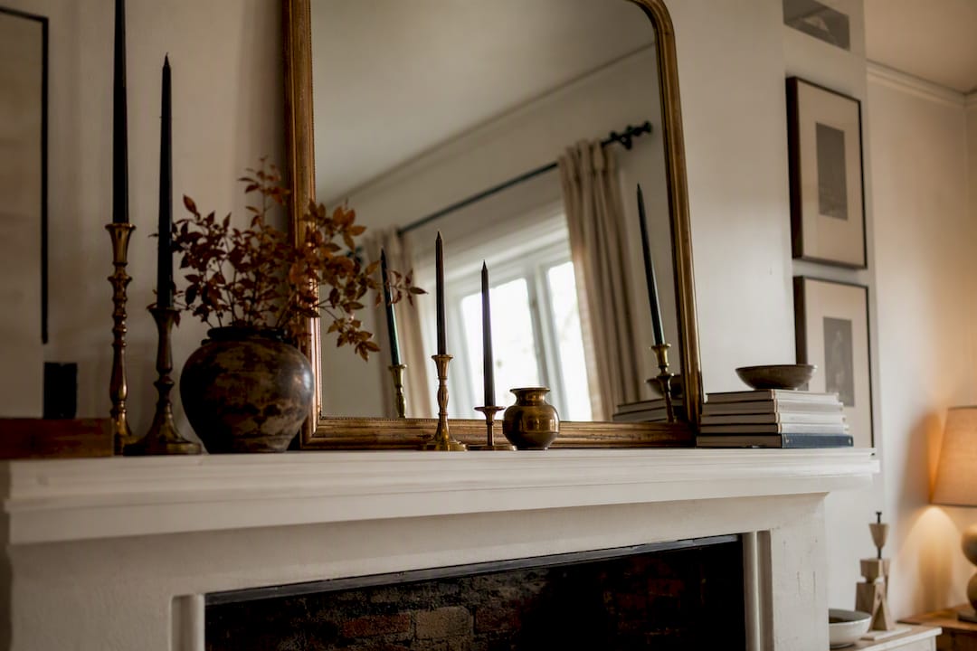
- Brass or gold. Amplifies warmth in golden beige rooms through hardware, picture frames, or a coffee table base.
How to Match an Accent Color to Your Exact Shade of Beige
Beige is not one color. It shifts warm, cool, or pink depending on the pigments mixed into it, and that shift changes which accent will actually look good.
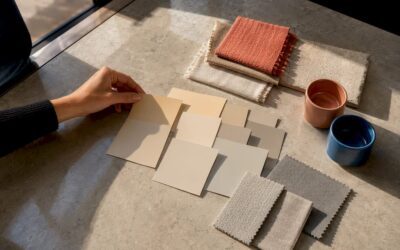
- Identify the undertone. Hold a pure white card next to your wall or fabric swatch. If the beige looks yellow or peachy by comparison, it is warm. If it looks slightly gray or lavender, it is cool.
- Run the daylight test. Paint or fabric shifts color depending on light exposure. A north-facing room cools everything down; a south-facing room warms it up. Look at your swatch in morning and evening light before committing.
- Apply the 3-Tone Rule. Pick one light tone (your beige base), one medium supporting tone (a taupe, greige, or soft wood), and one deeper accent (navy, olive, or walnut) to keep the room from feeling flat or unfinished.
Once you’ve done that, ask three questions: Does this accent share the same warm or cool family as my beige? Does it show up in at least two places (textile and hardware, or wall and furniture)? Would it still work if the sun moved across the room for six hours?
Pro Tip: Test your chosen accent on a pillow or small object before painting a wall or buying a sofa. Fabric and paint reflect light differently, and a color that looks perfect on a swatch card can shift entirely once it’s scaled up.
Room-by-Room Accent Color Ideas for Beige
A living room can absorb bolder accents than a bedroom, and a kitchen has its own durability demands that a throw pillow doesn’t.
- Living room. Save your boldest color, navy, cobalt, or burgundy, for one statement piece: a sofa, an accent chair, or a large piece of art. Keep everything else (rugs, curtains) in supporting neutrals.
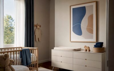
- Bedroom. Favor calmer, muted accents like dusty blue, blush, or sage on bedding and drapery. This is the room where restraint pays off; save saturated color for a single throw or headboard.
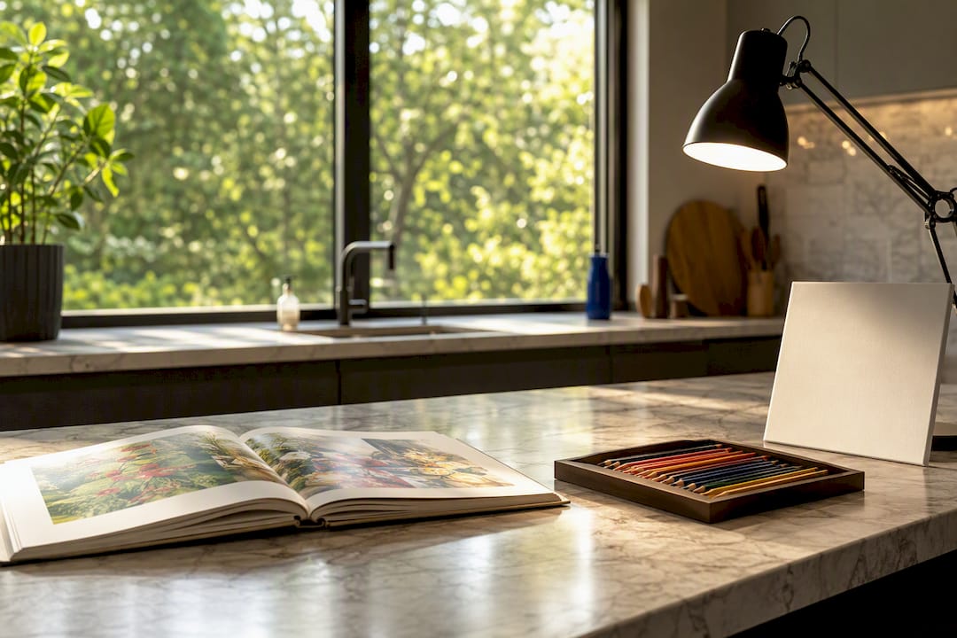
- Kitchen. Prioritize durability. Olive or navy cabinets pair well with beige countertops, and brass or matte black hardware ties the palette together without wearing out.
- Small spaces. Scale down bold accents to smaller objects, a lamp, a vase, a stack of books, and lean on brass or walnut wood tones to add warmth without visual clutter.
For living rooms specifically, browsing a wider set of living room color palettes can help you see how these accents play out at full scale before committing.
Ready-to-Copy Beige Palettes and How to Balance Them
Four palettes cover most beige rooms, and each one follows the same 60/30/10 split: 60% beige as your base, 30% a supporting neutral, and 10% your accent color.
- Light and calm: cream base, taupe support, dusty blue accent, brushed nickel hardware.
- Warm and earthy: golden beige base, camel support, terracotta accent, brass hardware.
- Cool and restful: greige base, gray support, sage accent, chrome or matte black hardware.
- Dark and modern: warm beige base, chocolate brown support, navy accent, walnut wood notes.
Tone-on-tone palettes (cream on beige, taupe on greige) suit rooms where you want calm and cohesion, bedrooms especially. High-contrast pairings (navy or burgundy against beige) suit rooms built for entertaining, where you want the eye to land somewhere specific. Swap accents seasonally, mustard and rust in fall, dusty blue and sage in spring, without repainting anything.
How Materials and Finishes Change the Way Color Reads
Paint chips lie a little once real materials enter the room. Metal and wood finishes shift how warm or cool a color appears: brass and walnut push a beige room warmer, while chrome and ash pull it cooler.
- Warm, golden beige pairs best with brass hardware and walnut furniture.
- Cool, grayish beige pairs better with chrome, nickel, or ash wood tones.
- Velvet intensifies saturated accents like navy or burgundy; linen and bouclé mute them for a softer look.
- Use satin or eggshell finishes on walls for durability in high-traffic rooms, and reserve high-gloss for trim or cabinetry only.
Pro Tip: If your beige room feels flat despite the right color choices, check your finishes before you blame the paint. A matte accent chair against a matte wall reads as one flat plane. Swap in a velvet pillow or a brass lamp and the same color suddenly has dimension.
Coordinating door and trim finishes matters too here; if you’re rethinking those alongside your wall color, current interior door trends are worth a look before you commit to a single palette.

What Beige Gets Wrong (and Why It’s Actually the Easiest Neutral to Style)
Beige has a reputation for being safe to the point of boring, and that reputation is mostly earned by rooms that stop at the wall color and never layer anything on top. The fix isn’t abandoning beige. It’s treating it as a canvas that demands texture and one confident accent rather than five timid ones. A single navy chair, a walnut console, and brass hardware will do more for a beige living room than four throw pillows in four different pastels.
The mistake I see most often is choosing an accent color in isolation, on a swatch card, under store lighting, disconnected from the beige it needs to sit next to. Undertone match matters more than trend does. A palette that looks striking on a design blog can fall flat in a west-facing bedroom with the wrong warm-cool pairing. Artinlifestyle covers these palette decisions in more depth for readers who want curated picks alongside the reasoning.
— Nealda
Find Your Next Accent Piece on Artinlifestyle
Choosing the right navy chair or brass lamp is only half the job. Finding one that actually looks like it belongs in your room is the harder part, and that’s where a curated source beats a generic search every time. Artinlifestyle pulls together palette breakdowns and specific product picks so you’re not scrolling through hundreds of mismatched options to find one terracotta vase or walnut console that fits your exact beige.
If you’re building a warm and earthy palette, our roundup of earth-toned decor pieces shows exactly which objects carry that terracotta or mustard accent without overwhelming a beige room. For a broader sense of where neutral palettes are heading this year, the 2026 home trends guide is a solid next stop, and if you want a statement piece to anchor your accent wall, browsing our art collections is worth ten minutes before you buy anything else for the room.