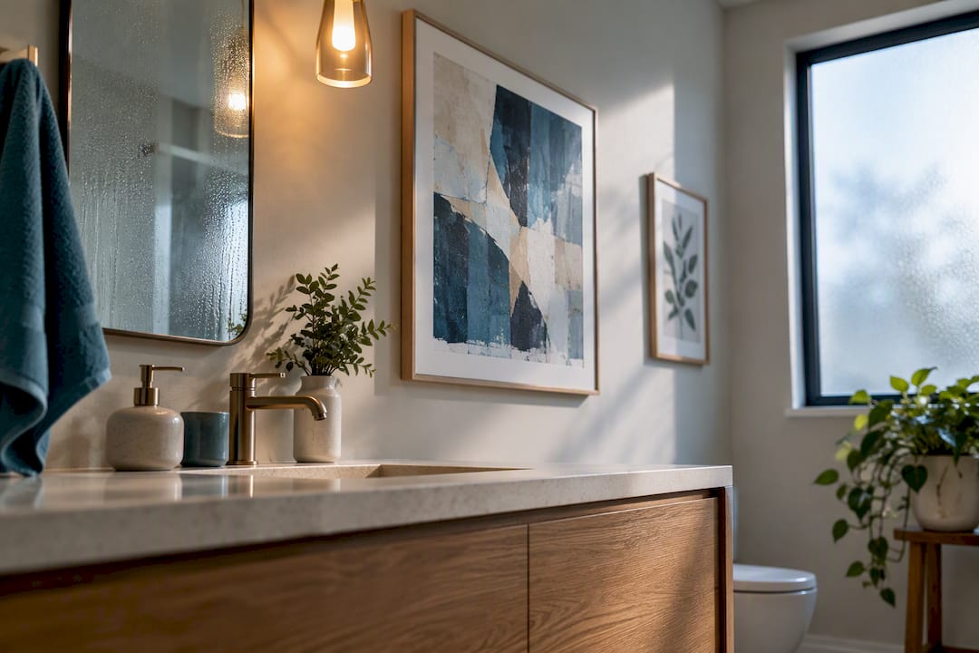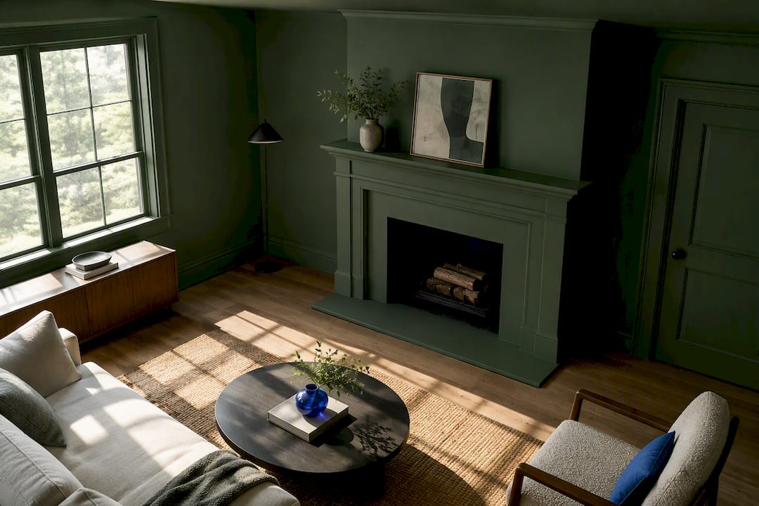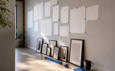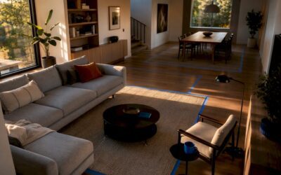
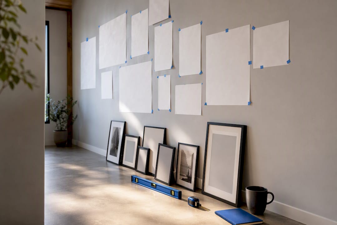
From there, the workflow is simple: measure, mock up on the floor or in a planner, transfer the measured nail coordinates to the wall, then hang from the center outward.
TL;DR:
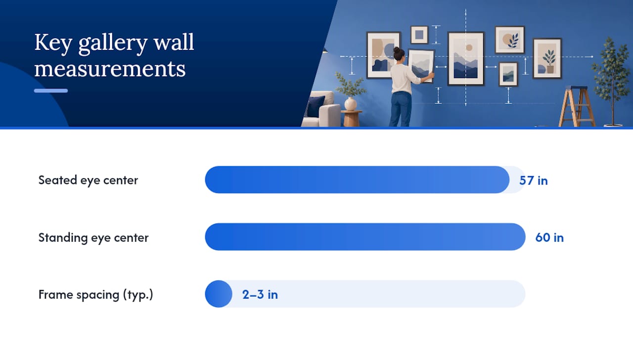
- Gallery walls should be centered at 57 inches for seated spaces or up to 60 inches for standing areas, aligning with where most adults look naturally.
- The total width of the gallery should be between 60 and 75 percent of the furniture beneath it, ensuring a balanced visual connection.
- Maintain a consistent 2 to 3 inch gap between frames across the entire layout to create cohesion and prevent clutter.
- Using a floor mockup and paper templates reduces guesswork, enabling precise spacing and level placement before drilling into the wall.
- Hanging hardware must match the frame’s weight and wall type, with measurements taken from loaded frames to avoid crooked displays.
Table of Contents
- Rules and measurements that decide every successful gallery wall
- Choosing a layout style and starter template
- The floor-to-wall mockup workflow that skips extra holes
- Spacing math and how planner calculators get it right
- Turning templates into a secure, level install
- How digital planners fit into the workflow
- Why wall color and texture change the plan
- Mixing photos, prints, and objects without it looking cluttered
- Adapting the layout to your room’s size and light
- Treating your gallery wall as a living arrangement
- Where to find frames and art that fit your plan
- Sources
- FAQ
Rules and measurements that decide every successful gallery wall
Every gallery wall that reads as intentional, rather than accidental, follows the same handful of measurements. They are not arbitrary. They come from how the eye actually settles on a wall, and once you know them, sizing a layout stops being guesswork.
The starting point is eye level. Museums and interior designers place the optical center of a composition at 57 to 60 inches from the floor, which lines up with where most adults naturally look when standing in a room. Above a sofa or in a space where people are usually seated, bias toward the lower end of that range, closer to 57 inches, so the art meets the eye from the couch rather than floating above it.
Width comes next. A well-known rule of thumb sizes the gallery at 60 to 75% of the furniture beneath it, whether that is a sofa, console, or bed frame. A sofa of typical width, for example, suggests a gallery width roughly between half and three-quarters of the furniture width, which keeps the composition visually tethered to the furniture instead of drifting off on its own.
Spacing is the third variable, and it is the one people get wrong most often. A gap of 2 to 3 inches between frames reads as cohesive on most walls, though smaller frames often look better with tighter gaps and oversized pieces can carry wider ones. The key is picking one number and holding it across the whole arrangement rather than eyeballing each gap individually.
- Eye level: center the group at 57 inches for seated spaces, up to 60 inches for standing areas like hallways.
- Width: target 60 to 75% of the furniture width, or 50 to 60% of a bare wall with no furniture reference.
- Spacing: hold a single gap, typically 2 to 3 inches, across every frame pair in the layout.
Once you have those three numbers, the footprint math is simple: total width equals the sum of your frame widths plus the sum of your gaps, and total height follows the same logic for stacked rows. A three-column, two-row grid of frames with typical dimensions and spacing can result in a footprint roughly in the range of 3 to 4 feet wide and 2 feet tall depending on exact frame sizes and gaps, and on frame height. Sketch that footprint before you buy a single frame.
Choosing a layout style and starter template
The pattern you choose should match both the wall and the mood you want. A grid reads clean and modern, with frames of matching or near-matching sizes lined up on strict rows and columns. A salon or cluster arrangement mixes sizes and orientations for a collected, layered look that suits a stairwell or a large blank wall. A linear row works well above a sofa or console, and a staircase layout follows the angle of the stairs rather than a strict horizontal line, a technique covered in more depth in our staircase gallery wall guide.
Whichever style you pick, plan the bounding box first. Decide the overall rectangle your gallery needs to fill, based on the furniture-width rule above, and only then start dropping in frame sizes. Working the other way around, picking frames first and hoping they fit the wall, is how most layouts end up lopsided.
A few starter combinations that tend to work without much fuss:
- Three-piece linear: one large anchor (roughly 16 by 20 inches) flanked by two smaller matching frames, ideal above a console or bed.
- Five-piece grid: five same-size frames in a two-over-three or three-over-two arrangement, best for a modern, orderly wall.
- Seven-piece salon: one oversized anchor (20 by 24 inches or larger) surrounded by a mix of small and medium frames in varied orientations.
Repetition is what keeps a mixed layout from feeling cluttered. Limit yourself to two or three frame finishes across the whole wall, and repeat a mat color or depth where you can. A single mat color used consistently across mixed frames does more to unify a salon-style wall than matching the frames themselves. For more layout inspiration, our gallery wall ideas roundup shows a range of these templates in finished rooms.
The floor-to-wall mockup workflow that skips extra holes
The fastest way to avoid a wall full of test holes is to solve the layout somewhere else first. A floor mockup and a set of paper templates let you finalize spacing before a single nail goes in.
- Measure the wall and furniture. Record wall width and height, then the width and top height of any furniture the gallery sits above.
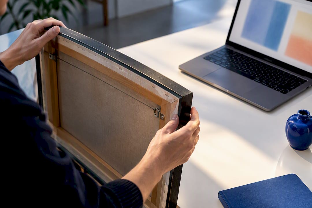
- Measure every frame. Note outside dimensions for each piece, plus the hardware drop, meaning the distance from the top edge of the frame down to the hook or wire when the frame is hanging naturally under its own weight.
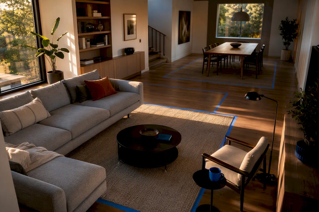
- Tape an outline on the floor matching your planned footprint, then lay the frames inside it in their final arrangement. Photograph it from above for reference.
- Cut kraft paper templates the exact outside size of each frame, then mark the hook position on each template using the hardware drop you measured.
- Tape the templates to the wall in the mocked-up arrangement, step back to check spacing and level, then punch a nail straight through each marked hook point before peeling the paper away.
This method, recommended in several practical gallery wall installation guides, turns a guessing game into a repeatable process, and it works whether your layout came from a floor mockup or a digital planner export.
Before you hang anything, run a short pre-hang check: confirm your fasteners suit the wall type, mark a calibration line if you printed a template, use a level on every template edge, and step back for a final visual review before committing.
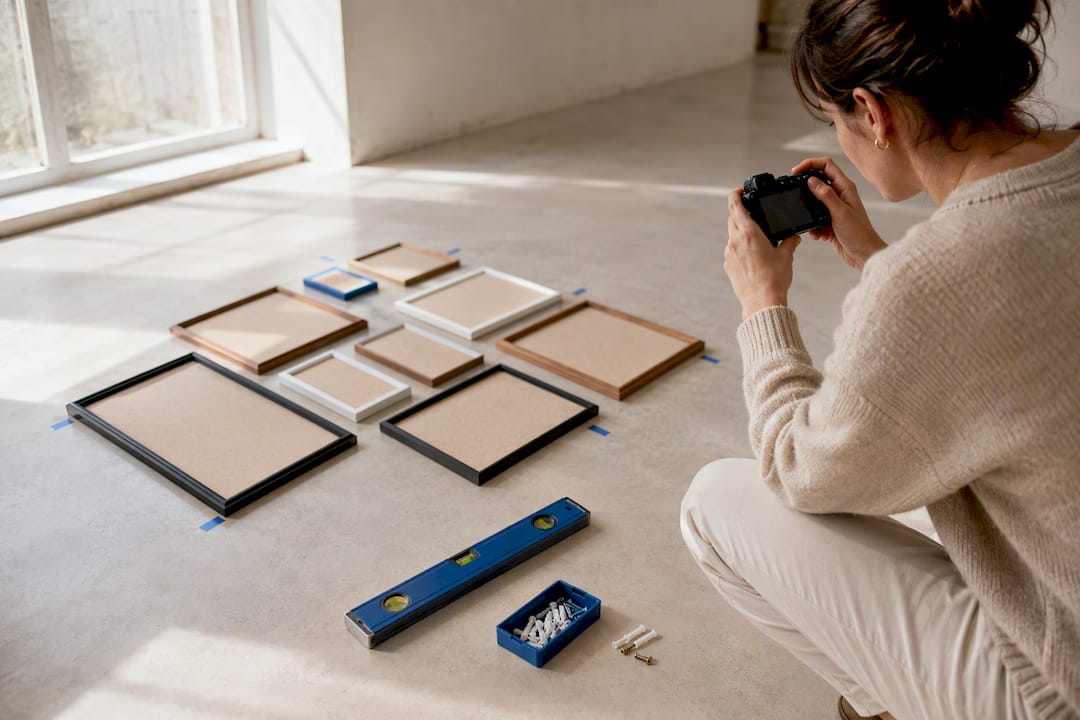
Pro Tip: Photograph the floor mockup at eye height, not from directly above; it shows you how the wall will actually read once it is vertical.
Spacing math and how planner calculators get it right
Behind every “even” gallery wall is a small piece of arithmetic, and it is worth understanding even if you end up letting a calculator do it. Spacing tools generally work in one of two modes.
Auto-Gap mode takes your wall width, subtracts the combined width of all your frames, and divides the leftover space evenly across the number of gaps you need. Say you have a 120-inch wall and three 20-inch frames. That is 60 inches of frame, leaving 60 inches of open space across two gaps, which gives you an exact 30-inch gap between each pair, plus margins on either end depending on how you center the row.
Fixed-Gap mode works the other way: you lock in a gap size, often the standard 2 to 3 inches, and the calculator centers the whole row within the wall rather than stretching the gaps to fill it. Fixed-Gap suits most living rooms, since a stretched 30 inch gap rarely looks like a cohesive gallery. Auto-Gap suits wide, sparse arrangements where filling the wall matters more than tight grouping.
| Input | Auto-Gap result | Fixed-Gap result |
|---|---|---|
| 120 inch wall, three 20 inch frames | 30 inch gaps (fills the wall) | 2 to 3 inch gaps (centered, with margin left over) |
| 60 inch wall, two 15 inch frames | 30 inch gap | 2 to 3 inch gap, centered |
Good spacing calculators export nail coordinates, not just frame positions. Layout tools like the VersaCalculator picture spacing calculator derive the actual nail point by adding the wall’s left margin to half the frame width, then adjusting for your measured hardware offset, which is what turns a visual layout into a drillable plan.
Whatever tool generates your coordinates, sanity-check the output before you drill.
Turning templates into a secure, level install
A perfect layout on paper still needs the right hardware to stay perfect on the wall. Measure the wire or D-ring drop while the frame is loaded, meaning hanging naturally with gravity pulling the wire taut, and transfer that exact measurement to your paper or printed template. Measuring an unloaded frame is one of the most common causes of a crooked hang, since slack in the wire can shift the frame’s actual hook point by an inch or more once it is loaded.
Match your fastener to the wall and the weight. Lightweight frames on drywall generally do fine with a standard picture hook rated for the frame’s weight. Heavier frames need a drywall anchor rated for the load, and masonry or plaster walls call for their own anchor types. Confirm what is behind the surface before you commit to a fastener, especially for anything heavier than a few pounds.
- Anchor first: hang your largest or most important piece at the calculated center point, then build outward from it.
- Dual-hook technique: use two hooks spaced apart on wider frames to keep them from rotating out of level.
- Level every piece: check with a physical level rather than eyeballing, especially on frames wider than about 16 inches.
The two mistakes that undo an otherwise careful plan are measuring from the frame’s top edge instead of the hook, and ignoring wire slack once the frame is loaded. Both are fixable by simply re-measuring the loaded frame and adjusting the template before you drill.
Pro Tip: If a frame keeps drifting out of level after hanging, add a small adhesive bumper to its lower back corners; it adds just enough friction to stop wall-shift.
How digital planners fit into the workflow
A planner earns its place by turning your measurements into a printable, drill-ready document, not by replacing the measuring itself. Most tools produce three kinds of output: a frame-edge plan showing outside dimensions and positions, a hardware mark map showing actual nail points once you enter your hook offsets, and a printable install sheet combining both with a calibration bar.
The practical sequence looks like this:
- Measure first: wall dimensions, furniture width, and every frame’s outside size and hardware drop.
- Enter frames into the planner, then try an auto-layout suggestion as a starting point rather than a final answer.
- Lock your hardware offsets before exporting anything meant for drilling.
- Export the hanging guide, then verify its printed calibration bar against a ruler before you cut it out.
GalleryPlanner and GalleryWallPlanner both generate measured, dimensioned templates you can print and tape directly to the wall, and a dedicated picture spacing calculator handles the gap math if you would rather build a layout piece by piece. Since many of these tools store projects locally in your browser, export and save your project file once you are happy with a layout, since clearing browser data can wipe unsaved work.
Why wall color and texture change the plan
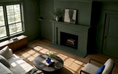
A layout that looks balanced on white drywall can read completely differently once color and texture enter the picture. Dark or richly colored walls tend to make gaps recede, so frames can sit slightly closer together, around the tighter end of the 2 to 3 inch range, without feeling cramped. Pale, low-contrast walls do the opposite, and benefit from a touch more breathing room between pieces so the eye can separate one frame from the next.
Texture matters just as much. A heavily textured surface, like shiplap, brick, or rough plaster, competes visually with thin, minimalist frames, which can get visually lost against the surface. Substantial frame profiles or deeper mats tend to hold their own better on textured walls, while a smooth, painted wall can support delicate, thin-edged frames without either fighting for attention.
Matting choices interact with both. A wide mat with a consistent border, repeated across several frames, does more to unify a mixed collection than matching every frame finish, an approach borne out in general framing guidance on visual weight and cohesion. Before finalizing a layout, hold a sample frame or mat swatch against the actual wall at the actual light level you will be living with, since color under gallery lighting and color under a lamp at 8 PM rarely match.
Mixing photos, prints, and objects without it looking cluttered
The strongest gallery walls rarely stick to one medium. Photographs, framed prints, and dimensional objects like small shelves, mirrors, or textiles can share a wall, but each needs a slightly different treatment to sit comfortably together.
Photographs tend to read as smaller, more intimate pieces, so grouping several together in a tight cluster, using the same mat and frame finish, keeps a wall of family photos from fragmenting into a dozen unrelated rectangles. Framed prints and artwork carry more visual weight individually and work well as anchor pieces, especially when sized larger than the surrounding photographs.
Dimensional objects need room to breathe that flat frames do not. A small shelf or mirror should get a slightly wider gap than the 2 to 3 inch standard, since its depth already reads as visual weight, and crowding it tightens the composition more than the numbers suggest. Placing a heavier or darker object lower in the arrangement and distributing that weight diagonally across the wall, rather than stacking it all on one side, is a technique designers use to keep mixed-medium walls from feeling lopsided.
Keep the frame finishes doing the unifying work rather than the mediums. Two or three consistent finishes across photos, prints, and objects will hold a mixed wall together far better than trying to match every piece’s category.
Adapting the layout to your room’s size and light
The same rules scale, but the numbers shift depending on the room. Large rooms with high ceilings can support wider galleries, closer to 75%, and often benefit from one substantially larger anchor piece to hold the composition together across the extra distance, a scaling approach covered further in our oversized art guide.
Light changes the plan too. A wall that gets strong, direct daylight for part of the day can wash out or glare off glass-fronted frames, so matte glazing or non-glare glass tends to hold up better there than standard glass. Dim hallways or interior walls with little natural light benefit from lighter mats and frame finishes that do not disappear into shadow, and from keeping the composition slightly smaller and simpler so it still reads clearly at a glance rather than requiring close inspection.
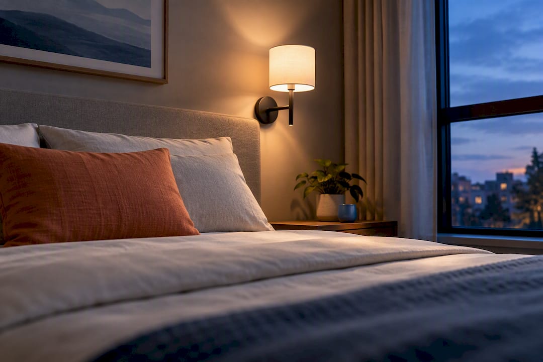
Whatever the room, mock up the layout under the lighting conditions it will actually live in before committing to nail placement. A composition that looks perfectly balanced under a bright showroom light can shift entirely once it is hanging under a single warm lamp at night.
Treating your gallery wall as a living arrangement
A gallery wall does not have to be a one-time decision. Designers increasingly describe these compositions as evolving, personal focal points rather than fixed exhibits, which means the plan you build today should leave room to swap pieces later.
Keep that flexibility built into the plan itself: repeat two or three frame finishes, hold onto one consistent mat depth, and let one or two smaller slots rotate with the seasons or new finds. For more ways to keep a wall feeling current, see our living room art ideas guide and our gallery wall inspiration roundup.
— Nealda
Where to find frames and art that fit your plan
Once your measurements and template are set, sourcing the right frames is what makes the layout hold together on the wall, not just on paper. Art in Lifestyle’s Store Finds collects curated frames and art pieces chosen for exactly this kind of cohesive, mixed-finish arrangement, so you are not hunting across a dozen retailers to match a mat depth or a frame profile.
Before you order anything, run through a short checklist:
- Confirm outside frame dimensions, not the artwork size, against your template.
- Choose two or three finishes and stick to them across the whole wall.
- Recheck hardware offsets on each frame once it arrives, since hook placement varies by manufacturer.
Browse Store Finds for frame and art picks sized to match the plan you just built, or see our living room styling guide for pieces suited to above-sofa arrangements.
Sources
These are the tools referenced throughout this guide, worth bookmarking before your next gallery wall project.
- How to measure and plan a balanced gallery wall – Frameology
- Gallery wall rules and measurements – Apartment Therapy
- GalleryPlanner user guide – GalleryPlanner
FAQ
What is the rule for gallery walls?
The most common rule combines three measurements: center the composition at 57 to 60 inches from the floor, size the total width at 60 to 75% of the furniture below it, and keep a consistent 2 to 3 inch gap between frames. Starting with one anchor piece and building outward keeps the arrangement balanced as you add more frames.
Is there a specific way to arrange a gallery wall?
Yes, though the specific pattern depends on the wall: a grid suits clean, modern spaces, a salon-style cluster suits collected or dramatic walls, and a linear row suits sofas and hallways. Whichever style you choose, mock up the layout on the floor or in a planner first, then transfer measured nail coordinates to avoid extra holes.
Are gallery walls still popular in 2026?
Gallery walls remain a common way to personalize a space, and designers increasingly frame them as evolving compositions that change over time rather than fixed, one-time displays. That flexibility, combined with planner tools that make measuring easier, has kept the format practical for a wide range of rooms.
What are common gallery wall mistakes?
The most frequent mistakes are skipping the measuring step and eyeballing spacing, and measuring a frame’s hardware drop while it is unloaded instead of hanging naturally. Both lead to crooked or unevenly spaced results, and both are avoidable by measuring the loaded frame and using a paper or printed template before drilling.
Recommended
- 6-Step Damage-Free Staircase Gallery Wall: Slope-First, No Holes
- 60–70% Rule: Hallway Art Ideas That Fit Real Homes
- 17 Art Gallery Wall Ideas That Decorate Blank Spaces Perfectly