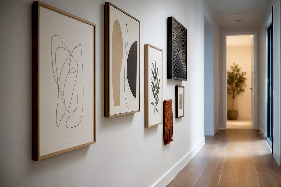
Most hallways call for one of two moves: a single well-scaled statement piece for short foyers and entry runs, or a tightly composed gallery wall for long corridors. Narrow passages do best with vertical stacks or a mirror that borrows light and space. Which one fits depends on your hallway’s length, width, and how much wall you actually have to work with, and the sections below break down the sizing and hanging rules for each.
TL;DR:
- Vertical stacks and mirrors are optimal for narrow hallways under 3.3 feet wide, while larger gallery walls require at least six feet of wall length.
- Maintaining a center height between 145 and 155 centimeters (57 to 61 inches) from the floor helps create balanced, visually appealing arrangements.
- Consistent frame finishes and a limited color palette improve cohesion more than matching subject matter or styles, especially in gallery walls.
- Use paper templates and live with a mockup for a day before drilling to ensure proper spacing and placement, reducing wall repairs.
- Opt for durable frames, glass-covered prints, and warm lighting to withstand high foot traffic and environmental stresses in hallways.
Table of Contents
- Hallway Art Ideas Worth Trying First
- Gallery Wall Layout Rules That Actually Hold Up
- Solving Narrow Hallways and Short Corridors
- Choosing Frames and Materials That Hold Up
- Lighting That Makes Hallway Art Look Intentional
- DIY and Budget-Friendly Hallway Decor
- Choosing Art Styles That Fit Your Hallway’s Architecture
- Coordinating Art Colors With Your Walls and Floor
- Adding Dimension With Three-Dimensional and Mixed Media Pieces
- Rotating and Seasonal Hallway Displays
- Picking Durable, Easy-to-Clean Art for High-Traffic Zones
- What Actually Makes a Hallway Worth Decorating
- Curated Gallery Wall Resources From Art in Lifestyle
- Sources
- FAQ
Hallway Art Ideas Worth Trying First
Before you start measuring walls or shopping for frames, decide which family of hallway wall art actually fits your space. Trying to force a salon-style gallery wall into a three-foot-wide passage almost always backfires, and a single tiny print on a twenty-foot wall reads like an afterthought. Here’s how to match the approach to the room.
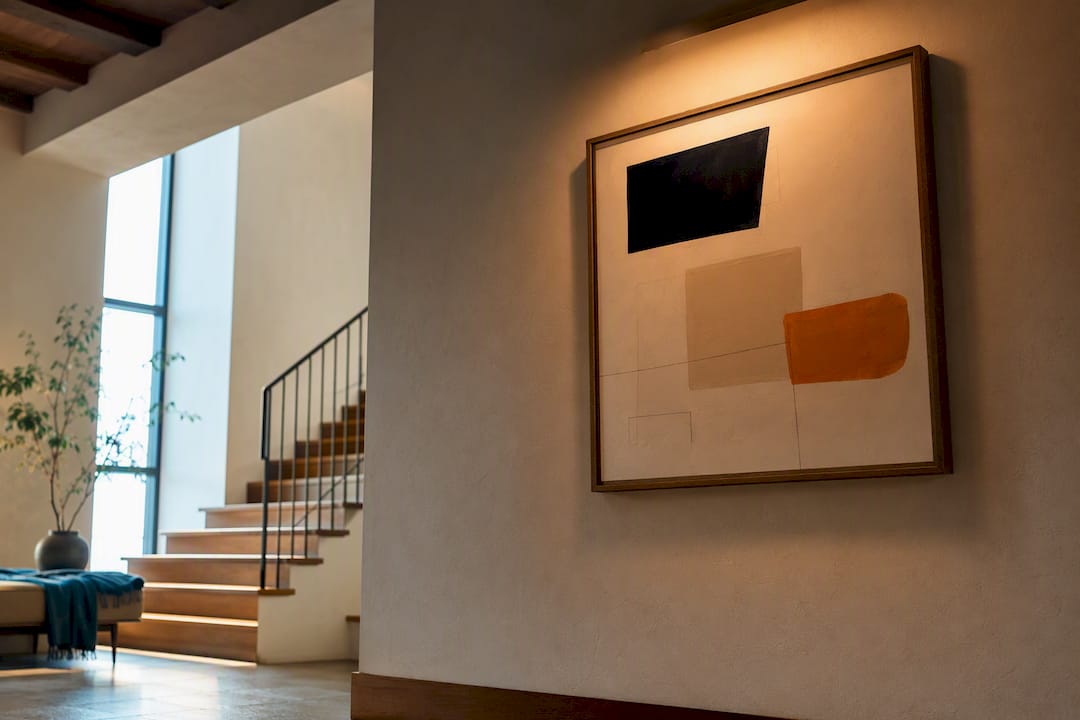
- A single oversized statement piece. This works best in foyers, entry runs, and short hallways under eight feet long. Aim for artwork that fills 60 to 70 percent of the available wall width, and if it’s hanging above a console table, keep the piece at least 15 to 20 centimeters above the furniture, with a width roughly two thirds that of the console.
- Gallery wall families. Grid layouts (matched frames, even spacing) suit shorter, calmer walls. Column layouts stack vertically and fit narrow corridors. Salon-style mixes of sizes and orientations need a generous, longer wall to avoid feeling cluttered. Pick based on wall length first, then style.
- Mirrors and reflective art. A large mirror or a piece with metallic or glossy elements bounces ambient light down a dim hallway and creates the illusion of a wider passage, particularly useful in windowless interior corridors.
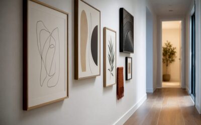
- Vertical stacks for narrow halls. Two or three portrait-oriented prints stacked with tight spacing read as one composition rather than three scattered accents, and they respect a corridor’s limited horizontal room.
A unifying thread ties any of these together. That could mean matching frame finishes across every piece, sticking to a three-color rule with one dominant hue, one secondary, and one accent, or choosing art that shares a subject matter, like botanical prints or black-and-white photography. Consistency does more visual work than any single “statement” piece.
Gallery Wall Layout Rules That Actually Hold Up
Getting a gallery wall to look intentional instead of accidental comes down to spacing and height, not artistic instinct. Three layout families cover most hallway situations. Grid arrangements use identical frame sizes and even spacing for a calm, orderly look that suits shorter walls and forgives small measuring errors. Column layouts stack frames vertically, which is the natural choice for narrow corridors. Salon-style walls mix sizes, orientations, and sometimes mediums, and they need real wall length, generally six feet or more, to breathe.
Spacing between frames typically runs around 5 centimeters edge to edge. Tighter spacing (closer to 3 centimeters) reads as one cohesive block, useful in a column stack, while looser spacing gives a salon wall room to feel curated rather than crammed.
Center height matters more than most people think. Keep the visual center of your arrangement between 145 and 155 centimeters (57 to 61 inches) from the floor, and drop it a few centimeters below that range in hallways since viewers are walking past rather than standing still in front of it. Above a console table, leave at least 15 centimeters of clearance between the furniture top and the frame’s bottom edge.
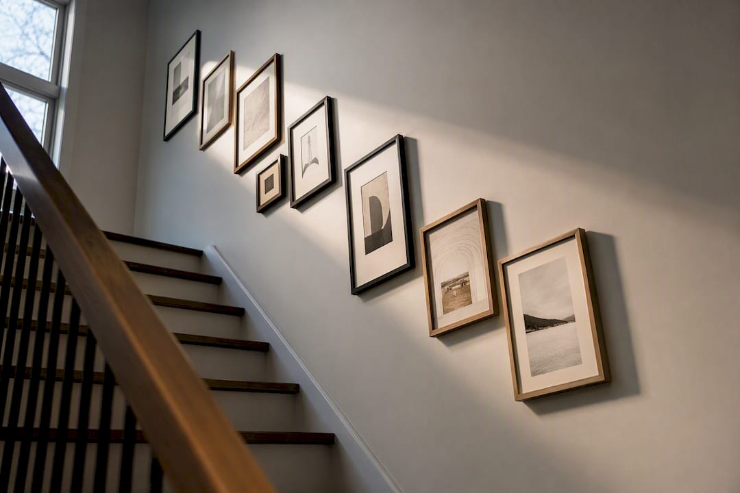
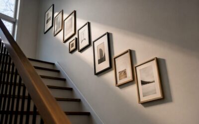
Stairwells need their own logic. For a stair-run gallery wall, align frame centers along an imaginary diagonal that mirrors the stair pitch, keeping a consistent vertical rise and horizontal offset between each frame as you climb.
- Measure your total wall length before choosing a layout family.
- Cut kraft-paper templates to scale and tape them to the wall to preview spacing.
- Step back to your hallway’s main approach angle and live with the mockup for a day before drilling.
- Adjust spacing in small increments (1 to 2 centimeters) rather than redesigning from scratch.
Paper templates plus a day of living with the layout cuts down on regret and patched holes far more than eyeballing it. For the exact hanging math, our guide to setting the right hanging height walks through the measuring steps in more detail.
Pro Tip: Lay your entire arrangement out on the floor first, using painter’s tape to mark the wall’s footprint. It’s far easier to shift a frame six inches on carpet than to patch a misplaced nail hole.
Solving Narrow Hallways and Short Corridors
Corridors under about 3.3 feet (1 meter) wide need a different set of rules than a standard hallway. Width, not length, becomes the limiting factor, and the wrong scale of art makes a tight passage feel even smaller.
- Choose portrait-oriented prints and column stacks over wide horizontal pieces, which visually compete with the corridor’s narrowness.
- Confine art to a single wall. Hanging pieces on both sides of a slim hallway creates visual noise and can make the space feel like a gauntlet.
- Leave breathing room around doorways, light switches, and thermostats. Nothing should feel crowded within about 15 centimeters of a functional fixture.
- Match print size to corridor width: smaller frames (roughly 20 by 30 centimeters) for hallways under a meter wide, scaling up as the space allows.
- Add a mirror, a slim console, or a runner rug to introduce perceived depth without eating into usable floor space.
- Favor low-profile frames and warm, dim lighting over bulky moldings, which can make an already tight corridor feel closed in.
Narrow hallways respond best to vertical formats and restraint: light-toned canvases and a single well-placed mirror do more for a cramped corridor than a busy gallery wall ever will.
Choosing Frames and Materials That Hold Up
Hallways see more foot traffic, more bumped elbows, and more temperature swings than almost any other room, so material choice matters as much as composition.
- A unified frame finish (all black, all natural wood, all brushed brass) helps a mixed collection of art read as one intentional set rather than a mismatched pile.
- Canvas prints are lightweight and forgiving of humidity shifts near entryways, but they lack the crisp edge definition a framed print under glass provides.
- Framed prints show detail beautifully but add weight, meaning sturdier hardware and, in older plaster walls, anchors rather than simple nails.
- Mirrors and textile art need secure mounting hardware rated for their actual weight, and mirrors near a front entry should use safety backing in case of impact.
- Wipe frames and glass near bathrooms, kitchens, or exterior doors every few weeks; humidity and dust settle fastest in transition zones.
Lighting That Makes Hallway Art Look Intentional
A well-placed light does more for hallway art than an expensive frame. A picture light or a warm 2700K LED sconce brings out texture and color in a way overhead ceiling fixtures simply can’t, since ceiling lights tend to flatten artwork and cast shadows from frame lips.
- Stick to warm white (2700K) bulbs. Cooler light temperatures wash out warm tones in prints and photography.
- If rewiring isn’t in the budget, battery-powered or plug-in picture lights deliver most of the same effect with none of the electrical work.
- Angle sconces to avoid direct glare on framed glass, which creates a distracting hot spot rather than even illumination.
- Consider how door swings affect sightlines. A sconce mounted where a door swings open can end up half-blocked for half the day.
Pro Tip: If you only light one thing in the hallway, light the piece nearest the entrance. It sets the tone for everything else down the corridor. Our full lighting guide covers fixture types and placement in more depth.
DIY and Budget-Friendly Hallway Decor
You don’t need custom framing or a contractor to make a hallway look considered. A few low-cost, low-commitment moves get you most of the way there.
- Install a picture ledge. A single floating shelf lets you lean and swap art without new holes every time your taste changes.
- Print your own art. Pair consistent, matching frames with printable designs or personal photography for a curated look at a fraction of gallery pricing. Our DIY home decor guide has more no-cost styling recipes.
- Use low-damage hanging hardware. Adhesive strips and hooks work for lightweight frames; reserve wall anchors for anything over a couple of pounds. Our guide to hanging paintings without nails breaks down which method fits which frame weight.
- Try one of three reliable recipes: one large piece flanked by two smaller ones, three matching prints in a row, or a simple 2×2 grid with even spacing.
Choosing Art Styles That Fit Your Hallway’s Architecture
Hallway art should feel like it belongs to the house, not like it wandered in from a showroom. A Craftsman bungalow with wood trim and low ceilings suits botanical prints, warm-toned photography, or arts-and-crafts patterns more than sleek minimalist abstracts. A mid-century home with clean lines and open sightlines can carry bold geometric prints or abstract line art without clashing.
Architectural details you already have, like crown molding, wainscoting, or exposed brick, give you a style cue for free. Ornate trim pairs naturally with classic or vintage-inspired art in gilded or dark wood frames. Sparse, modern trim looks better with minimal frames and cleaner subject matter.
Ceiling height changes what reads well, too. Hallways with eight-foot or taller ceilings can support taller vertical pieces or stacked arrangements that draw the eye upward. Standard seven-and-a-half-foot hallways do better with horizontal groupings that keep the eye moving along the wall rather than up toward a low ceiling.
If your home leans traditional, a mix of framed botanical illustrations, classic landscapes, or family photography in matching antique-finish frames tends to read as coherent. If it leans contemporary, abstract line work, black-and-white photography, or minimalist graphic prints in slim black or brushed metal frames fit the architecture without fighting it. The goal isn’t matching your art to a design “era” exactly. It’s choosing pieces that don’t visually argue with the trim, ceiling height, and light already built into the space.
Coordinating Art Colors With Your Walls and Floor
Hallway walls and floors set the palette your art has to work with, and ignoring that is the single most common styling mistake in this part of the house. A dark wood floor with warm undertones pulls harder toward earthy, warm-toned art. Cool gray flooring and white walls open the door to bolder, more saturated pieces since the neutral base absorbs the contrast.
Because hallways are transitional, motion-view spaces, you can be bolder with color and density here than you would in a living room. Viewers absorb hallway art while walking past it rather than sitting and studying it, which means saturated colors and denser groupings that might overwhelm a seating area often work beautifully in a corridor.
A simple approach: pull one accent color already present in your flooring, trim, or an adjacent room, and let that color show up in at least one piece of your hallway art. It doesn’t need to dominate. A single warm terracotta accent in one print, echoing a rug in the room at the end of the hall, is enough to make the whole sequence feel connected rather than like two unrelated spaces stitched together.
If your walls are painted a deep or unusual color, like navy, forest green, or charcoal, lean toward art with lighter values or metallic accents so pieces don’t disappear into the wall. On white or light neutral walls, almost any art palette works, which is part of why neutral hallways are the easiest starting point for a first gallery wall.
Adding Dimension With Three-Dimensional and Mixed Media Pieces
Flat prints aren’t the only option, and a hallway that’s all framed rectangles can start to feel repetitive on a long wall. Woven wall hangings, ceramic wall discs, sculptural metal pieces, and shadow-box displays add texture and depth that flat art simply can’t.
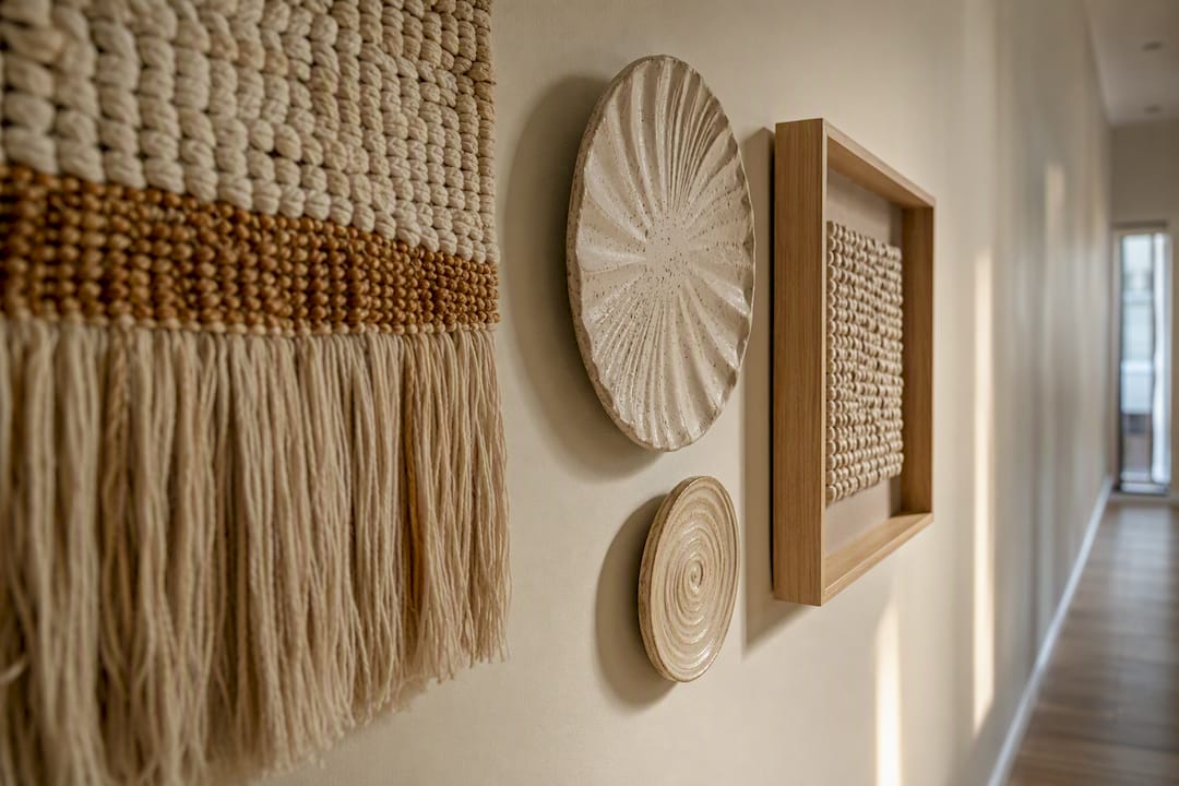
Mixed media works particularly well as a break point in a long gallery wall, one dimensional piece among six or seven flat frames keeps the eye from gliding past the whole arrangement too quickly. A small textile hanging or a cluster of ceramic wall discs also softens a hallway that leans heavily on hard surfaces like tile floors or plaster walls.
Displaying collections works the same way. A curated arrangement of small objects, like vintage cups or ceramic pieces, mounted on wall brackets or small shelves brings personality that framed prints alone don’t offer, and it’s a technique borrowed directly from how collectors display mug and object collections on gallery walls.
Weight and mounting matter more here than with flat art. Ceramic and ceramic-adjacent pieces need wall brackets rated for their actual weight, not decorative hooks, and anything projecting more than an inch or two off the wall needs to sit above door-swing height or well clear of where people naturally brush past. In a high-traffic corridor, a piece that sticks out becomes a shin-height (or shoulder-height) hazard fast if it’s mounted carelessly.
Rotating and Seasonal Hallway Displays
A hallway is one of the easiest rooms in the house to refresh seasonally, precisely because it’s usually a smaller footprint than a living room gallery wall. Swapping four or five prints twice a year costs far less than reworking an entire room.
The picture-ledge approach makes rotation effortless: lean seasonal prints, postcards, or even framed botanical cuttings against the wall and swap them without touching a single nail. A column stack with uniform frame sizes works the same way if you standardize on one print dimension and simply switch the inserts inside the frames.
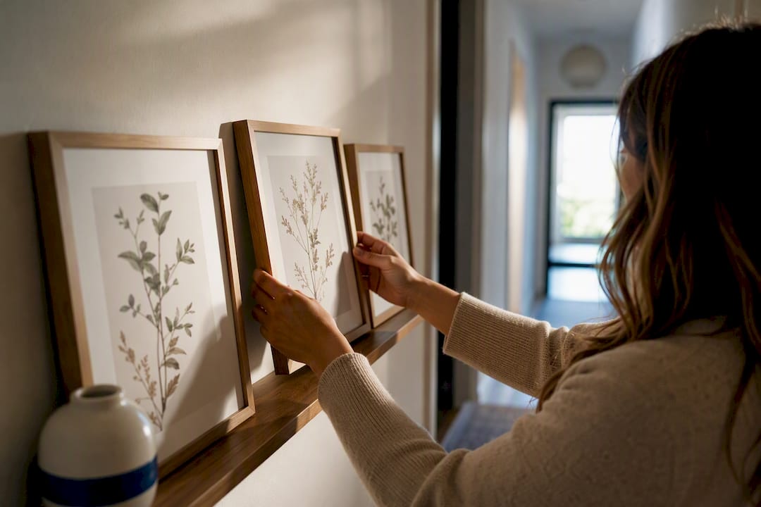
Some households rotate around holidays: warmer, richer tones and botanical or harvest imagery in fall, brighter and lighter prints in spring. Others rotate around family milestones, updating photography every few months as kids grow or travel adds new material. Either approach keeps a hallway from going stale, which matters more in this room than almost any other since it’s the space you pass through daily, often without slowing down enough to really look.
If full rotation feels like too much upkeep, rotate just one anchor piece, the largest or most central item, and leave the supporting pieces fixed. That single swap refreshes the whole wall’s feel without redoing the entire layout each season.
Picking Durable, Easy-to-Clean Art for High-Traffic Zones
Hallways absorb more incidental contact than almost any other room: brushed shoulders, bumped elbows, kids running past, pets shaking off rain near the entry. Art here needs to tolerate that in a way a dining room piece never has to.
Glass-covered framed prints wipe clean easily and protect the artwork underneath from dust, fingerprints, and humidity, making them a safer bet near entry doors or bathrooms than exposed canvas. Canvas prints without glass pick up dust and the occasional stray touch, so they’re better suited to hallway stretches farther from doors, wet areas, or kids’ regular paths.
Matte finishes hide fingerprints and smudges better than glossy glass, which shows every touch under hallway lighting. For textile or mixed media pieces in these zones, choose washable or wipeable surfaces over delicate, dry-clean-only fabrics.
Frame material matters for longevity, too. Solid wood or metal frames hold up to the occasional bump far better than lightweight plastic or particleboard, which chips and dents faster in a corridor that sees daily contact. If your hallway sits near an exterior door, expect more humidity and temperature swings, and favor materials, like sealed wood or metal, that don’t warp the way untreated wood or paper mats can over time.
What Actually Makes a Hallway Worth Decorating
Hallways get skipped constantly because they feel like connective tissue rather than a “real” room, but that’s exactly why they’re one of the highest-impact, lowest-cost places to invest in art. You’re not competing with furniture, rugs, or a sofa that anchors the whole design. A single well-chosen piece or a tight gallery wall does all the work.
If there’s one editorial preference worth pushing on, it’s this: match your frame finishes before you match your subject matter. A mixed gallery wall in matching black or matching natural wood almost always reads better than a collection of visually perfect prints in five different frame styles. Consistency, not perfection, is what makes a hallway feel finished.
— Nealda
Curated Gallery Wall Resources From Art in Lifestyle
If you’d rather start from a template than measure and mock up everything yourself, curated ready-made gallery wall sets and print collections designed to fit standard hallway dimensions can help avoid the trial-and-error phase. Getting the sizing and spacing rules right on your own is entirely doable with the steps above, but a curated collection saves you the step of hunting for pieces that actually work together in scale, color, and framing.
Our gallery wall idea collection shows full room examples across grid, column, and salon layouts, with the print pairings already worked out. If you’re building around a narrow corridor, our space-saving decor picks are chosen specifically for tight footprints. Browse either collection, pick a set that matches your wall length, and you’ll have a shoppable starting point instead of a blank wall and a tape measure.
Sources
FAQ
What kind of art looks good in a hallway?
Portrait-oriented prints, photography series, and gallery walls with a consistent frame finish all work well, since hallways are viewed in motion rather than up close. Botanical prints, abstract line art, and black-and-white photography are especially forgiving choices because they read clearly at a walking pace.
What are the trends for decorating hallways in 2026?
Mixed media gallery walls that combine flat prints with ceramic or textile pieces are gaining ground, along with warmer 2700K picture lighting replacing flat overhead fixtures. Seasonal rotation on picture ledges is also becoming a more common way to keep hallways feeling current without a full redesign.
What is the best way to decorate a hallway?
Match your approach to your hallway’s shape: a single statement piece for short entries, a gallery wall for long runs, and vertical stacks or mirrors for narrow corridors. Keep the visual center of any arrangement between 145 and 155 centimeters from the floor, and mock up the layout with paper templates before hanging anything.
What are some creative ideas for painting my hallway?
Pull one accent color from your flooring or an adjacent room and let it echo in your hallway art rather than repainting the whole corridor. Since hallways are motion-view spaces, you can go bolder with wall color and denser art groupings than you would in a room where people sit still.