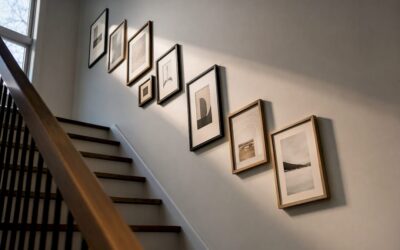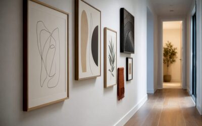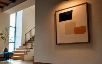
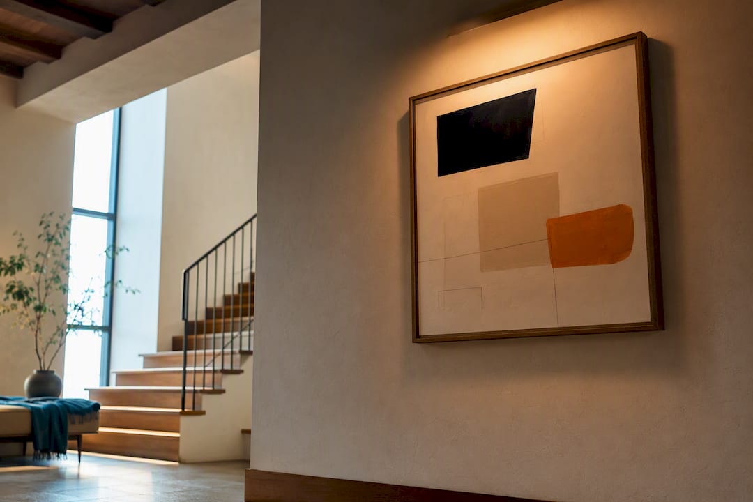
Smaller pieces under 18 inches tall require a tighter 4 to 6 inch gap, while large or dramatic canvases can climb to 10 to 14 inches. Get those three numbers close, then fine tune with a simple stand back test.
TL;DR:
- Smaller artworks under 18 inches tall benefit from a 4 to 6 inch gap to keep the light focused and prevent spillover.
- Most fixtures should cover 50% to 70% of the artwork’s width, with 60% being ideal for rectangular pieces, to avoid uneven illumination or spill onto the wall.
- A tilt angle of 30 to 35 degrees balances avoiding hot spots and glare, with adjustments needed based on fixture beam angle and artwork material.
- For large works over 48 inches, a wider gap of 10 to 14 inches is recommended to allow the light to expand across the entire canvas.
- LED bulbs with a high CRI (90 or above) and a color temperature between 2700K and 3000K are best for color accuracy and preserving artwork over time.
Table of Contents
- What Is the Right Picture Light Height Above a Frame?
- How Wide Should the Picture Light Fixture Be?
- Getting the Tilt Right Without Creating Glare
- Adjusting for Texture, Color, and Fragile Materials
- Room Proportions: Ceilings, Furniture, and Molding
- Choosing Bulbs: LED, Color Temperature, and Preservation
- How to Install and Calibrate Your Picture Light
- Common Picture Light Mistakes and Quick Fixes
- Refinements for Real Rooms
- Adjusting for Natural Light and Room Brightness
- Glare and Eye Strain: Why Picture Light Height Matters for Safety
- An Editor’s Take: Rules Are a Starting Point, Not a Verdict
- Where to Go Next for Lighting and Hanging Guidance
- Sources
- FAQ
What Is the Right Picture Light Height Above a Frame?
The 6 to 10 inch gap above the frame is the number most lighting guides converge on, and it’s not arbitrary. Mount too close and you get a hot, tight beam that reads as a spotlight instead of a wash. Mount too far and the light spreads thin before it reaches the canvas, leaving a dim halo instead of even illumination.
Artwork size changes where you land in that range. A practical baseline of 6 to 7 inches works for most mid-size pieces, roughly 24 to 40 inches tall. Outside that middle ground, the math shifts:
- Small works under 18 inches tall: use a tighter 4 to 6 inch gap so the beam stays focused instead of spilling past the frame edges.
- Standard mid-size pieces (24 to 40 inches): the 6 to 7 inch baseline delivers an even wash without crowding the top of the frame.
- Oversize or gallery-scale works (over 48 inches): push closer to 10 to 14 inches so the beam has room to expand across the full canvas before it hits the wall.
- Viewing distance matters too. A piece hung above a mantel or sideboard, viewed from across the room, tolerates a slightly wider gap than one hung at close range in a hallway.
Think of the gap as a throw distance problem, not a decoration choice. The farther the light sits from the top of the frame, the more room the beam has to widen and blend before it lands on the art. That’s good for large, uniform surfaces and bad for small detailed pieces that need a tighter, more focused pool of light.
How Wide Should the Picture Light Fixture Be?
Fixture width should land between 50% and 70% of the artwork’s width, and about 60% is the sweet spot for most rectangular pieces. Undersize the fixture and you get bright center coverage with dark, neglected corners. Oversize it and light spills past the frame onto bare wall, which looks careless rather than intentional.
- Measure the artwork’s width first, not the frame’s outer edge. If the canvas or print measures 30 inches wide, a 60% fixture lands at 18 inches, well within the 15 to 21 inch range the 50 to 70% rule allows.
- For portrait orientation pieces, favor the lower end of the range, closer to 50%, since narrower artwork needs less horizontal throw to look proportional.
- For landscape or panoramic pieces, lean toward 65 to 70% so the beam reaches both edges without leaving dim triangles in the corners.
- For anything wider than about 48 inches, skip the single oversized fixture and mount two smaller lights symmetrically instead. Two fixtures at roughly a third of the width each produce a softer, more even wash than one long bar straining to cover the whole span.
A 40 inch wide painting, for example, calls for a fixture between 20 and 28 inches.
Getting the Tilt Right Without Creating Glare
A tilt of roughly 30 to 35 degrees toward the artwork is the number to start with, and the acceptable range runs from 30 to 45 degrees depending on fixture and frame. Beam angle and fixture width aren’t independent decisions. A narrow beam concentrates light in a tight cone and needs more throw distance, meaning a slightly higher mount, to spread evenly across the canvas. A wider beam covers the same surface from closer in, which lets you keep the mount lower without losing coverage.
- Center the fixture over the artwork’s midpoint, not the frame’s, since mats and borders can throw off the visual balance if you eyeball it.
- Tilt too steeply and the beam creates a hot spot at the bottom of the piece while the top stays dim.
- Tilt too shallow and light bounces straight back at the viewer, especially with glazed or glass covered frames.
- For anything behind glass, drop the tilt angle slightly below 30 degrees and check from multiple standing positions, since glare from glazing shifts with the viewer’s eye height.
Pro Tip: Test your tilt angle in the evening with every other light in the room switched off. Daytime ambient light masks glare and uneven edges that become obvious the moment the sun goes down.
Adjusting for Texture, Color, and Fragile Materials
Not every piece of art wants the same numeric setup, because surface and pigment change how light behaves once it lands.
- Heavily textured works, like impasto oil paintings or textile pieces, benefit from a slightly steeper angle and shorter throw distance. Raking light across relief reveals brushstrokes and stitching that flat, head on illumination flattens into invisibility.
- Dark palettes absorb more light than they reflect, so pieces dominated by deep browns, blacks, or navy often look better with a fixture on the higher end of the 50 to 70% width range and a gap closer to 8 or 9 inches, giving the wash more room to register against the darker surface.
- Light, high key palettes reflect more readily and can tolerate a tighter gap without washing out.
- Fragile or light sensitive materials, including watercolors, works on paper, and anything with a conservator’s warning label, need distance and lower intensity rather than a closer mount. Favor the higher end of the height range paired with a dimmer rather than pulling the fixture in tight.
Glazed frames deserve their own consideration here too. Glass reflects at almost any angle under about 30 degrees, so texture heavy or glazed pieces often need the tilt adjustment described above combined with these material specific tweaks.
Room Proportions: Ceilings, Furniture, and Molding
The numbers above assume a standard room. Real rooms have low ceilings, high ceilings, sideboards, and crown molding that all pull the ideal height in one direction or another.
- Low ceilings (under 8 feet): mount slightly lower than the standard range suggests. A fixture that reads as proportional in a 9 foot room can feel like it’s crowding the ceiling in a shorter one, compressing the whole wall visually.
- High ceilings (9.5 feet and up): raise the fixture slightly above the standard gap so it doesn’t look stranded on an oversized wall, and the artwork itself may sit higher on the wall to match.
- Furniture below the artwork, like a console table or headboard, can cast shadows into the lower third of the piece if the picture light’s angle isn’t accounted for. Check the shadow line before finalizing the mount.
- Crown molding and architectural trim give you a natural alignment reference. Where possible, keep the fixture’s top edge parallel to nearby molding lines so the installation reads as intentional rather than improvised.
If you’re weighing sightlines and mounting mechanics more broadly, the same proportional thinking applies to mounting height for wall mounted televisions, where eye level and room scale drive the decision just as they do here.
Choosing Bulbs: LED, Color Temperature, and Preservation
LED is the clear choice for picture lights today, and it’s not close. Halogen bulbs generate significant heat, which can accelerate fading and drying in sensitive materials over years of exposure, while modern LEDs run cool enough to sit closer to artwork without that cumulative risk.
- Prioritize high CRI bulbs (90 or above) so colors render accurately instead of shifting warm or cool under artificial light.
- Color temperature between 2700K and 3000K suits warm toned rooms and oil paintings with rich, saturated pigments.
- 3500K to 4000K neutral white works better for cooler palettes, black and white photography, and contemporary pieces where color accuracy matters more than ambiance.
- Install a dimmer wherever possible. Lower intensity plus distance limits cumulative light exposure on fragile or light sensitive pieces without sacrificing visibility in the evening.
Heat and light exposure both accumulate over years, not days, which is exactly why the bulb choice matters more for long term wall art than it does for temporary display. A cooler running LED at the correct height protects the investment quietly, in the background, for the life of the piece.
How to Install and Calibrate Your Picture Light
Getting the numbers right on paper is only half the job. The install itself determines whether those numbers translate into even, glare free light on the wall.
- Confirm your power source and anchor points first. If you’re hardwiring into an existing switch, shut off power at the breaker before touching any wiring, and use appropriate wall anchors if you’re not hitting a stud.
- Mark the artwork’s horizontal centerline and measure your chosen gap (starting around 6 to 7 inches) up from the top of the frame.
- Use a level to mark two mounting points, then drill pilot holes before driving screws to avoid cracking plaster or drywall.
- Mount the fixture and connect wiring or plug it in, then turn it on before you consider the job finished.
- Run the stand back test. Step back to your normal viewing distance, look for hot spots or dim corners, and adjust the tilt or height in quarter to half inch increments until the wash reads evenly across the whole piece.
Pro Tip: Before you commit to permanent holes, test the height with a removable clamp mount or command strip bracket. Living with a temporary setup for a day or two often reveals adjustments you’d miss by eyeballing it once and drilling immediately.
Common Picture Light Mistakes and Quick Fixes
Most placement problems trace back to a handful of repeated errors, and each one has a fast correction that doesn’t require starting over.
- Mounted too close or too low: raise the fixture in small increments rather than remounting from scratch; even half an inch changes the wash noticeably.
- Fixture too narrow for the artwork: swap for a longer bar sized to 60% of the width, or add a second fixture for pieces over 48 inches wide.
- Aimed too steeply, creating a bottom hot spot: reduce the tilt angle toward 30 degrees and recheck with the stand back test.
- Glare bouncing off glazing: lower the tilt angle slightly and shift the viewing check to multiple eye heights before assuming the glazing itself is the problem.
Refinements for Real Rooms
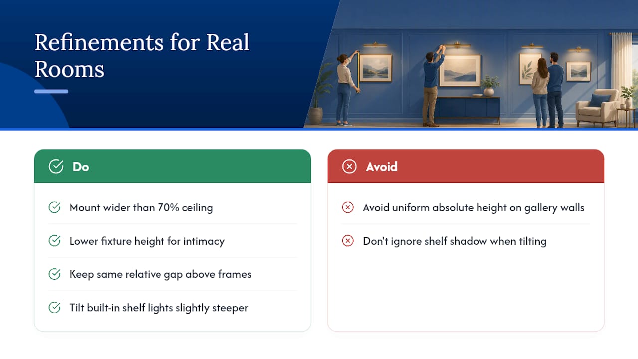
Some designers deliberately mount fixtures wider than the 70% ceiling for dramatic scale, or drop the height slightly lower than standard to create intimacy over a reading chair or bedside piece.
For gallery walls, keep every fixture at the same relative gap above each frame rather than a uniform absolute height, since mismatched frame sizes will look inconsistent otherwise. Built-in shelving art benefits from a slightly steeper tilt to compensate for the shelf’s shadow. For a deeper walkthrough of accent lighting strategy, see Artinlifestyle’s art lighting guide for gallery results at home, and pair it with the hanging height guide for the full placement picture.
Adjusting for Natural Light and Room Brightness
A picture light doing double duty in a sunlit room needs different calibration than one working after dark. During the day, natural light from windows can wash out a picture light’s effect entirely, making a correctly aimed fixture look dim or pointless by comparison. If a piece sits near a window or in a bright, south facing room, consider a slightly closer mount within your chosen range and a brighter bulb, since the fixture has to compete with ambient daylight rather than simply supplement it.
In rooms with minimal natural light, or for evening viewing, the same fixture can sit at the farther end of its height range and still read as plenty bright, because it’s no longer competing with anything. This is also where the earlier tip about testing at night pays off twice: it reveals glare, but it also shows you what the fixture looks like at its full, uncontested brightness.
Rooms with mixed lighting, such as a living room with both a window and overhead fixtures, need a middle ground setup. Aim for a mount and bulb combination that looks balanced under artificial light at night and doesn’t look washed out or invisible during the day. If the artwork moves between rooms with different lighting conditions, budget a few minutes to recalibrate the tilt and height rather than assuming the original setup transfers directly.
Glare and Eye Strain: Why Picture Light Height Matters for Safety
Poorly aimed picture lights create more than an aesthetic problem. A fixture mounted too low or tilted too steeply can send light directly into a viewer’s eye line, especially in hallways or over seating where people linger at a fixed distance from the wall. That direct glare causes genuine eye strain over repeated exposure, not just a moment of squinting.
The 30 to 35 degree tilt range recommended earlier exists partly for this reason. Light angled properly toward the artwork illuminates the surface without throwing a direct beam back at eye level. Test this from every angle someone would realistically view the piece from, standing, seated, and while walking past, since a fixture that looks fine from one position can glare badly from another.
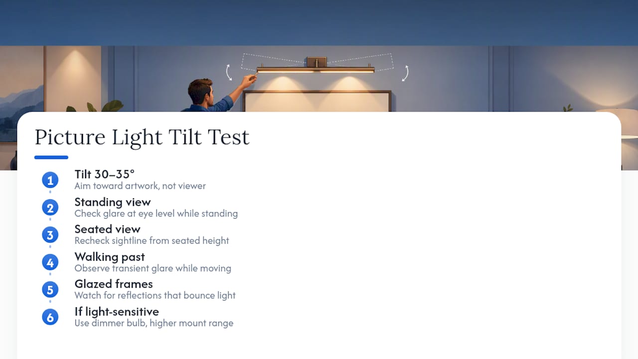
Glazed and glossy framed pieces raise the stakes further, since glass reflects light at predictable angles that can bounce a bright fixture straight into a viewer’s eyes from across the room. If a household includes anyone with light sensitivity or migraine triggers, err toward a dimmer bulb and the wider end of the height range rather than pushing for maximum brightness. Comfort and safety should outrank raw illumination every time the two are in tension.
An Editor’s Take: Rules Are a Starting Point, Not a Verdict
Every number in this piece is a reliable anchor, not a law. Use them to get close, then trust the stand back test over the tape measure. Small iterative adjustments, half an inch here, five degrees there, almost always beat a perfect calculation applied once and never revisited.
— Nealda
Where to Go Next for Lighting and Hanging Guidance
Artinlifestyle covers the full picture beyond height and tilt, including how framing choices and wall placement work together to make a room feel finished rather than assembled piece by piece.

If this walkthrough solved the lighting half of your gallery wall project, the hanging height is the other half of the equation. The Art Hanging Height That Actually Works Every Time breaks down eye level placement with the same measurement first approach used here, so the two guides work as a pair rather than requiring you to hunt for conflicting advice elsewhere. For a broader dive into accent lighting strategy across a whole room, An Art Lighting Guide for Gallery Results at Home picks up where this article leaves off. And if you’re still shopping for the piece that’s going under that new light, browse Cameron Limbrick’s abstract paintings for a sense of how bold color and texture change the lighting math discussed above.
Sources
- Picture Light Size Calculator – Find the Perfect Art Light
- A Full Guide on Picture Lights + A Round-Up
- How to Install a Picture Light: Height, Angle & Wiring – Luxe Living Insights
- How High Should I Mount A Picture Light Above A Painting?
FAQ
How High Should a Picture Light Hang Above a Painting?
Most guides recommend 6 to 10 inches above the top of the frame, with a 6 to 7 inch baseline for mid-size pieces and a tighter 4 to 6 inches for small works under 18 inches tall.
What Is the 5’7" Lighting Rule?
This isn’t a standard measurement used in picture light guidance; the more relevant industry benchmarks are the frame gap and fixture width percentages covered above.