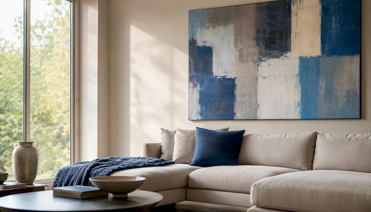
The framing style that matters most is the one that disappears into the artwork rather than competing with it, so the single rule to follow is: match the frame to the piece’s medium and era first, then choose materials that protect it. Every option below falls into one of seven families.
- Gallery/floor frames — slim profiles built for exhibition walls
- Floater frames — the “floating” look for gallery-wrapped canvas
- Modern flat wood frames — clean, low-profile, versatile
- Metal and glass frames — crisp lines for photography and prints
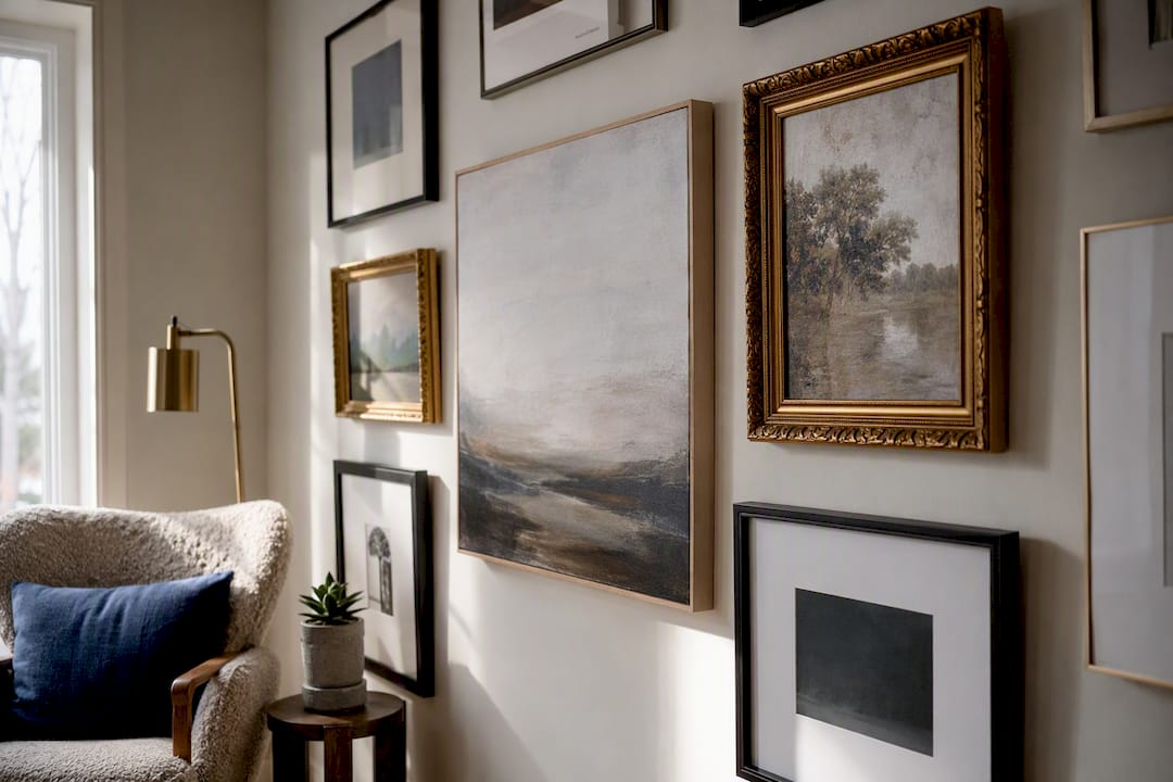
- Ornate/gilded frames — traditional, decorative, historical
- Box/shadowbox frames — for objects, textiles, and dimensional work
- Poster/acrylic frames — budget-friendly, lightweight display
Once you know which family fits your piece, the next step is running it through a short decision checklist.
Key Takeaways
The right art framing style protects the medium first and matches its era and visual character second, with archival glazing and mats determining how well it holds up over time.
| Point | Details |
|---|---|
| Match medium to construction | Canvas suits floaters, paper needs spacers, objects need shadowboxes. |
| Prioritize archival materials | Acid-free mats and buffered backing prevent yellowing and edge damage. |
| Choose glazing by value | Acrylic suits large, lightweight pieces; museum-grade AR glazing suits high-value works. |
| Budget for custom timelines | Custom framing typically takes one to four weeks; museum-grade takes longer. |
| Let art lead, not furniture | Frame color and finish should echo the piece’s era, not the sofa. |
Table of Contents
- Types of Art Frames: What Each Style Looks Like and When to Use It
- How Do You Choose the Right Frame for Your Art?
- Do Canvas, Paper, and Photographs Need Different Frames?
- Protection, Glazing, and Archival Materials Explained
- What Does Custom Framing Cost and How Long Does It Take?
- What Are the Biggest Art Framing Trends Right Now?
- What Framing Mistakes Cost You the Most Money?
- Where Did Today’s Framing Styles Come From?
- How Does Frame Color Change the Way Art Is Seen?
- How Do You Match Framing Style to Your Interior Design?
- Balancing Preservation With Design
- Frequently Asked Questions
- Sources
Types of Art Frames: What Each Style Looks Like and When to Use It
Every framing style solves a different visual problem, and knowing what each one looks like in person saves you from an expensive mismatch. Here’s how the main types of picture frames break down.
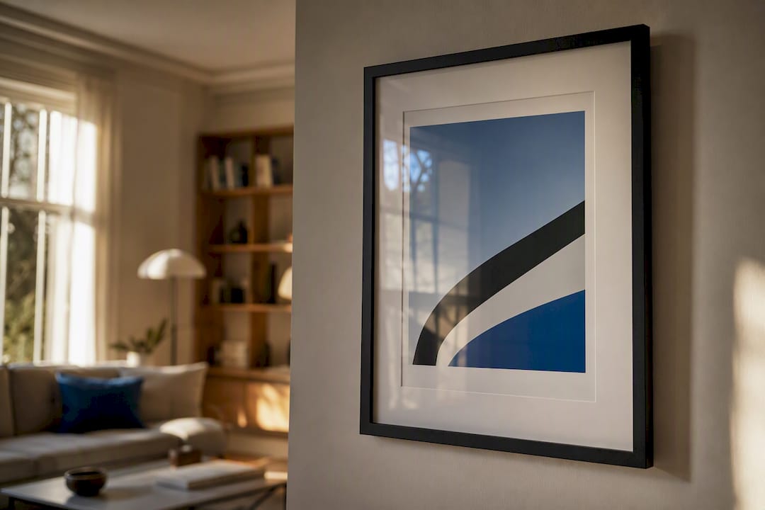
Gallery/floor frames use a thin, unobtrusive profile, typically in black, white, or raw wood, paired with a wide mat. Galleries default to this look because it minimizes distraction and lets a wide mat do the work of drawing the eye inward, according to the Ultimate Guide to Picture Frame Styles. Best for contemporary prints, photography, and fine art reproductions. Pro: goes with nearly any interior. Con: can feel generic without a strong mat choice. Needs UV-filtering glazing since prints fade fast under direct light.
Floater frames leave a visible gap between the canvas edge and the frame’s inner wall, so a gallery-wrapped painting appears to hover inside it. This construction is a defining feature of contemporary canvas display, per Arthouse SF’s framing guide. Best for gallery-wrapped canvas and mixed-media panels. Pro: shows off the canvas edge and gives depth. Con: not appropriate for framed works on paper. No glazing needed in most cases.
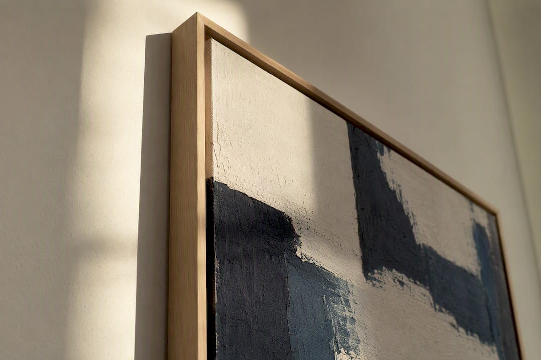
Modern flat wood frames are simple rectangular profiles in oak, walnut, or painted finishes, usually one to two inches wide. Best for minimalist interiors and mid-century art. Pro: pairs with almost any decor era. Con: can undersell a highly ornate or antique piece.
Metal and glass frames offer thin aluminum or steel profiles, often in matte black, brushed silver, or brass. Best for photography, architectural prints, and graphic art. Pro: sharp, contemporary look that photographs well itself. Con: cold visual feel for warm, textured paintings.
Ornate/gilded frames feature carved wood or composite molding finished in gold, silver, or antique leaf. Best for classical oil paintings, heirloom portraits, and traditional interiors. Pro: signals value and history immediately. Con: can overwhelm small or minimalist pieces.
Box/shadowbox frames add depth (often one to three inches) to accommodate dimensional objects. Best for textiles, medals, sports jerseys, and mixed-media assemblages. Pro: the only style that properly protects 3D pieces. Con: bulkier and pricier than flat frames.
Poster/acrylic frames use lightweight acrylic sheets, sometimes frameless clip systems. Best for posters, temporary displays, and budget decor. Pro: inexpensive and easy to swap. Con: minimal archival protection.
Pro Tip: Photograph each frame option against your actual wall color before deciding. What looks neutral under a store’s white light can read warm or cold against your paint.
How Do You Choose the Right Frame for Your Art?
The selection rule is simple: let the artwork’s medium and style dictate the frame, not your furniture or your favorite finish. Designers consistently push back against matching a frame to a sofa or rug, arguing the frame’s real job is to protect the piece and focus the viewer’s eye on it, a point echoed throughout Jackson’s Art Blog’s framing guide. Work through this checklist in order:
- Identify the medium. Canvas, paper, photograph, or object each demand different constructions.
- Note the era and style. A 1960s abstract print calls for a different frame than a Victorian portrait.
- Measure scale and proportion. Larger pieces can carry a wider profile; small works get overwhelmed by heavy molding.
- Check sight and face width. This is how much of the art the frame’s lip covers versus how wide the visible frame face reads on the wall.
- Consider profile shape and depth. A flat modern profile reads differently than a deep, curved traditional one.
- Test against wall color. Hold a sample against the actual wall, not just under store lighting.
- Decide on matting. Single mat, double mat, or none.
- Choose glazing. UV protection matters more than most buyers realize.
- Set budget and timeline. Custom work takes longer and costs more than ready-made.
Bring specific questions to your framer: “Will the paper touch the glass?” “What glazing options do you carry, and which include UV filtering?” “Can you show me a corner sample before committing?” A good framer answers all three without hesitation.
Display environment changes your priorities too. A home hallway favors durability and cost over archival perfection. A gallery setting prioritizes a clean, exhibition-standard profile. A museum context demands archival materials and reversible mounting above all else, since the goal there is decades, not years, of preservation.
Do Canvas, Paper, and Photographs Need Different Frames?
Yes, and treating them the same is the most common framing mistake collectors make. Each medium carries its own framing techniques for artwork and its own risk of damage if handled wrong.
- Canvas: Choose a floater for gallery-wrapped pieces or a traditional rebate frame for canvases with visible edges. Check that the rebate depth clears your stretcher bars, since frames vary and construction choices like standard rebate, deep/tray, and floater profiles each fit different stretcher depths, per Karol Milewski’s maker’s guide. Skip glazing on most oil and acrylic canvases; it traps moisture and adds unnecessary glare.
- Works on paper: Never let the paper touch the glazing. Use a spacer or mat to create an air gap, and insist on acid-free, buffered backing. Float mounting techniques prevent the paper from sticking or developing condensation damage over time, a standard conservation practice noted in Jackson’s Art Blog.
- Photographs: Pair a mat with UV-filtering glazing for archival prints, or use direct acrylic face-mounting for a modern, glass-free poster look. Metal frames suit crisp digital prints; wood suits warmer film photography.
- Textiles and objects: Shadowbox or box construction is close to mandatory here. Museum-style mounting (stitched, not glued) and humidity control matter more than the frame’s finish.
Protection, Glazing, and Archival Materials Explained
Glazing does more work than most buyers assume. Standard glass is affordable but heavy and reflective. Acrylic (often called Plexiglas) is lighter and shatter-resistant, though it scratches more easily than glass. Low-reflective and museum-grade options, sometimes called Optium-style anti-reflective glazing, cut glare dramatically and typically carry higher UV-blocking ratings, according to BLICK Art Materials’ frame buying guide.
Pro Tip: For large or lightweight pieces, acrylic glazing reduces the frame’s total weight enough to matter on drywall hangers. For high-value work where reflection would distract viewers, museum-grade anti-reflective glazing earns its higher price.
Insist on acid-free mats, buffered backing board, and archival hinges for anything on paper, since standard mat board yellows and can burn the artwork’s edges within a few years. Before finalizing an order, run through this preservation checklist: How much direct sunlight will the piece receive? Is the room prone to humidity swings (bathrooms and kitchens are risky)? Will the piece be handled or moved often? Each answer should shift your glazing and mounting choices.
What Does Custom Framing Cost and How Long Does It Take?
Ready-made frames run affordable and are usually available same day. Basic custom framing costs considerably more once you add labor, mat cutting, and glazing, with turnaround typically running one to four weeks. Museum-grade framing, with archival materials and specialty glazing, costs the most and can take longer depending on the framer’s backlog.
Size, mat count, and glazing choice all move the price. Adding a second mat or upgrading to museum glass often costs more than the frame itself.
- Ready-made: fastest, lowest cost, minimal customization
- Custom basic: moderate cost, one to four week turnaround
- Museum-grade: highest cost, longest lead time, best longevity
Watch for hidden costs: mounting fees, double-mat upcharges, specialty glazing, and delivery or hanging services often show up as line items after the initial quote.
What Are the Biggest Art Framing Trends Right Now?
Natural wood finishes are leading current demand, with thin-profile metal frames holding steady as the second most common choice, and a smaller but real resurgence in ornate gilded framing rounding out the mix. One industry guide projects natural wood finishes account for roughly 45% of framing orders, thin metal around 30%, and ornate or gilded styles near 15%.

Natural wood suits organic, textured art and Scandinavian-leaning interiors. Thin matte black metal favors photography and graphic prints. Partial gilding works best on statement pieces in traditional or maximalist rooms.
Follow a trend when it genuinely complements your art’s texture and your room’s palette. Skip it when the artwork’s own era already dictates a clear direction, like an antique portrait that calls for a period-appropriate gilded profile regardless of what’s currently popular.
What Framing Mistakes Cost You the Most Money?
The most expensive mistake is matching a frame to your sofa instead of your art. It looks right on day one and wrong the moment you redecorate. Close behind: mat widths that are too narrow for the piece’s scale, and frame profiles so heavy they visually crush a small or delicate work.
A few pro-level habits prevent most of this:
- Check rebate depth before ordering for any canvas, so the stretcher bars actually fit
- Hold a frame corner sample against your real wall color, not the store’s lighting
- Use a spacer for anything on paper so it never touches the glazing
- Ask your framer to show you the mat color against the actual artwork before cutting
Designers who prioritize the artwork’s own medium and history over matching furniture consistently produce rooms that photograph and age better, because the frame’s job is to protect and focus attention on the art itself, not blend into the couch.
Where Did Today’s Framing Styles Come From?
Ornate gilded frames trace back to Renaissance Italy, where carved and gold-leafed molding signaled a painting’s importance in churches and wealthy households. That decorative tradition still shapes how we read a heavily gilded frame today: as a marker of formality and value, even on a reproduction.
Modern flat wood and metal frames emerged largely in the 20th century alongside minimalist and modernist art movements. As painters and photographers stripped ornamentation from the work itself, frame makers followed, producing the clean profiles that now define contemporary gallery presentation.
The floater frame is a newer invention tied directly to gallery-wrapped canvas, a stretching technique that became common only once artists started wrapping canvas around deeper stretcher bars instead of relying on a separate frame’s rebate to hide raw edges. Box and shadowbox construction has older roots in cabinet-making and curio display, adapted by framers once collectors wanted to preserve three-dimensional keepsakes the same way they preserved paintings.
Knowing this history helps explain why a gilded frame feels formal and a metal frame feels contemporary. It is not arbitrary taste. It is centuries of association built into the material itself.
How Does Frame Color Change the Way Art Is Seen?
Frame color and finish act less like decoration and more like a lens the viewer looks through before they even register the artwork itself. A warm wood tone pulls out earthy pigments in a painting; a cool black metal frame sharpens contrast and makes colors read more saturated by comparison.
Gold and gilded finishes add perceived weight and formality, which is why they suit classical work but can make a delicate watercolor feel over-dressed. White and raw wood frames do the opposite: they recede, letting a busy or colorful piece stay the visual focus without competition.
Dark frames, particularly matte black, tend to sharpen edges and make a piece feel more contemporary regardless of when it was actually painted. That’s part of why so many galleries default to black or white gallery frames rather than color-matching to the art. It’s a neutral choice that avoids clashing with any single palette while still adding a visible boundary.
The finish matters as much as the hue. A glossy gold frame reads more decorative and formal than a matte, brushed gold in the same shade. If your art already carries strong color, a neutral frame finish keeps the piece as the focal point instead of splitting attention.
How Do You Match Framing Style to Your Interior Design?
Framing choices work best when they echo, rather than fight, the surrounding room’s material palette. A space built around warm wood furniture and natural textures generally calls for wood-toned frames, while a room built on chrome, glass, and cool metals reads better with matte black or brushed steel framing.
Color coordination matters here too. Frame color should sit in conversation with your accent wall or paint choice, not fight it. A muted gray wall handles a wider range of frame tones than a bold accent color, which narrows your options fast.
If you’re building a gallery wall with multiple frame styles, a single unifying element, most often a consistent mat color, ties the arrangement together even when the individual frames vary in material or finish, a principle detailed in Gelato’s visual guide to picture frames. This is the trick behind gallery walls that look curated instead of accidental; check out more gallery wall layout ideas for specific arrangements that use this principle well.
For rooms that mix design eras, like a mid-century sofa under a contemporary print, a neutral modern wood or thin metal frame usually bridges the gap better than trying to match either style exactly.
Balancing Preservation With Design
I think the most common error collectors make is treating preservation and decoration as competing goals, when they usually pull in the same direction. Archival mats and UV glazing rarely clash with good design; a well-chosen neutral frame protects the work and looks better doing it than a decorative frame that ignores conservation. My rule: prioritize preservation whenever a piece is original, valuable, or irreplaceable, and loosen up on archival materials only for prints and posters you’d happily replace. Artinlifestyle’s gallery wall guides and framing coverage exist to help you make that call before you spend money on the wrong frame.
Frequently Asked Questions
What is the most versatile art framing style?
Modern flat wood frames adapt to the widest range of art styles and interiors, from mid-century prints to contemporary photography, without overwhelming the piece.
Do I need glass for a canvas painting?
Most oil and acrylic canvases skip glazing entirely, since it traps moisture and adds glare without meaningful protection benefits for that medium.
How wide should a mat be?
Mat width scales with the piece’s size and the room’s presentation goals; gallery-style displays often favor wider mats to create visual breathing room around the art.
Is custom framing worth the extra cost over ready-made?
For original or valuable pieces, yes. Custom framing lets you control archival materials, exact fit, and glazing choices that ready-made frames rarely offer.
Should frame color match my furniture?
No. Framing professionals recommend matching the frame to the artwork’s medium and era first, since furniture and decor trends change far more often than the art itself.
Sources
- Choosing the Right Frame for Your Artwork – Jackson’s Art Blog
- The Ultimate Guide to Picture Frame Styles: Choosing the Perfect Look
- Picture Frame Styles and Constructions: A Maker’s Guide
- Frame Buying Guide: How to Choose the Best Frame for Your Art | BLICK Art Materials
- Types of Picture Frames – Arthouse SF