Damien Hirst may have made spot paintings a household name, but maybe … just maybe … it’s time we move past the neat, orderly dots and let a little chaos in.
Enter Kat Yew, an emerging artist who’s quietly turning dot painting on its head. Her dots don’t sit politely in a grid or play by the rules. They don’t reference pharmaceutical charts or comic books. Instead, they drift, collide and scatter like thoughts, moods and music.
Kat’s dots are a feeling. Hirst’s are a formula.
And that difference? It matters.
In a world that’s grown comfortable with controlled, predictable art, Kat’s work invites you into something far messier … and far more human.
The Art World’s Longstanding Love Affair with the Dot
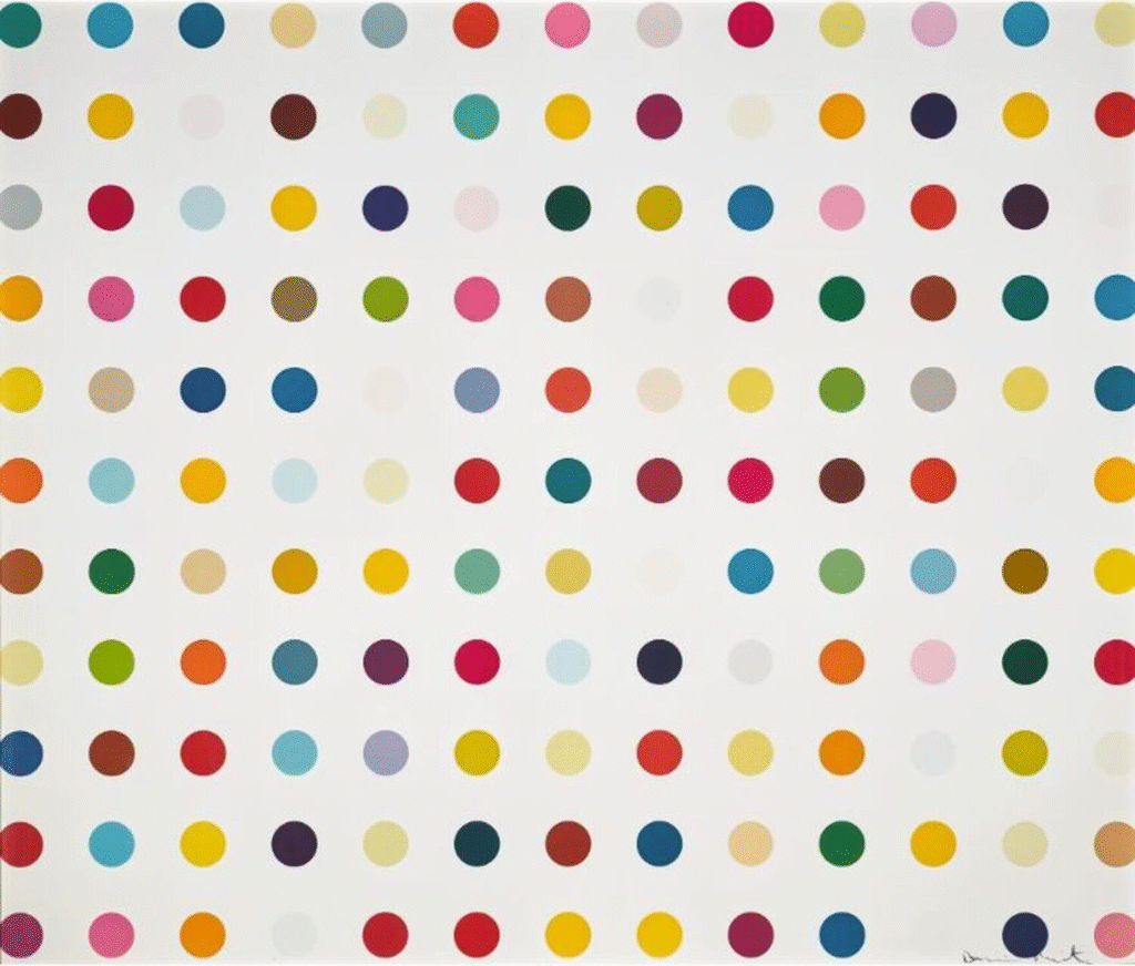
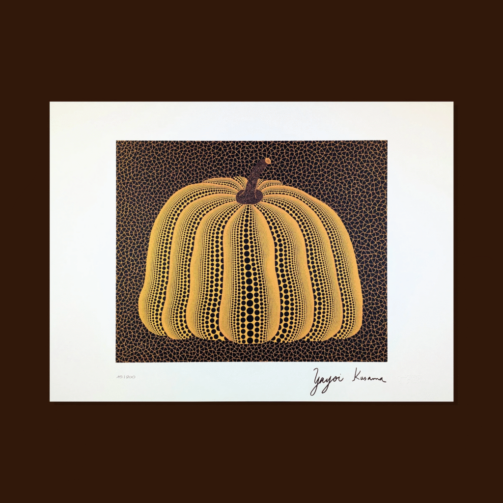
Let’s back up for a second. Dot-based art isn’t new, and the names at the top are familiar. Damien Hirst’s “Pharmaceutical” paintings gave us clean rows of coloured spots, clinical and cool. Yayoi Kusama’s dots are immersive and obsessive. Although they appear hallucinatory, they are still coaxed into a strict form. And Roy Lichtenstein turned comic strip dots into Pop Art gold with his signature Ben-Day patterns.
These artists didn’t just paint with dots. They built empires around them.

But over time, something happened. Dots, which should be playful and poetic, became calculated and constrained. They became symbols of status, theory, and yes … market value. Somewhere along the way, we stopped feeling the dot and started analysing it instead.
Which is why artists like Kat Yew feel like such a breath of fresh air.
When Art Becomes Too Clean-Cut
Damien Hirst didn’t even paint most of his own spot works. He famously outsourced the brushwork to assistants, a conceptual move meant to remove the “artist’s hand” from the equation.
Interesting on paper. But emotionally? It leaves a lot on the table. And he is not alone. Andy Warhol, Mr. Brainwash and Jeff Koons use an army of assistants to manufacture works of art that sell for millions.
But art constructed from precise specifications, while technically perfect, are a bit like elevator music. Slick. Predictable. Pleasant, maybe. But do they stir anything in you? Do they say anything real?
Many younger collectors today aren’t looking for polish. They want rawness. Personality. Mistakes. They want art that makes them feel seen, not just impressed. And that’s where Kat Yew comes in.
Meet Kat Yew: The Artist Who Lets Her Dots Breathe
Kat Yew didn’t start painting because she wanted to follow a trend. She started because she had something to express. And colour, motion, and rhythm were her tools of choice.
Her dots don’t obey any system. They aren’t trying to be part of a brand. They spill across the canvas with purpose but without precision. She paints intuitively, often letting the moment lead. The result is less a pattern and more a pulse.
Her works feel alive because they are. Each piece is an improvisation, not an execution.
As a former accountant, her artwork represents an escape from the rigid, meticulous and organised grip of financial tasks. Kat’s work showcases the opposite of compliance and a hard breakaway from rules-based responsibilities.
Kat has produced over 500 artworks, demonstrating her commitment to developing her skills and growing as an artist.
A Closer Look at Kat Yew’s Work
What do Kat’s dots even mean? That’s the beauty of it. You don’t have to “get” them.
For some, Kat’s dots feel like a release. For others, they’re small explosions of joy, or tiny messengers of energy, chaos, even tenderness. Unlike Hirst’s clinically spaced or Kusama’s manic repetition, Kat’s dots represent the in-between … the spontaneous, the personal, the not-so-polished.
They are unapologetically emotional.
Take her Floating Happiness trio that evokes a breezy, quiet optimism. Each piece buzzes with colour and vitality, practically leaping off the canvas. Placed together, they feel introspective, like a daydream you don’t want to end.

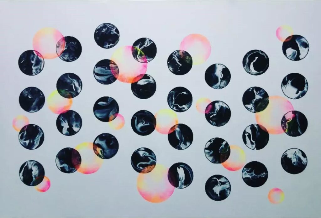
Or look at Black Orbs & Pink Bubbles, an explosion of joy that seems to float mid-laughter. The dots dance like they’re celebrating something you can’t quite explain, but totally understand.
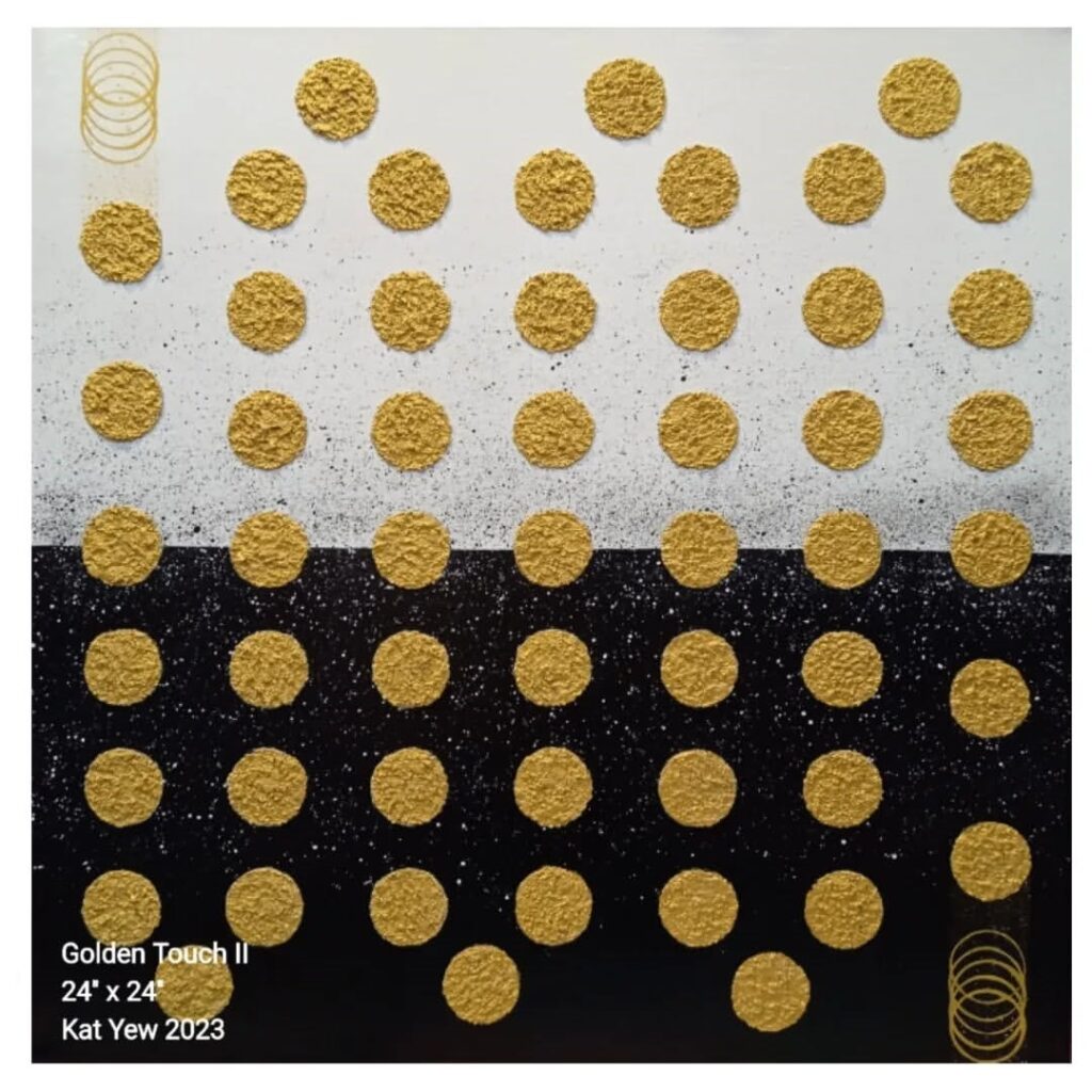
Golden Touch II reimagines minimalism with a circular twist, combining textured raw sand mortar and modeling paste for depth. Accents of gold glitter add a subtle shimmer, bringing elegance and a hint of glamour to its geometric simplicity.
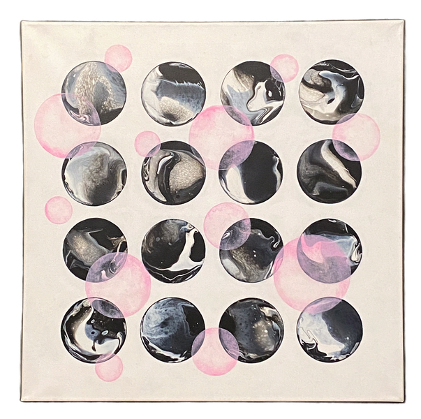
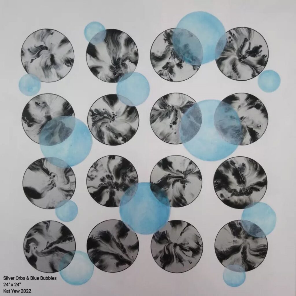
Like its pink counterpart, the Silver Orbs & Blue Bubbles blends geometric structure with fluid acrylic pour techniques. Featuring 16 reverse dips for a soft, abstract floral effect, this piece offers a silvery shimmer contrasted by playful blue accents, elegant with a touch of whimsy.
Dots Gone Rogue
For Kat, her dots don’t ask for permission. They claim their space.
And maybe, that’s the direction dot art needs to head toward … away from perfect grids and into the wild unknown.


