Beyond the predictable parade of burnt orange and generic fall decor, there’s a more nuanced way to approach your autumn colour scheme. It’s one that sees the season as a rich spectrum, not a single theme.
Colour drenching and monochromatic schemes have dominated design conversations for fall. But here, we invite a return to thoughtful contrast and unexpected pairings that feel grounded yet sophisticated.
“Colour is the quickest way to change how a room feels” explains colour psychologist and interior consultant Maria Chen.
For anyone seeking unique autumn colour inspirations, the palettes below offer practical ideas for creating warmth and visual harmony throughout the home.
Warm Neutrals with a Playful Twist
Olive Green | Muted Pink | Warm Taupe | Slate Grey
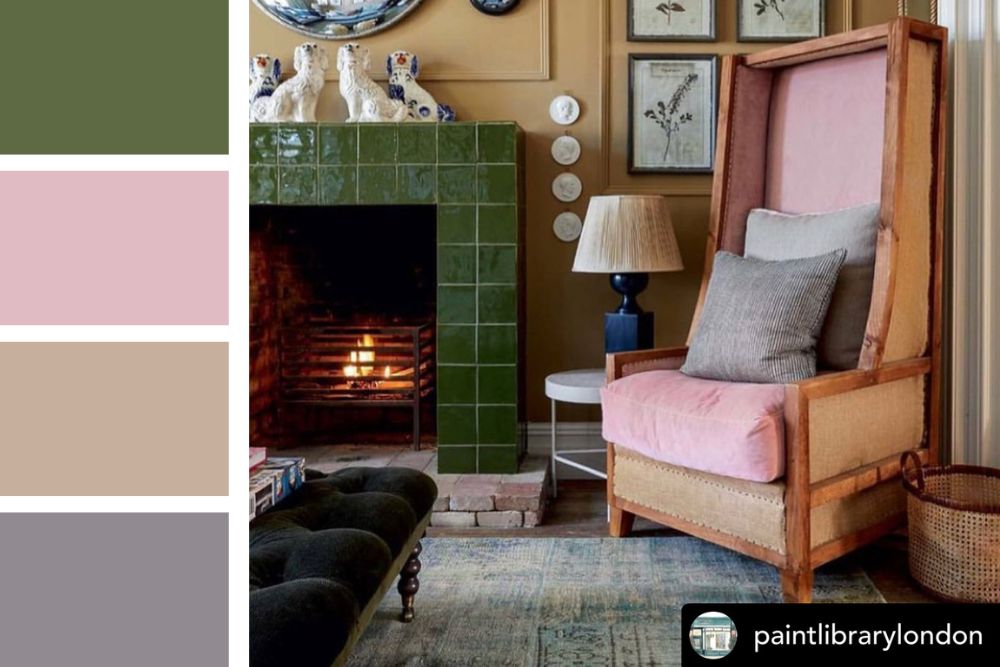
There’s something quietly bold about pairing military-inspired olive with soft dusty pink. The mix feels grounded yet refreshingly modern.
Taupe warms the space without demanding attention, while slate grey adds cool contrast to keep the look from feeling overly delicate. It’s the kind of palette that works for people who want their homes to feel thoughtful rather than themed.
Modern Neutrals with a Pop of Autumn Brights
Charcoal Grey | Crisp White | Mustard Yellow | Natural Wood Brown
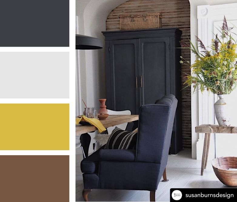
Charcoal and white form the crisp colour foundation that modern interiors love. Mustard yellow adds just enough seasonal warmth to make the space feel inviting.
“The key to mixing contemporary design with seasonal colour is restraint,” notes interior designer James Liu.
This works beautifully in kitchens and dining areas. Charcoal cabinetry pairs with white walls, while wooden tables ground the space. Mustard shows up in fresh flowers, table linens, or a single statement piece. The result feels intentional, not overly styled.
Related: 7 Indigo Colour Combos That Will Make Your Home Pop
Playful Contrast: Orange and Baby Blue
Vibrant Orange | Baby Blue | Soft White | Natural Wood Beige
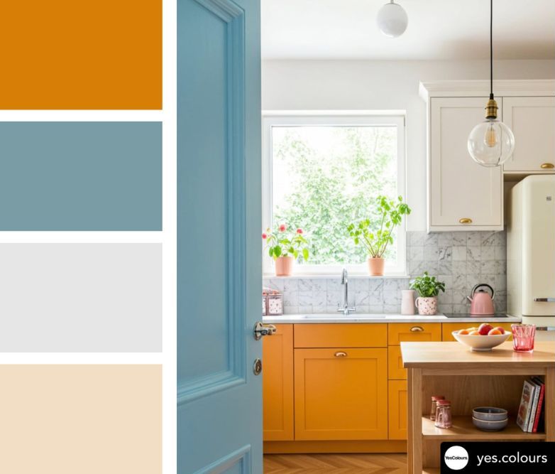
Not every autumn colour palette needs to be quiet, and this one certainly isn’t. This vivid orange colour palette, balanced by baby blue, feels both retro and refreshingly modern. Soft white opens up the space and prevents colour overload, while natural wood beige keeps it grounded and organic.
It works best in spaces where personality matters as much as function, kitchens, creative workspaces, or playrooms where conventional taste takes a backseat to give way to joy. Orange lower cabinets paired with baby blue doors or accent walls create lasting visual interest. White upper cabinets and wooden countertops give the room breathing space.
Luxe Drama: Burgundy and Blush with Gold Accents
Deep Burgundy | Blush Pink | Warm Gold | Marble White
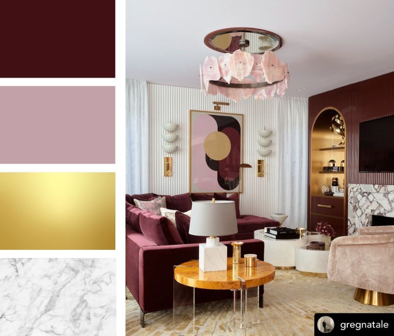
It’s a striking fall colour combination that proves moody tones and metallics can feel just as inviting as traditional autumn shades.
Burgundy adds depth and richness without the heaviness of black. Blush pink softens that intensity with a romantic touch. Gold glows like candlelight, subtle but uplifting. Marble white adds elegance and visual relief.
This palette isn’t for every room, and that’s fine. It works best where you want to make an impression, like the living room, dining area, or main bedroom. It rewards quality over quantity.
Related: 17 Art Gallery Wall Ideas That Decorate Blank Spaces Perfectly
Bold Contrast: Lime Green Meets Warm Neutrals
Lime Green | Warm Beige | Natural Wood Brown | Deep Red-Brown
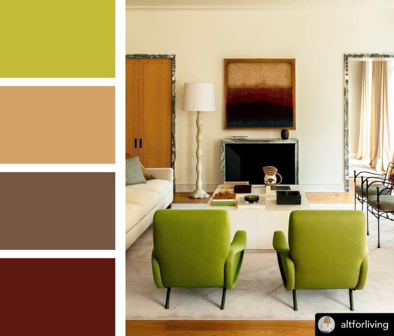
Lime green may seem unusual for an autumn palette. But, when paired with warm beige and natural wood, it brings energy indoors as the world outside slows down. The deep red-brown anchors the unexpected brightness. It provides just enough traditional fall reference to keep the palette seasonal rather than spring-like.
This works beautifully in eclectic living spaces or sunrooms where rules feel optional. Lime green accent chairs against beige sofas and walls create focal points that energise without overwhelming.
Rustic Charm: Poppy Red with Olive Green Accents
Poppy Red | Olive Green | Honey Brown | Charcoal Black
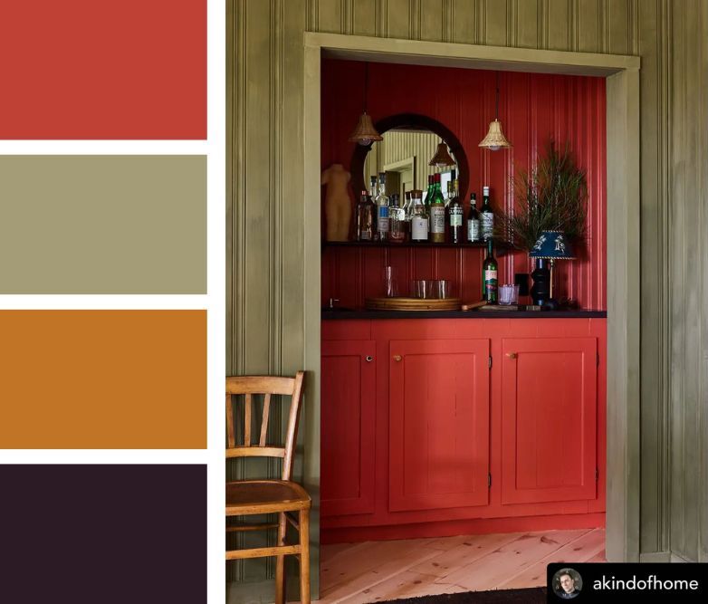
Vintage kitchens and country cottages often return to red and green for good reason. When done in the right tones, the combination feels timeless.
Poppy red adds cheerful warmth. Olive green brings an earthy balance. Honey brown adds natural sweetness, and charcoal black provides the contrast necessary to keep everything sophisticated.
“The mistake people make with traditional colour combinations is using them too cautiously”, explains heritage paint specialist Eleanor Ross.
In practice, use poppy red cabinetry or wall panels with olive green accents. Add honey-toned wooden furniture for warmth, and let charcoal countertops or shelves ground the bolder colours.
Sophisticated Elegance: Chocolate with Marble and Gold
Chocolate | Marble White | Natural Wood | Brushed Gold
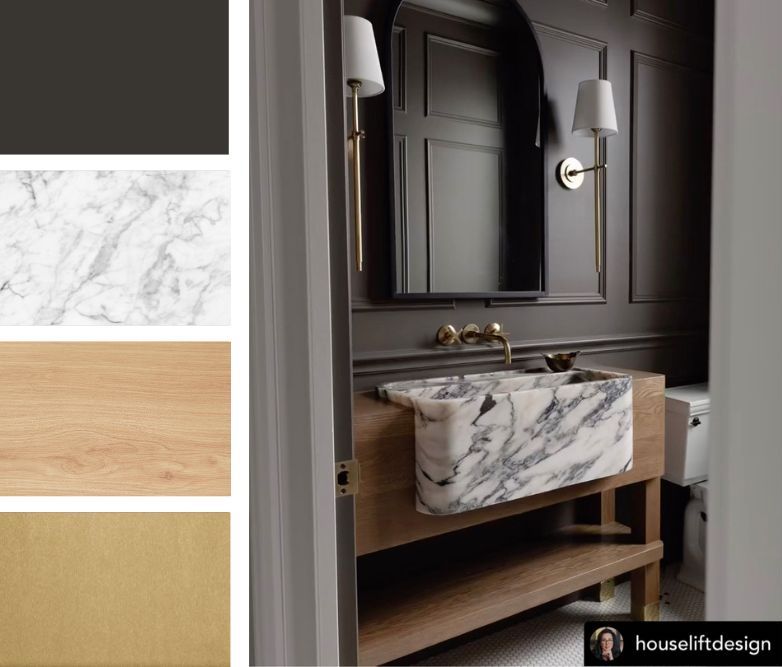
This palette speaks softly of autumn that meets timeless restraint. Chocolate brown creates intimacy and wraps spaces in moody sophistication. Marble white adds luxury through texture and veining. Natural wood keeps the look warm and approachable. Brushed gold fixtures bring a gentle sensuous gleam.
Warm & Inviting: Marigold Yellow with Burgundy
Marigold Yellow | Deep Burgundy | Soft Cream | Dark Espresso
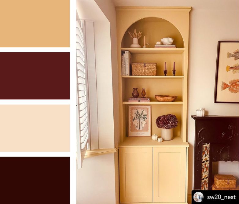
This palette captures autumn’s magical golden-hour afternoons when light seems to gild everything it touches. A marigold yellow bookshelf brings optimism without the glare of gold. Deep burgundy, on candles or flowers, adds depth and seasonal weight. Soft cream walls keep the space light, while the dark espresso sideboard adds structure and balance.
Classic Comfort: Cream and Grey
Warm Cream | Earthy Brown | Muted Grey | Deep Burgundy Red
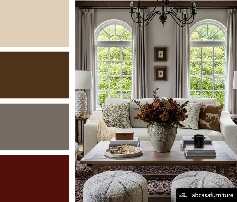
Sometimes the most beautiful autumn palette is the simplest. This scheme layers soft neutrals with care, letting seasonal accents appear naturally instead of taking over.
It’s the kind of palette that works for people who want to acknowledge fall without committing to a complete seasonal overhaul. Those who prefer their spaces to evolve subtly rather than transform dramatically.
Warm cream forms a soft base that works all year. Earthy brown adds natural warmth, muted grey brings calm, and deep burgundy appears in accents like flowers, rugs, or cushions.
The beauty of this approach is its flexibility. You can refresh the look each season by swapping accent pieces, making it perfect for living or family rooms where comfort matters.
Related: 10 Minimalist Home Decor Accessories That Complete Your Space
Soft Serenity: Sage Green, Lavender and Navy
Sage Green | Lavender Purple | Navy Blue | Warm Natural Wood
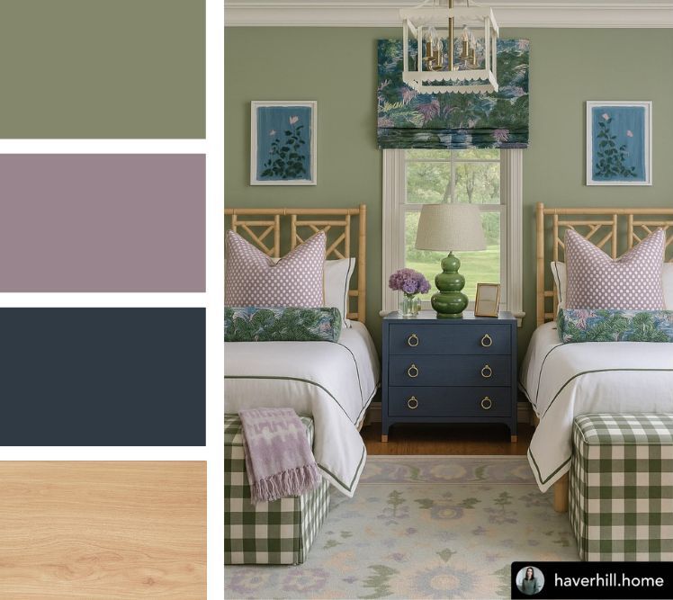
Not every autumn palette needs to announce itself in harvest gold and pumpkin orange. This one speaks in mistier tones, offering a nature-inspired scheme that feels both calming and contemporary.
Sage green brings calm without feeling too earthy. Lavender adds a gentle touch of romance, navy offers depth without darkness, and warm wood connects everything to something recognisable and natural.
Sage green walls, lavender accents, navy details, and natural wood frames create a space that feels like autumn seen through soft lens.