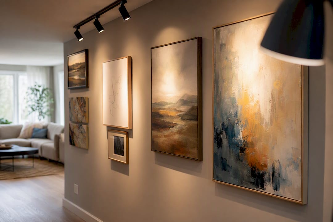
Swap your bulbs to 90+ CRI LEDs at 2700 to 3000K, aim each fixture at roughly a 30-degree angle, and keep light levels between 50 and 200 lux depending on the medium. That single move fixes the three problems that ruin most home art displays: muddy color, flat glare, and light exposure that fades pigments over time.
Do this today:
- Replace the bulb over your most important piece with a 90+ CRI, 2700 to 3000K LED.
- Tilt the fixture until the beam lands on the artwork at about 30 degrees from vertical, not straight on.
- Set a dimmer (or swap in a dimmable bulb) and pull the intensity down until the art reads clearly without glare.
Pro Tip: If you only do one thing this weekend, do the bulb swap. A cheap CRI 80 bulb can wash a warm oil painting into an oddly greenish, lifeless version of itself, while a 95 CRI bulb at the same wattage brings back the actual pigment.
Key Takeaways
The most reliable path to gallery-quality art lighting at home combines 90+ CRI LEDs at 2700 to 3000K, a 30-degree aim angle, and medium-appropriate lux limits.
| Point | Details |
|---|---|
| Prioritize CRI first | Choose 90+ CRI bulbs, 95+ preferred, before worrying about wattage or fixture style. |
| Aim at 30 degrees | Tilt fixtures roughly 30° off vertical, adjusting narrower for glass and steeper for texture. |
| Cap lux by medium | Keep works on paper near 50 lux or below and oils up to roughly 200 lux. |
| Choose LED over halogen | LEDs run cooler, emit negligible UV, and cost less to operate over time. |
| Match your tier to your collection | Start with a bulb swap, move to track lighting, then consider hardwired gallery systems as needs grow. |
Table of Contents
- Why Lighting Matters for Displaying and Preserving Art
- What Are the Key Numbers for Lighting Artwork?
- How Should Lighting Differ by Type of Artwork?
- How Do You Aim and Mount Fixtures to Avoid Glare and UV Damage?
- Controls and Maintenance That Keep Lighting Consistent
- Which Installation Tier Fits Your Home and Budget?
- A Starter Shopping List That Matches the Numbers Above
- Common Mistakes That Ruin an Otherwise Good Setup
- The Numbers Matter More Than the Style
- Frequently Asked Questions
- Sources
Why Lighting Matters for Displaying and Preserving Art
Good art lighting does four jobs at once, and most home setups only manage one of them. The overhead ceiling fixture that lets you see a painting is not the same fixture that makes the painting look right, and it is definitely not the fixture that keeps it safe for the next twenty years.
Visibility is the obvious one. Under-lit art disappears into shadow, and over-lit art washes out into a flat, shiny rectangle. Between those two failures sits a narrow band where detail, brushwork, and depth actually show up.
Color accuracy is where most homeowners lose the game without realizing it. A standard household bulb rated at CRI 80 renders reds as slightly brown and blues as slightly gray. CRI 90+, with 95+ preferred for genuine color fidelity, closes that gap and lets pigments read the way the artist intended.
Focus is a hierarchy problem. A room lit uniformly treats a $2,000 painting the same as the wall it hangs on. Accent light creates a visual pecking order, telling a visitor’s eye where to land first.
Preservation is the quiet stakes behind all of it.
Light damage to artworks accumulates over years and cannot be reversed, which is why conservators advise against hanging anything light-sensitive in direct sunlight and recommend managing total exposure the way you’d manage a budget.
You cannot undo fading. You can only slow it down, and the choices below are about doing exactly that without turning your living room into a museum vault.
What Are the Key Numbers for Lighting Artwork?
Every decision in this guide traces back to a handful of numbers. Once you know them, choosing a fixture or setting a dimmer stops being guesswork.
The 30-degree rule is the backbone of the whole system: tilt downlights so the beam hits the art at about 30 degrees off vertical, which controls glare and reveals texture that flat, head-on light flattens out. Push closer to 45 degrees for heavily textured impasto oil paintings where you want shadow to define brushstrokes, and pull back toward 15 to 20 degrees for glass-covered pieces where reflections are a bigger risk than flatness.
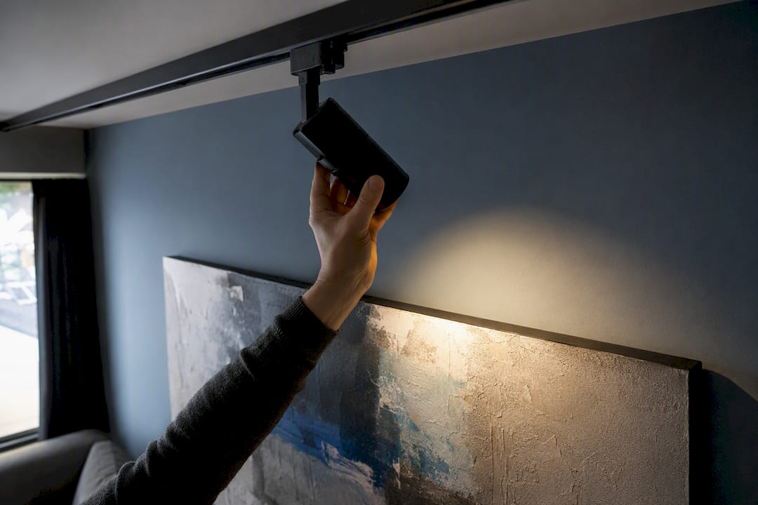
Distance and beam angle scale with your ceiling. On a standard 8-foot ceiling, mount fixtures roughly 2 to 3 feet out from the wall; on a 10-foot ceiling, push that to 3 to 4 feet, and on 12-foot-plus ceilings, expect to move toward 5 feet or use a narrower beam spot to keep the pool of light tight instead of letting it spread into a soft, unfocused wash.
| Factor | Recommended Range |
|---|---|
| Beam angle from vertical | 30° standard, 15° to 20° for glass, up to 45° for texture |
| Fixture distance (8 ft ceiling) | 2 to 3 ft from wall |
| Fixture distance (10 to 12 ft ceiling) | 3 to 5 ft from wall |
| Color temperature | 2700K to 3000K, 3000K as a versatile default |
| CRI | 90+ minimum, 95+ preferred |
| Light level (works on paper) | Around 50 lux or below |
| Light level (oils, acrylics) | allowed higher light levels, up to a moderate lux range appropriate for those media |
Beam width matters as much as angle. A narrow 15 to 25 degree spot suits a small piece, roughly 16 inches or under, where you want a tight, dramatic pool of light. A medium 25 to 40 degree beam covers a typical 24 to 36 inch canvas without spilling onto the frame or wall. Anything larger, including a mural or a gallery wall of grouped pieces, calls for a flood beam or a dedicated wall-washing fixture built to spread light evenly across width rather than concentrate it.
How Should Lighting Differ by Type of Artwork?
Oil paintings tolerate the widest lighting range of any medium, which makes them forgiving for a first attempt. Warmer Kelvin, closer to 2700K, tends to flatter the earth tones and varnish common in older oils, and a steeper beam angle, pushing toward 40 to 45 degrees, brings out visible brushwork and impasto texture that flat light erases.
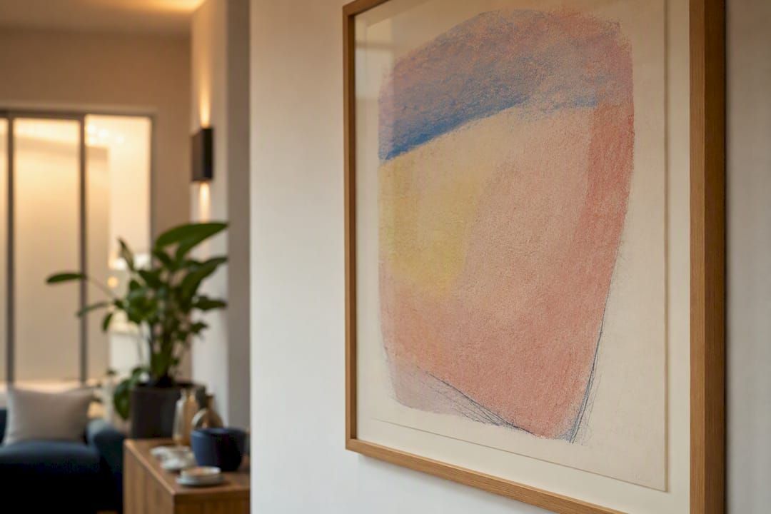
Works on paper and pastels are the strictest category. They call for the low end of the lux range, around 50 or below, because pigments and paper fibers degrade faster under light than oil or acrylic. Frame them under UV-filtering glazing, and place them on interior walls away from windows rather than anywhere that catches indirect daylight through the day.
Photographs, especially black-and-white prints, do best under a neutral color temperature closer to 3500K to avoid an unwanted warm or cool color cast on gray tones. Glass-covered frames need the steeper glare fix: split the beam across two lower-intensity fixtures rather than one strong source, which cuts reflection without losing brightness.
Sculpture is the outlier because form, not a flat surface, dictates the setup.
- Light from two or three angles rather than one to avoid flattening the piece into a silhouette.
- Keep at least one source off-axis from the main viewing angle so shadows carve out dimension instead of hiding it.
- Avoid a single front-on light, which is the single fastest way to make a three-dimensional piece look two-dimensional.
Pro Tip: If a piece sits in a corner or a low-traffic hallway, resist the urge to crank the wattage to compensate for the location. A dimmer, closer fixture at the correct angle beats a brighter one from a bad angle every time.
How Do You Aim and Mount Fixtures to Avoid Glare and UV Damage?
Stand where a typical viewer stands, roughly 3 to 5 feet back from the piece, and check whether the fixture reflects directly into your eye line. If it does, the beam angle needs adjustment before anything else matters. The 30-degree rule exists precisely to keep the reflection point off the artwork’s surface and out of the viewer’s sightline at normal standing height.
Mounting height follows ceiling height in a fairly predictable way. On an 8-foot ceiling, most fixtures land 12 to 18 inches out from the wall at the ceiling line. On 10-foot ceilings, that gap widens to roughly 18 to 24 inches, and on very tall ceilings above 12 feet, a narrower beam spot compensates for the added throw distance so the light doesn’t spread thin by the time it reaches the wall.
Glare on glass-covered pieces has three fixes, roughly in order of effort: re-angle the existing fixture first, since a small tilt often solves it for free; add anti-reflective glazing if the frame allows it; or split one strong source into two softer ones positioned symmetrically, which cancels out the hot spot a single light creates on glass.
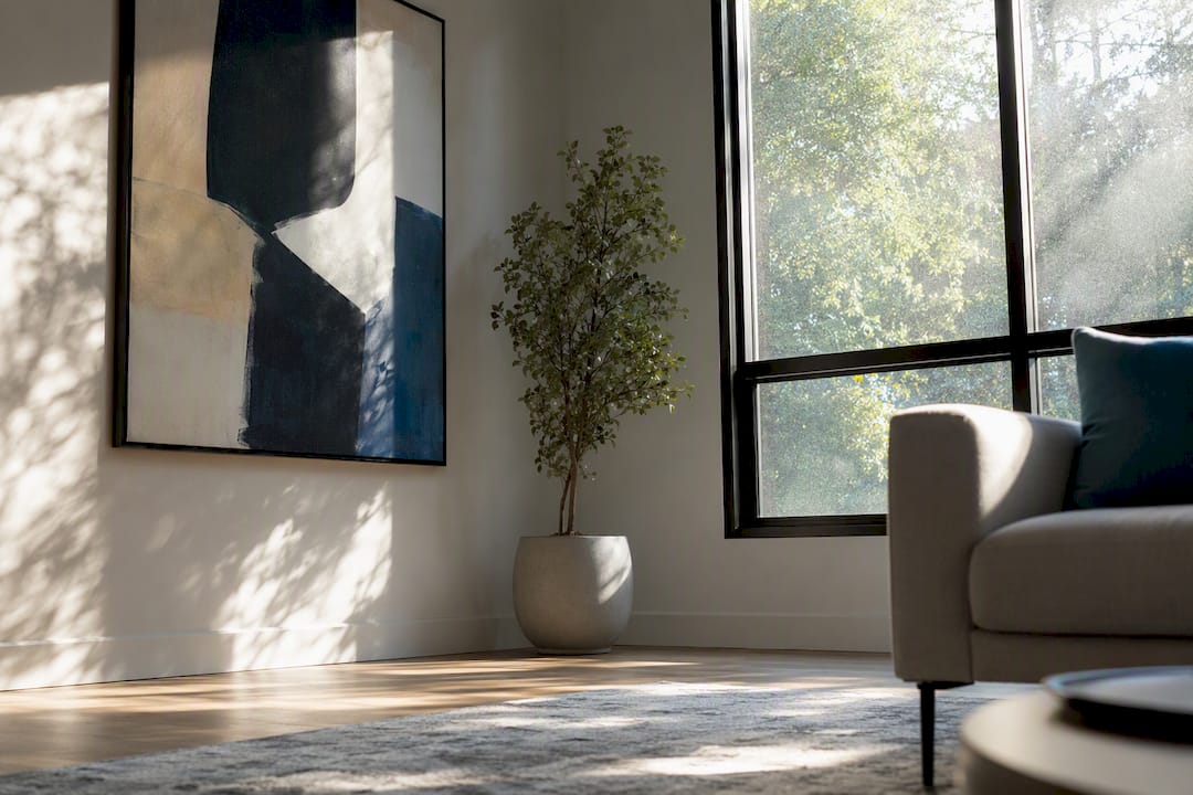
Sunlight is the fix nothing else on this list can substitute for. Direct sun causes accelerated, cumulative fading that no amount of correct artificial lighting can reverse, so any wall that catches direct sun for part of the day is the wrong wall for anything irreplaceable. Where a window can’t be avoided, UV-blocking window film cuts more than 99 percent of incoming UV for a fraction of the cost of replacing faded artwork.
Pro Tip: Track the sun for a full day before you commit to a wall. A room that looks shaded at 9 a.m. can flood with direct afternoon light by 3 p.m., and that’s exactly the kind of exposure conservators warn against.
Controls and Maintenance That Keep Lighting Consistent
A dimmer does two jobs simultaneously: it lets you set the art as the visual focal point of the room, and it reduces the total light exposure a piece accumulates over months and years. Both matter, and most homeowners only think about the first one.
Match Kelvin across every fixture aimed at art in the same room. Mixing a 2700K picture light with a 4000K ceiling can, for instance, creates a visible color clash where one light looks amber and the other looks clinical, even though each is fine on its own. When a bulb burns out, replace both bulbs in a pair or a matched set together rather than one at a time, since even small manufacturing variance between an old and new bulb becomes noticeable under close comparison.
Run this once a year:
- Wipe dust off fixture lenses and shades, since accumulated dust quietly cuts lumen output over time.
- Recheck aim after any furniture rearranging or art rehanging, because a beam that was perfect six months ago drifts out of alignment more easily than people expect.
- For light-sensitive works on paper, a basic lux meter (including inexpensive phone apps) gives a rough check that you’re still in the safe range.
Which Installation Tier Fits Your Home and Budget?
Most homeowners fall into one of three tiers, and the right one depends on how many pieces you own and how often your collection changes.
Tier 1: Quick upgrade. Swap existing bulbs for 95+ CRI A19 LEDs, add a single plug-in picture light over your best piece, and use a floor lamp for secondary accents. No electrician, no rewiring, and it’s the highest-value first move for anyone testing whether better lighting actually changes how a room feels.
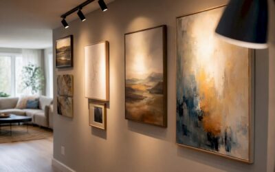
Tier 2: Flexible system. Install a short plug-in or low-voltage track with two to four adjustable heads, letting you rotate and re-aim as your collection grows or moves. Track lighting’s main advantage is reconfiguration: a head can be repointed at a new piece in minutes rather than requiring an electrician revisit.
Tier 3: Gallery-grade. Hardwired track or recessed wall-washer systems with calibrated optics, dedicated dimming circuits separate from general room lighting, and UV-blocking window film where daylight is unavoidable. This tier suits a serious collection or a room built around art display as its primary function.
Choose your tier based on three questions:
- How many pieces do you display, and how often do they rotate?
- Is the room primarily for living, or is art the main event?
- Are you comfortable with a basic DIY bulb and fixture swap, or does the project need an electrician for hardwiring and dedicated circuits?
Tier 1 runs the lowest cost and can be done in an afternoon. Tier 3 involves electrician labor and is worth budgeting as a proper home improvement line item rather than a weekend project.
A Starter Shopping List That Matches the Numbers Above
These picks map directly to the specs covered earlier, so you’re not guessing which bulb or fixture satisfies the CRI, Kelvin, and beam-angle targets already laid out.
- Cree 95 CRI A19 LED bulb: the simplest possible upgrade, dropping into any existing fixture or lamp while hitting the 95+ CRI target with zero rewiring required.
- Cocoweb LED picture light: a dedicated, purpose-built fixture that mounts above a frame and delivers the even, angled wash a picture light is designed for, available in both hardwired and plug-in versions.
- Juno Trac-Master compatible track heads and sections: the backbone of a Tier 2 setup, giving you independently aimable heads on a system you can extend as your collection grows.
- Gila UV-blocking window film: an inexpensive add-on for any wall near a window, cutting the UV exposure that no amount of correct artificial lighting can compensate for.
- Brightech Sky LED floor lamp: a flexible, no-installation accent option for renters, secondary pieces, or rooms where a hardwired fixture isn’t practical.
Layer these with your existing ambient room lighting rather than replacing it entirely. Layered lighting, ambient plus accent plus task, is what makes a room feel curated instead of like a spotlight aimed at a single object in an otherwise dark space.
Common Mistakes That Ruin an Otherwise Good Setup
Overlighting is the most common error, and it’s easy to self-diagnose: if the art looks shinier or flatter than it does in daylight, or a viewer squints when they walk up to it, dial the dimmer down until detail returns instead of glare.
Wrong color temperature shows up as a subtle “off” feeling you can’t quite name. Hold a 2700K bulb next to a 4000K one side by side and the mismatch becomes obvious immediately; standardize on one range per room.
Glare and reflections usually trace back to beam angle, not the fixture itself. Re-aim toward 30 degrees before assuming you need new equipment or added glazing.
Mixed CRI sources, like a CRI 95 picture light next to a CRI 80 ceiling can, create a visible split in how colors render across the same wall. Replace the weaker bulb rather than living with the inconsistency.
The Numbers Matter More Than the Style
Most art lighting advice online focuses on aesthetics: warm versus cool, dramatic versus subtle. That framing misses the point. The numbers, CRI, Kelvin, angle, and lux, are what actually determine whether a painting looks correct and survives the next decade in good condition. Style is a downstream decision once those numbers are locked in.
The tier system in this guide exists because most advice assumes an unlimited budget or a dedicated gallery room, neither of which describes a typical home. A $30 bulb swap solves 70 percent of the problem for most people, and that’s worth saying plainly instead of pushing straight to a hardwired system nobody asked for.
If there’s one place conventional advice undersells the stakes, it’s UV exposure from windows. Homeowners obsess over fixture choice while a sunlit wall does more damage in a single afternoon than a mismatched bulb does in a year. Fix the window before you fix the fixture.
Frequently Asked Questions
What is the best color temperature for lighting art?
Most paintings and photo prints look best between 2700K and 3000K, with 3000K serving as a versatile default across a mixed collection.
How far should a light be from a painting?
On a standard 8-foot ceiling, mount fixtures roughly 2 to 3 feet out from the wall; scale that distance up to 3 to 5 feet as ceiling height increases.
Do LED lights damage artwork?
LEDs emit essentially no UV and produce far less heat than halogen or incandescent bulbs, making them one of the safest light sources for displayed art when kept within recommended lux ranges.
What angle should picture lights be at?
Aim for roughly 30 degrees off vertical as a baseline, adjusting steeper for textured oils and shallower for glass-covered pieces to control glare.
Is natural light bad for artwork?
Direct sunlight causes cumulative, irreversible fading, so light-sensitive pieces should never hang in direct sun; UV-blocking window film is a low-cost safeguard for walls near windows.
Ready to turn these numbers into a finished room instead of a to-do list? Artinlifestyle’s Art Concierge service pairs you with hands-on guidance for choosing fixtures, aiming them correctly, and building an installation plan that matches your collection and your budget.
Sources
LED has effectively won this argument. LEDs emit essentially zero UV compared with halogen and incandescent sources, run cooler so they don’t bake a canvas from six inches away, and use meaningfully less energy over the life of the bulb. Halogen still shows up in older picture lights and looks warm and flattering at first glance, but the UV output and heat make it a worse long-term choice for anything you actually care about preserving.
Fixture type depends on your collection and how often it changes:
- Art Lighting Masterclass: The Complete Guide
- How to Light Artwork – Walls & Gallery Lighting | Lutron
- Protection from light damage | NEDCC
- How to light your artworks | Christie’s
Before you buy anything, check five specs on the product page: CRI (90 minimum), Kelvin (2700 to 3000K), beam angle (matched to your artwork’s size using the ranges above), dimmability (non-negotiable if you want to control lux), and lumen output (more isn’t automatically better once you’re past the point of even, glare-free coverage); for detailed guidance, see the Revit Rendering Settings Checklist for Architects. Skipping any one of these five is how people end up with a fixture that looks fine in the store and wrong on the wall.
Recommended
- Jonathan Adler’s New Art Collection Bursts With Summer Colour
- Beautiful House Garden: Art-Inspired Ideas and Weekend Plan
- 17 Art Gallery Wall Ideas to Decorate Blank Spaces Perfectly