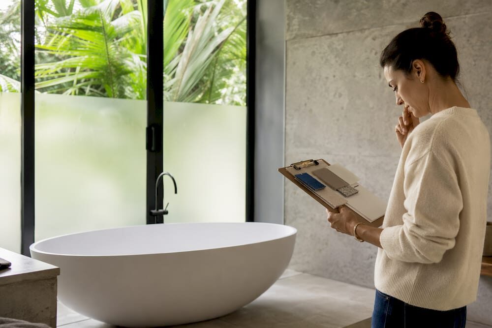
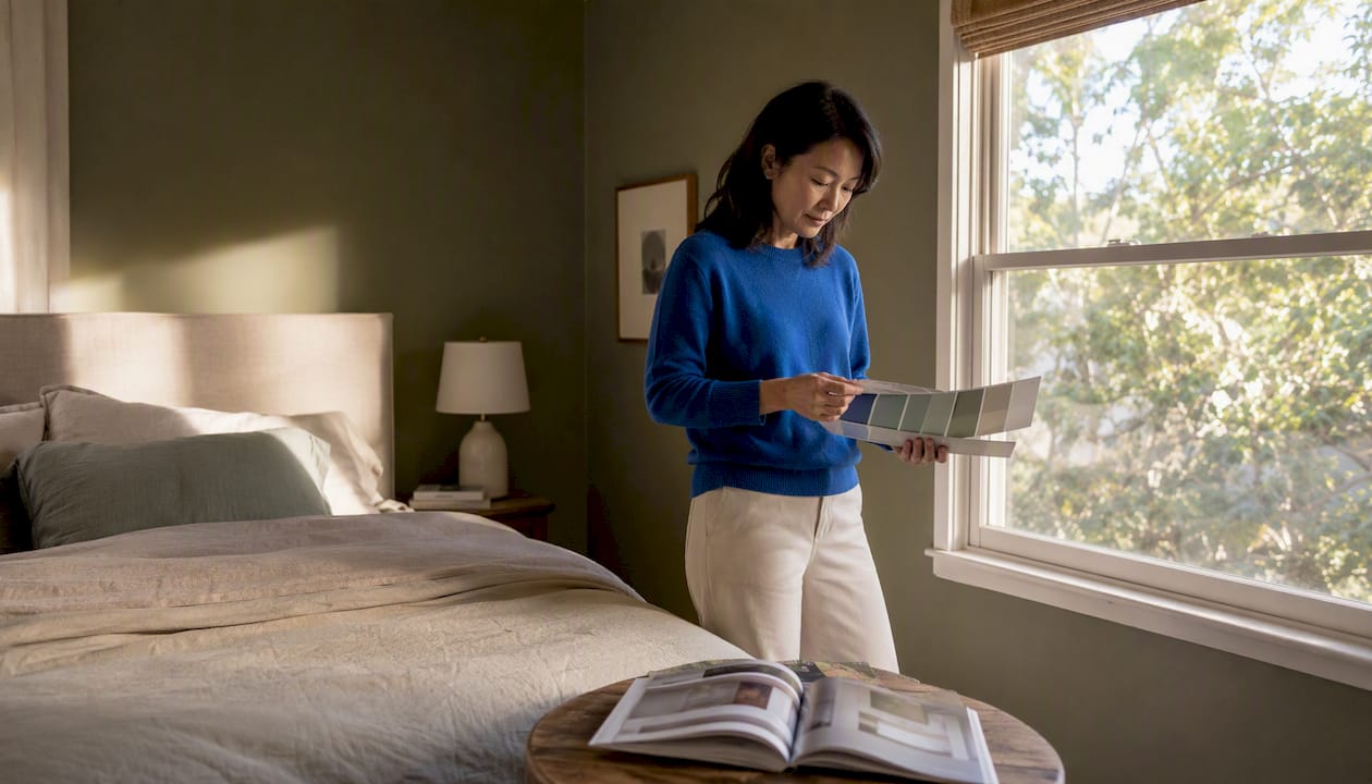
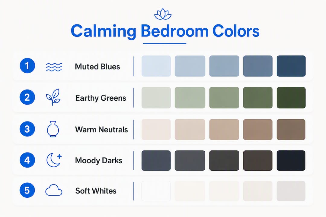
Muted blues, earthy greens, and warm neutrals are the most reliably calming bedroom colors — and three shades worth sampling right now are Benjamin Moore’s Quiet Moments (a soft blue-gray), Sherwin-Williams’ Softened Green, and Benjamin Moore’s Coventry Gray. Research linking muted blues and greens to reduced stress found that soft, muted blues specifically correlate with lower heart rate and reduced stress response in controlled observations. The Sleep Foundation reinforces this, recommending low-contrast, muted shades over bright or highly saturated hues for any bedroom meant to support genuine rest. Before committing to a full gallon, test peel-and-stick swatches or brush-on sample spots in your actual room light — morning, midday, and evening — because the same shade can read entirely differently depending on your windows and bulbs.
Table of Contents
- What are the best calming bedroom colors by family?
- How do you pick the right calming paint for your bedroom?
- How do you layer a calming palette across walls, trim, and textiles?
- Which colors and finishes undermine a restful bedroom?
- How do you test paint colors in your bedroom before committing?
- How does paint finish affect the mood of a bedroom?
- Why do designers keep returning to muted, nature-inspired tones?
- Key Takeaways
- The room that finally lets you exhale
- Artinlifestyle has more to help you design your restful space
- Useful sources and tools
What are the best calming bedroom colors by family?
Color psychology in interior design groups soothing bedroom colors into three primary families, each with a distinct sensory character. Understanding why each family works helps you choose with confidence rather than guessing from a chip rack.
Muted blues
Soft blue is the quiet hero of bedroom color. Its association with open sky and still water triggers a physiological slowdown — slower breathing, lower perceived tension. The key word is muted: a powdery, gray-leaning blue reads as restful, while a saturated cobalt reads as electric.
- Benjamin Moore Quiet Moments (a blue-gray with subtle lavender undertones)
- Benjamin Moore Morning Dew (a pale, cool blue with green undertones)
- Sherwin-Williams Sleepy Blue (a soft, dusty blue with gray depth)
- Sherwin-Williams Upward (a light, airy blue that reads almost neutral in low light)
Earthy greens
Biophilic design research consistently points to green as a visual rest trigger — the eye requires almost no adjustment to focus on green wavelengths, which reduces ocular fatigue. Earthy, moss-toned greens feel grounded rather than clinical.
- Benjamin Moore October Mist (a soft sage with warm gray undertones)
- Sherwin-Williams Softened Green (a muted, warm-leaning sage)
- Sherwin-Williams Retreat (a deeper, forest-adjacent green that reads moody without going dark)
- Benjamin Moore Pale Avocado (a warm, yellow-green that pairs beautifully with natural wood)
For readers drawn to green color combinations, pairing any of these with warm wood tones and off-white trim creates a palette that feels genuinely organic.
Warm neutrals and soft greiges
Warm neutrals are the most forgiving calming family — they work in nearly every light condition and with almost any furniture style. A greige (gray-beige hybrid) with a warm undertone reads as cozy without the yellow cast that makes some beiges feel dated.
- Benjamin Moore Pale Oak (a warm greige with pink-beige undertones)
- Sherwin-Williams Accessible Beige (a classic warm greige, slightly cooler than Pale Oak)
- Benjamin Moore White Dove (a creamy off-white that functions as a neutral base)
- Sherwin-Williams Antique White (a warm, slightly golden neutral that softens a room without yellowing)
A note on moody, darker calming options
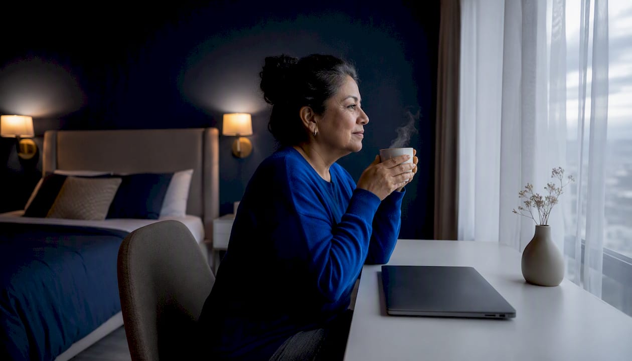
Deeper, low-saturation shades — think dusty slate, muted charcoal-blue, or dark olive — can create a cocooning effect that many people find deeply restful. Dark bedroom color ideas work best in rooms with controlled light (blackout curtains, dimmable fixtures) where the depth of the wall color wraps the space rather than closing it in.
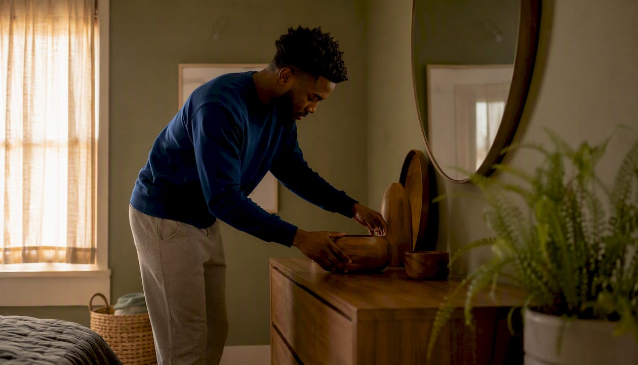
Pro Tip: Undertones shift dramatically under different light sources. A blue-gray that looks serene under daylight can turn lavender under warm incandescent bulbs. Always evaluate your swatch under the actual bulbs you plan to use in the room — not just by a window.
How do you pick the right calming paint for your bedroom?
Choosing a soothing paint color is less about picking a favorite shade and more about reading your room honestly. Work through these steps before ordering a single sample pot.
- Assess your natural light direction. East-facing rooms get warm morning light and cool afternoon light; west-facing rooms do the opposite. North-facing rooms stay cool and flat all day, which means warm-undertone neutrals and greens tend to perform better than cool blues. South-facing rooms can handle almost any muted shade.
- Identify your fixed undertones. Look at your flooring, existing trim, and any furniture you’re keeping. Warm wood floors and cream trim call for warm-undertone paints (greiges, warm greens). Cool gray floors or white trim pair more naturally with cool blues and soft greiges.
- Evaluate contrast level. High contrast between walls, trim, and ceiling creates visual stimulation — the opposite of calm. Aim for a low-contrast palette where wall, trim, and ceiling shades share the same undertone family.
- Consider the room’s function. A master bedroom used only for sleep benefits from the most muted, low-saturation shades. A guest bedroom that doubles as a home office can tolerate slightly more color depth without disrupting its primary function.
- Choose your finish last. Finish affects how much light a wall reflects and therefore how the color reads.
| Finish | Light Reflection | Mood Effect | Best Use |
|---|---|---|---|
| Flat/Matte | Very low | Softest, most absorbed color — reads calmest | Primary bedroom walls |
| Eggshell | Low-moderate | Slight sheen adds warmth; easy to wipe | Bedroom walls with kids or pets |
| Satin | Moderate | More reflective; can amplify color intensity | Trim, doors, high-traffic surfaces |
For rooms where size is a concern, lighter muted shades expand perceived space, while deeper moody tones shrink it — but in a way that can feel intentional and enveloping rather than cramped, provided the room has adequate light control.
How do you layer a calming palette across walls, trim, and textiles?
The low-contrast principle is the single most effective tool for reducing visual stimulation in a bedroom. When walls, trim, and ceiling share the same undertone family — even if they differ in depth — the eye moves around the room without snagging on hard edges. Benjamin Moore’s curated soothing collections are built around this principle, pairing wall shades with coordinating trim and ceiling options.
Three palettes worth copying:
-
Soft blue palette: Walls in a muted blue-gray (Quiet Moments or Sleepy Blue), trim in a warm white with matching gray undertone (Benjamin Moore Chantilly Lace or White Dove), ceiling in the same wall color lightened by 50%. Accent with natural linen bedding and a warm walnut nightstand. The accent color pairings for blue walls guide at Artinlifestyle goes deeper on this combination.
-
Earthy green palette: Walls in October Mist or Softened Green, trim in a creamy off-white, ceiling in the trim color. Layer in a jute rug, terracotta ceramic lamp base, and soft blush throw. The warm earth tones act as warmth multipliers, pulling the green toward organic rather than clinical.
-
Warm greige palette: Walls in Pale Oak or Accessible Beige, trim and ceiling in White Dove or Antique White. Add soft charcoal linen curtains and a natural fiber rug. This palette is the most universally forgiving — it reads as calm in virtually any light condition and with almost any furniture style.
Both Benjamin Moore’s Color Portfolio app and Sherwin-Williams’ color visualizer let you upload a photo of your actual bedroom and preview shades in context — a genuinely useful step before buying samples.
Which colors and finishes undermine a restful bedroom?
Some colors and surface treatments actively work against sleep hygiene, even when they look appealing in isolation.
- High-saturation reds and oranges stimulate the nervous system and raise perceived room temperature. Even a single accent wall in a warm, vivid red can disrupt the visual quietness a bedroom needs. Alternative: a dusty terracotta or muted clay at low saturation.
- Neon or bright whites create a clinical, high-contrast environment that keeps the eye alert. Bright white trim against a muted wall can undercut an otherwise calm palette. Alternative: a warm off-white like White Dove or Antique White.
- Icy cool grays with strong blue or green undertones can feel sterile and cold, particularly in north-facing rooms with limited natural light. Alternative: a warm greige or a gray with a subtle beige undertone.
- High-gloss wall finishes reflect light in ways that create visual activity — every shadow and imperfection becomes visible, and the room never fully settles. Alternative: flat or eggshell on walls, reserving satin for trim only.
- Metallic sheens on large surfaces amplify light movement and add visual noise. Alternative: matte metallics or warm brass used sparingly as hardware accents.
The Sleep Foundation’s guidance on bedroom environments specifically flags high-contrast and highly saturated palettes as counterproductive to sleep hygiene — a useful reminder that color choice is genuinely functional, not purely aesthetic.
How do you test paint colors in your bedroom before committing?
The single most common painting mistake is choosing a color from a chip under store lighting and skipping in-room testing. A shade that looks perfect in the paint aisle can feel entirely wrong once it covers four walls. Follow this protocol instead.
- Order sample pots or peel-and-stick swatches from Benjamin Moore or Sherwin-Williams. Both brands offer peel-and-stick options that require no painting and leave no residue.
- Paint or place large samples — at least 12 inches by 12 inches — on poster board or directly on the wall in two or three locations: near a window, on an interior wall, and adjacent to your trim.
- Observe at three times of day: morning (natural light entering), midday (brightest natural light), and evening (artificial bulbs only). Note how the undertone shifts at each stage.
- View samples next to your fixed elements — flooring, trim, bedding, and any furniture staying in the room. Undertones that clash with existing finishes will be immediately visible.
- Photograph samples at night under your actual bedroom bulbs and review the images on a screen with neutral calibration. This reveals how the color will read during the hours you spend most time in the room.
Pro Tip: Benjamin Moore’s undertone guidance recommends testing swatches against your trim before finalizing — the trim undertone either harmonizes or fights the wall color, and you won’t see the conflict until both are in the same frame.
How does paint finish affect the mood of a bedroom?
Finish is the quiet variable most homeowners overlook. Two walls painted in the same color but different finishes will read as noticeably different shades — the higher the sheen, the more light the surface reflects, and the more the color appears to shift and intensify.
- Flat/matte absorbs light rather than bouncing it, which makes color appear softer and more settled. Rooms painted in flat finishes tend to feel quieter and more enveloping — the walls recede rather than assert themselves.
- Eggshell offers a barely perceptible sheen that adds a subtle warmth to muted shades. It also tolerates gentle cleaning, making it the practical choice for most bedrooms.
- Satin on trim and doors adds a clean, defined edge without introducing gloss to large surfaces. Keeping wall sheen low while using satin on trim creates a refined contrast that reads as intentional rather than stimulating.
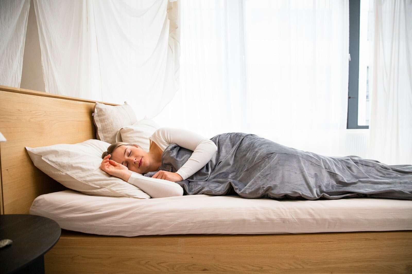
Textured materials amplify these effects. Linen bedding, wool throws, and natural fiber rugs introduce what designers call visual rest — the eye reads texture as warmth rather than pattern, which reduces stimulation. Smooth, hard surfaces (lacquered furniture, glossy ceramics) do the opposite. If a full repaint feels impractical, layering natural materials over existing walls often achieves a comparable calming effect, as Benjamin Moore’s project guidance notes — linen bedding, natural fiber rugs, and warm wood tones can reduce visual stimulation without touching a single wall.
Pro Tip: If you need a cleanable surface but want the calm of flat paint, choose eggshell rather than satin for walls. The difference in sheen is subtle, but eggshell keeps the color reading soft while still tolerating a damp cloth.
Why do designers keep returning to muted, nature-inspired tones?
The answer sits at the intersection of color psychology and sensory design. Research on color and psychological response links soft, muted blues and greens to measurably lower heart rate and reduced stress response — a finding that aligns with what designers have observed empirically for decades. The Calm Blog’s overview of color therapy describes cool tones as capable of reducing perceived anxiety when used deliberately in designed environments, which is precisely what a bedroom is.
Designer Kimberly Oxford frames it this way: true tranquility in a bedroom comes from layering color, materials, and lighting to quiet the nervous system — paint is only one part of the equation. A muted blue wall paired with warm linen and a dimmer-controlled lamp does more for sleep than the same blue wall under harsh overhead lighting with synthetic bedding.
The practical application of this thinking comes down to two moves. First, choose a wall color from a muted, nature-adjacent family — soft blue, earthy green, or warm greige — and keep its saturation low. Second, treat every other surface and material in the room as part of the same palette: warm wood, natural fiber, soft textile. The 2026 bedroom trends tracked by Artinlifestyle show this layered, nature-inspired approach as the dominant direction in residential design right now, which means the palette choices covered here are both timeless and current.
Key Takeaways
Muted blues, earthy greens, and warm neutrals are the most reliably calming bedroom colors — and the right finish and undertone matter as much as the color family itself.
| Point | Details |
|---|---|
| Start with three sample shades | Order peel-and-stick swatches in one blue, one green, and one warm neutral before buying a full gallon. |
| Test at three times of day | Morning, midday, and evening light shift undertones significantly — observe all three before deciding. |
| Keep contrast low | Match wall, trim, and ceiling undertones to the same family; high contrast creates visual stimulation. |
| Choose flat or eggshell for walls | Flat absorbs light for maximum calm; eggshell balances softness with cleanability for most bedrooms. |
| Artinlifestyle design guides | Artinlifestyle’s curated color and trend guides help readers connect paint choices to full-room palettes. |
The room that finally lets you exhale
There is a particular quality of stillness that a well-chosen bedroom color creates — not silence exactly, but a kind of visual permission to slow down. Walking into a room painted in a soft sage or a dusty blue-gray, with warm linen on the bed and low light on the walls, feels less like entering a space and more like setting something down. That feeling is not accidental. It is the result of deliberate choices: the right color family, tested in real light, layered with materials that share its quiet register. The steps in this guide — choosing a family, sampling three shades, testing across the day, matching undertones, picking a finish — are not complicated. They are simply the difference between a bedroom that looks calm in a photo and one that actually feels calm when you close the door.
Artinlifestyle has more to help you design your restful space

Artinlifestyle’s editorial team curates design guidance that goes beyond paint chips — connecting color choices to full-room palettes, furniture, art, and the small material decisions that make a space feel genuinely considered. If this guide helped you narrow down a color direction, the 2026 home trends and interior design guide at Artinlifestyle is a natural next step: it maps the broader palette and material directions shaping bedrooms and living spaces this year, giving you the context to make choices that hold up over time. For readers who want to add art to a calming bedroom without disrupting a low-contrast palette, the abstract line art feature on Kat Yew shows how carefully chosen artwork can reinforce stillness rather than compete with it. Browse both, then take the smallest possible next step: order three sample pots and put them on the wall this weekend.
Useful sources and tools
- Study: muted blues and greens linked to reduced stress response
- Sleep Foundation: bedroom color and sleep guidance
- Calm Blog: color therapy techniques and calming tones
- CamilleStyles: calming bedroom colors and designer tips
- Kimberly Oxford: designer perspective on layering for calm