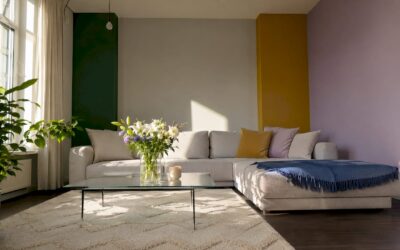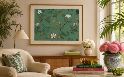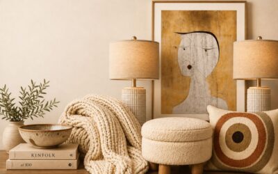
Accent walls are not out of style in 2026. The concept, formally called a “feature wall” in architectural and interior design practice, has simply matured. The flat, high-contrast painted wall that defined the 2010s is now considered a dated approach. What replaced it is more considered: texture, materiality, and tonal cohesion tied directly to a room’s architecture. Design guidance across the industry now treats the feature wall as a structural contribution to a space, not a decorative afterthought. The result is a trend that feels quieter, richer, and far more lasting.
Are accent walls out of style in 2026, or just evolving?
The traditional single bright flat-painted accent wall is out of style in 2026, replaced by texture and tonal cohesion tied to room architecture. That shift is significant. It means the question is not whether to use a feature wall, but how to use one correctly.
Designer Emily LaMarque frames the change well. She describes the shift from addition to contribution: a feature wall should support the room’s narrative and architecture, not compete with it. A bold teal wall dropped into a beige room without any textural or tonal connection is the version of the trend that feels dated. A limewash wall in a warm ochre that deepens the tone of adjacent furnishings is the version that feels permanent.

The most effective accent walls in 2026 combine architecture-driven design with surface texture, avoiding high-contrast flat colors. Walls treated with limewash or board and batten in tonal hues add architectural weight. They feel like they grew from the room rather than being applied to it.
What design principles define on-trend feature walls for 2026?
Six principles separate a well-executed feature wall from one that will feel tired in two years.
- Architectural integration. The wall should feel like part of the room’s bones. Fluted panels, board and batten, and wood slats all add physical dimension that flat paint cannot replicate.
- Texture over flat color. Materials like limewash, microcement, stone veneer, and wood slats are the dominant surface treatments in current design guidance. Each one catches light differently and changes character throughout the day.
- Tonal cohesion, not sharp contrast. The goal is depth, not drama. Choose a color from the same family as your furnishings and go two to three shades deeper.
- Unbroken wall surface. A wall interrupted by multiple doors, windows, or radiators loses its visual authority. Walls behind key furniture pieces, such as sofas, headboards, and dining tables, create the strongest focal points.
- LRV discipline. Light Reflectance Value (LRV) measures how much light a color reflects on a scale of 0 to 100. Designers recommend an LRV difference of 20–30 points between the feature wall and adjacent walls. Below that threshold, the contrast reads as accidental rather than intentional.
- Restraint elsewhere. Professionals apply the 60-30-10 color rule where the accent wall acts as the 30% secondary color. Strong feature walls require restraint in furniture and decor to maintain harmony.
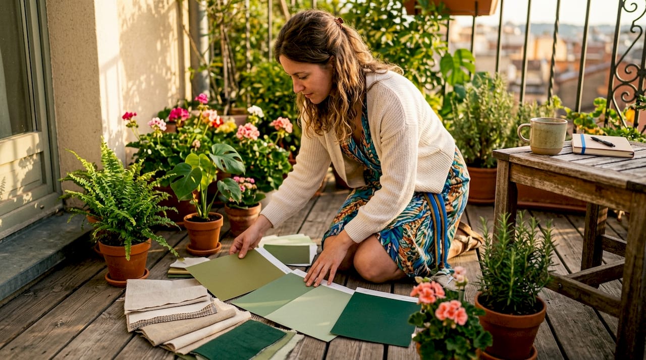
Pro Tip: Before committing to a material or color, pin a large sample to the wall and live with it for 48 hours across different lighting conditions. Morning light and evening lamplight will tell you more than any color card.
Which colors and materials are trending for accent walls in 2026?
Earth-inspired palettes dominate accent wall design this year. Deep navy, indigo, sage green, eucalyptus, terracotta, and macchiato are the tones appearing most consistently across design publications and professional portfolios. Pantone’s 2026 Color of the Year, “Cloud Dancer,” functions as an ideal neutral backdrop that allows richer accent tones to breathe without overwhelming a space.
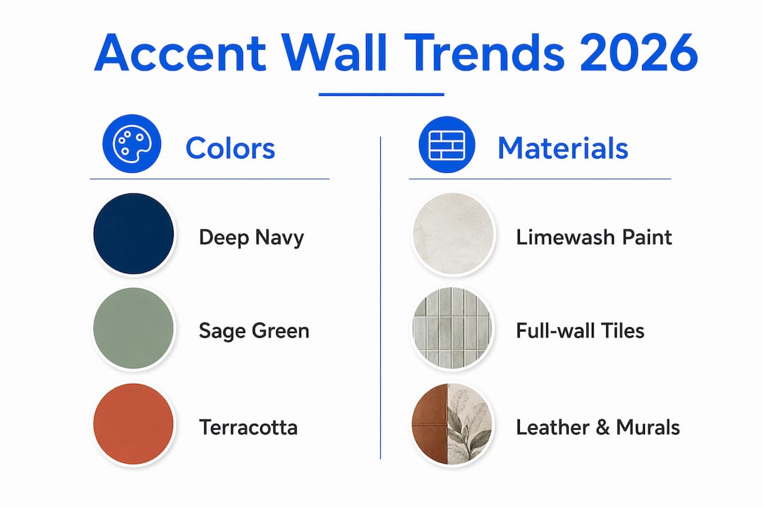
Room orientation shapes which colors work. South and west-facing rooms receive warm, direct light that can handle deep navy and indigo (LRV below 15) without feeling oppressive. North-facing rooms, which receive cooler, indirect light, benefit from warmer earth tones like terracotta and macchiato that compensate for the lack of natural warmth.
| Material | Best room use | Renter-friendly? |
|---|---|---|
| Limewash paint | Living rooms, bedrooms | Yes |
| Wood slat panels | Living rooms, home offices | Yes (removable) |
| Microcement | Dining areas, bathrooms | No |
| Peel-and-stick murals | Bedrooms, nurseries | Yes |
| Stone veneer | Fireplaces, entryways | No |
| Large-scale tapestries | Bedrooms, studios | Yes |
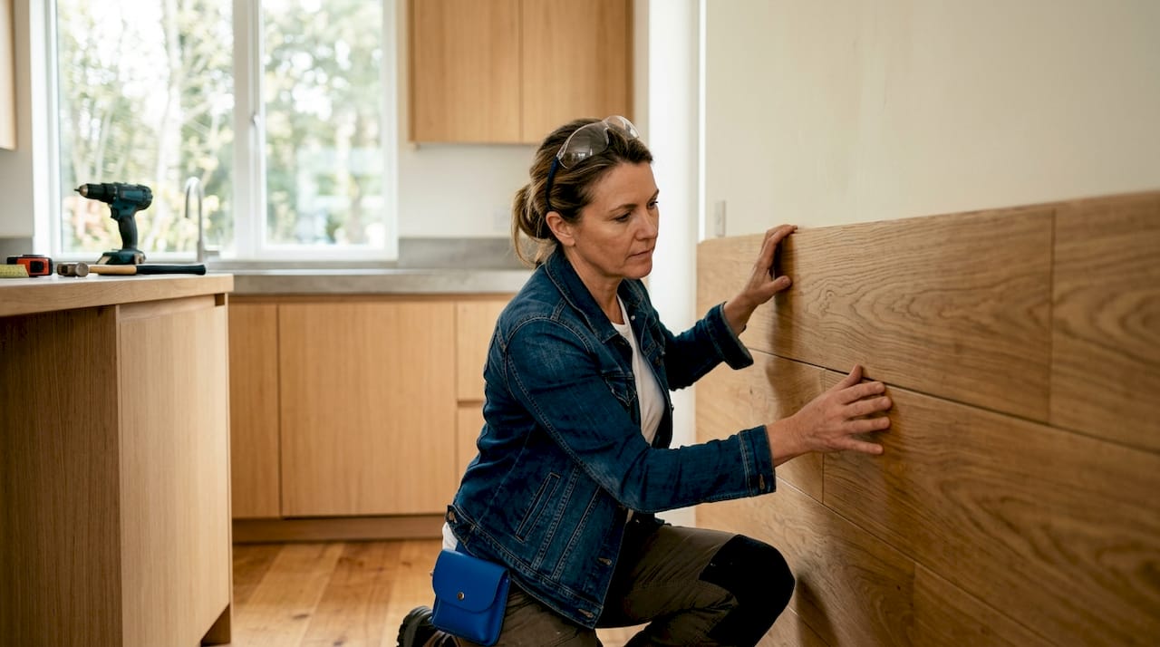
Textured, curated accent walls using materials like full-wall tiles, leather, murals, and tapestries add depth and personality while maintaining modernity. For renters, peel-and-stick panels and tapestries offer the same visual weight without permanent alteration. You can also explore wood panel treatments for a tactile, architectural finish that works in almost any room.
Pro Tip: In a north-facing room, avoid the temptation to go bold with a dark feature wall. A warm terracotta or clay tone will make the space feel grounded and inviting rather than dim.
What mistakes do homeowners make with accent walls?
Most feature wall failures come down to a handful of recurring errors. Recognizing them before you start saves both money and frustration.
- Choosing a wall with too many interruptions. A wall broken by two doors and a window has no visual authority. The eye has nowhere to rest. Selecting unbroken walls behind principal furniture is the single most reliable rule in feature wall placement.
- Ignoring LRV and lighting. Dark colors in poorly lit or north-facing rooms create a muddy, oppressive atmosphere. The LRV mismatch between the accent wall and the room’s natural light is one of the most common causes of a feature wall that simply does not work.
- Using an undersized tapestry or wall hanging. A small tapestry centered on a large wall reads as decoration, not architecture. Large-scale tapestries that anchor the entire wall surface create a collected, intentional feel. Scale is everything.
- Applying multiple accent walls. One feature wall creates focus. Two or three create visual noise. The effect diminishes with each additional wall, and the room begins to feel cluttered rather than considered.
- Painting before testing. Color looks different on a wall than on a chip. Always test with a large painted swatch or a physical material sample before committing to the full surface.
- Disconnecting the accent from the room palette. A feature wall that shares no color relationship with the furniture, textiles, or flooring will always feel like a mistake. Pull a tone from something already in the room and deepen it.
Pro Tip: Use a free LRV calculator (most major paint brands publish them online) to check the reflectance difference between your chosen accent color and your existing wall color before purchasing a single can of paint.
How to apply modern accent wall trends in different rooms
Room type shapes every decision about feature wall placement, material, and color. What works in a bedroom does not automatically translate to a home office or dining room.
-
Living room. Place the feature wall behind the sofa, not the television wall. The sofa wall is where the eye lands when entering the room. Limewash in a warm sage or terracotta works well here. Wood slat panels add warmth and acoustic softness. Check out 2026 bedroom trends for complementary color palette ideas that carry across connected spaces.
-
Bedroom. The wall behind the headboard is the natural focal point. Deep, enveloping tones like indigo or forest green create a sense of shelter. Peel-and-stick murals work well for renters. Leather-wrapped panels add a tactile luxury that reads as intentional rather than decorative.
-
Dining room. The wall behind the primary seating or buffet works best. Microcement and stone veneer suit dining spaces because they hold up visually under both natural and artificial light. A mural on this wall creates a conversation piece without requiring permanent architectural changes.
-
Home office. The wall behind the desk, visible on video calls, benefits from a textured, tonal treatment. Wood slats in a warm walnut tone or a deep sage limewash both read as professional and considered. Avoid anything too visually busy that competes with the work itself.
-
Small rooms. Consider color drenching as an alternative to a single feature wall. Painting walls, trim, and ceiling in one rich shade reduces visual fragmentation and makes a small room feel deliberate rather than cramped. Designer Elaine Mayer identifies color drenching as a preferred stylistic alternative for more immersive interior design. For small spaces, space-saving decor that doubles as art can complement a drenched room without adding visual clutter.
For a gallery-style approach that works alongside or instead of a traditional feature wall, art gallery wall ideas offer a flexible alternative that suits almost any room type. You can also explore architectural visualization tools to plan your feature wall layout before lifting a brush.
Key Takeaways
Accent walls remain a powerful design tool in 2026 when they are built on texture, tonal cohesion, and architectural logic rather than flat color contrast.
| Point | Details |
|---|---|
| Feature walls are not outdated | The concept is alive; only the flat, high-contrast painted version is considered dated. |
| Texture replaces flat paint | Limewash, wood slats, microcement, and stone veneer are the leading surface treatments. |
| LRV difference matters | Aim for a 20–30 point LRV gap between the accent wall and adjacent walls for intentional contrast. |
| Wall selection is critical | Choose unbroken walls behind key furniture where the eye naturally lands. |
| Color drenching is a valid alternative | Painting walls, trim, and ceiling in one tone creates cohesion in small or awkward spaces. |
Why I think the “are accent walls dead?” debate misses the point
The question of whether accent walls are out of style in 2026 is, in my view, the wrong question entirely. What went out of style was laziness. The version of the trend that involved picking a random bold color and painting one wall without any connection to the room’s palette, architecture, or lighting was always a shortcut. It was never good design. It just looked acceptable for a while because the bar was low.
What I find genuinely exciting about where feature walls are now is that the conversation has shifted from “which wall do I paint?” to “what does this wall need to say?” That is a meaningful change. A limewash wall in a warm clay tone is not just a color choice. It is a decision about texture, light, and the way a room feels at 7 PM with the lamps on. That kind of thinking produces spaces that age well.
The homeowners I see getting this right are the ones who treat the feature wall as an architectural element, not a decor layer. They choose materials that have physical presence. They think about the LRV before they think about the color name. They test before they commit. And they resist the urge to do more than one wall, because restraint is what gives a feature wall its power.
My honest advice: if you are hesitating because you are worried about getting it wrong, start with limewash. It is forgiving, it layers beautifully, and it looks intentional even when the application is imperfect. That is a rare quality in any design material.
— Nealda
Artinlifestyle can help you get your feature wall right
Creating a feature wall that feels considered rather than accidental takes more than a color choice. It takes an understanding of how art, texture, and architecture work together in a specific space.
Artinlifestyle’s Art Concierge service helps homeowners select and place wall art and design elements that work in harmony with their feature walls, whether that means a large-scale piece that anchors a limewash surface or a curated gallery arrangement that replaces a traditional accent wall entirely. For those who prefer a hands-on approach, the site’s DIY home decor ideas cover practical texture application, panel installation, and color pairing techniques that make the process approachable for any skill level.
FAQ
Are accent walls still popular in 2026?
Accent walls remain popular in 2026, but the trend has shifted from flat painted contrast to textured, architecturally integrated feature walls using materials like limewash, wood slats, and microcement.
What is the best color for an accent wall in 2026?
Earth-inspired tones including deep navy, sage green, terracotta, and macchiato lead current design trends. Room orientation matters: south and west-facing rooms suit darker tones, while north-facing rooms benefit from warmer earth colors.
What is color drenching and is it better than an accent wall?
Color drenching means painting walls, trim, and ceiling in a single rich shade to create an immersive, cohesive space. It works particularly well in small rooms where a single accent wall might feel fragmented.
How do I choose the right wall for a feature wall?
Select an unbroken wall behind a principal furniture piece, such as a sofa, headboard, or dining table. Walls interrupted by multiple doors or windows lose visual authority and reduce the impact of any treatment applied to them.
What is LRV and why does it matter for accent walls?
LRV, or Light Reflectance Value, measures how much light a color reflects. Designers recommend a difference of 20–30 LRV points between the accent wall and adjacent walls to create contrast that reads as intentional rather than accidental.