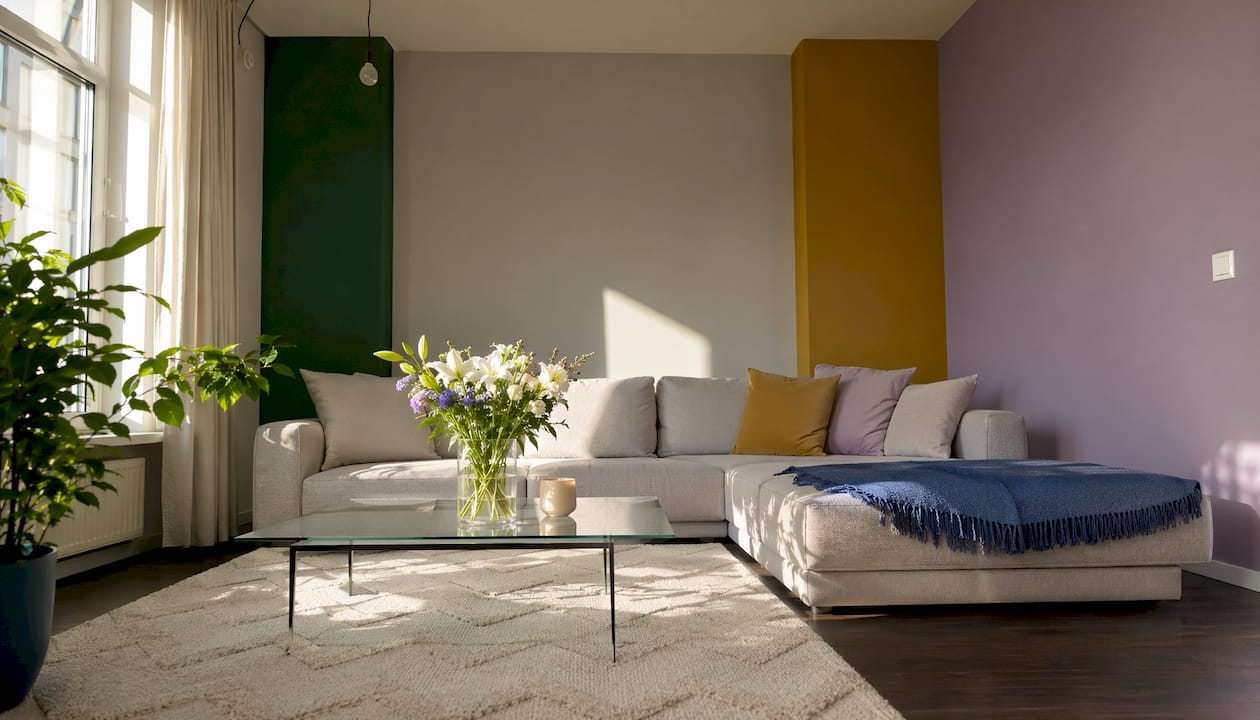
What are the best accent wall colors that go with gray walls?
Gray walls are one of the most forgiving backdrops in interior design, and the accent colors that work best fall into four clear families: jewel tones, earthy shades, soft pastels, and high-contrast neutrals. The right choice depends almost entirely on whether your gray leans cool or warm, but a few colors perform beautifully across both.
- Jewel tones: Navy blue, emerald green, and plum bring depth and a sense of quiet luxury to gray rooms, particularly those with cool undertones.
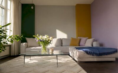
- Earthy shades: Terracotta, mustard yellow, and olive green add warmth and grounded energy, pairing naturally with warm grays that carry beige or brown undertones.
- Soft pastels: Dusty lavender, blush pink, and sage green create a calming, spa-like quality that softens gray without competing with it.
- High-contrast neutrals:
are universally compatible with every shade of gray, offering timeless drama or crisp freshness depending on the pairing.
These four families cover the full range of moods gray can support, from serene and minimal to bold and atmospheric.
Which color families complement gray walls most effectively?
Gray is, at its core, a color of infinite possibility. It neither competes nor retreats; it simply holds space for whatever surrounds it. Understanding how each color family interacts with that neutrality is what separates a room that feels designed from one that merely feels decorated.
Jewel tones
Navy, emerald, and plum are the most consistently designer-approved choices for gray walls, and the reason is straightforward: their depth of saturation creates visual contrast without jarring the eye. In living rooms and bedrooms, a single emerald accent wall against cool gray can feel almost cinematic. These colors catch light in ways that shift throughout the day, lending a room a sense of life that flat neutrals alone cannot provide.
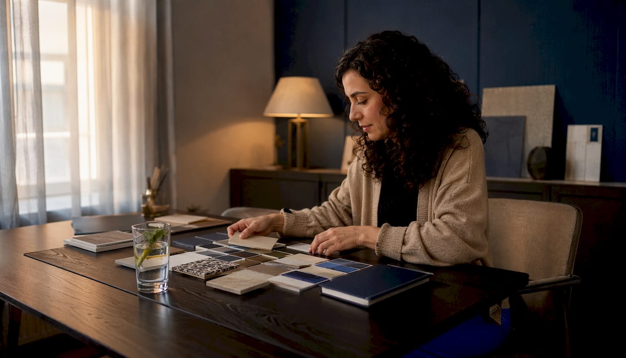
Earthy and organic shades
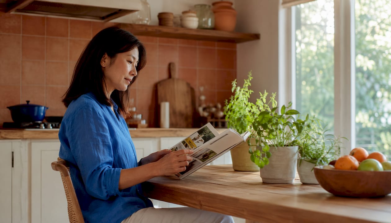
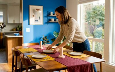
Terracotta, mustard yellow, and olive green function as warmth multipliers. Where gray can read as cold or clinical, these shades restore a sense of the organic and the lived-in. Warm gray walls with beige or brown undertones pair especially well with terracotta and mustard, creating a cozy balance that works beautifully in dining rooms and kitchens. Natural wood tones, whether in flooring or open shelving, amplify this effect further.
Soft pastels
Blush pink, dusty lavender, and sage green soften gray walls and generate a calming, almost meditative atmosphere. These are the accent colors of choice for bedrooms and lounges where the goal is rest rather than stimulation. They add gentle color without overpowering the neutral backdrop, which is precisely their appeal.

High-contrast neutrals
| Neutral Accent | Best Gray Pairing | Mood Created |
|---|---|---|
| Crisp white | Any shade of gray | Fresh, airy, timeless |
| Matte black | Light to mid-tone gray | Bold, dramatic, modern |
| Charcoal | Light gray | Sophisticated, layered depth |
Sometimes restraint is the most expressive choice. Black against light gray creates bold drama; charcoal adds depth while staying within the same tonal family. White, meanwhile, keeps things open and clean, particularly effective in kitchens and bathrooms where clarity of space matters.
How do gray undertones change your accent color choices?
Not all grays are the same, and this is where most accent wall decisions go wrong. Designers in 2026 categorize gray into two temperature profiles: cool grays, which carry blue, green, or purple undertones, and warm grays, which lean toward beige, brown, or red. Matching your accent color to that underlying temperature is the single most reliable way to achieve a cohesive result.
Cool grays pair naturally with jewel tones like navy and emerald, as well as soft pastels such as sage and lavender. The shared cool temperature creates harmony rather than tension. Warm grays, by contrast, call for earthy shades like terracotta and mustard yellow, colors that echo and amplify the warmth already present in the wall.
The risk of mismatching is real. A terracotta accent wall against a cool blue-gray can feel unsettled, as though two separate rooms have been stitched together. The same terracotta against a warm greige gray feels intentional and inviting.
Benjamin Moore’s color experts advise: “Look to the color of the other walls in the space to determine the accent wall color. We recommend choosing a color a few shades lighter or darker to create optimal contrast. If walls are a midtone or deeper hue, try a lighter accent wall color. For rooms with lighter, softer colors, bring in depth with dark, bold accent colors.”
Lighting compounds the undertone question. A gray that reads as a clean silver in afternoon sun can shift toward lavender or green under artificial light. The perceived color of gray walls and accent colors changes markedly with lighting orientation, so testing paint samples on the actual wall, viewed at different times of day, is not optional. It is the step that separates a confident choice from an expensive mistake.
- Cool gray accent pairings: Navy, emerald, plum, sage green, dusty lavender, soft teal
- Warm gray accent pairings: Terracotta, mustard yellow, olive green, rust, warm coral, camel brown
- Universal pairings (work with both): Crisp white, matte black, charcoal, brass metallics
Practical tips for choosing and applying accent colors with gray walls
The most common mistake with accent walls is treating them as an afterthought. An accent wall should be chosen with purpose, highlighting a focal point such as a fireplace wall, a bed headboard wall, or the first surface the eye lands on when entering a room. Randomness reads as indecision.
Contrast in color value matters as much as hue. A color too close in tone to the existing gray looks like a mismatch rather than a design choice. The goal is a deliberate step away, either lighter or darker, so the accent reads as intentional. For dark gray walls, a lighter accent creates breathing room; for light gray walls, a deeper, bolder color adds the weight the room needs.
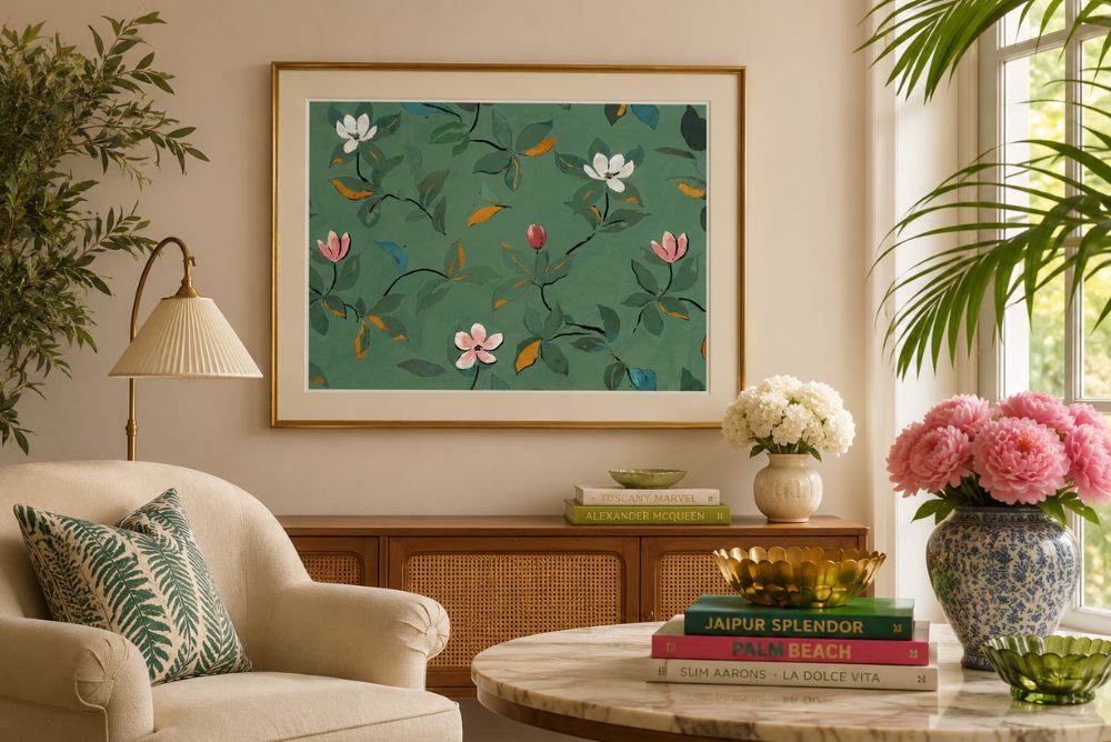
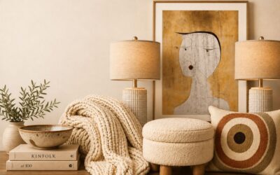
- Pull accent colors from existing textiles, artwork, or rugs already in the space. This technique, recommended by Benjamin Moore’s color team, ties the room together without requiring a complete redesign.
- Consider room orientation. North-facing rooms receive cooler, bluer light, which can intensify cool gray undertones. South-facing rooms get warmer light that flatters earthy accents. For a visual preview before committing to paint, interior CGI tools let you simulate different accent colors against your actual walls.
- For finish, matte paint on an accent wall absorbs light and creates a soft, enveloping quality. Satin finishes reflect slightly more light and work well in kitchens or bathrooms. Metallic accents, particularly brass and gold in hardware or decor, add warmth to gray rooms without requiring a full wall commitment.
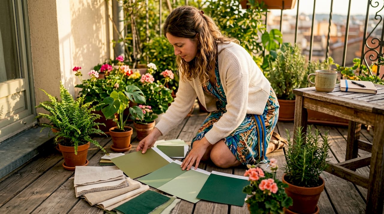
Pro Tip: Paint two large sample swatches of your shortlisted accent colors directly on the wall, at least 12 inches square, and observe them at morning, midday, and evening. The color that holds its appeal across all three lighting conditions is the right one.
Accent walls also work well in functional spaces. Entryways, laundry rooms, and kitchens benefit from a single bold accent wall that adds personality with minimal commitment. Small rooms, in particular, gain instant character from a well-chosen accent without the visual weight of four painted walls.
Designer-approved accent colors for gray walls in 2026
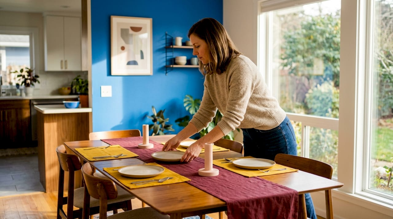
The colors that designers return to consistently for gray walls share one quality: they respect the gray rather than fight it. Navy blue remains the most versatile jewel tone, working with both cool and mid-tone grays to create a sense of depth and sophistication. Sage green has emerged as a particular favorite for its biophilic quality, bringing a breath of the natural world into spaces that might otherwise feel overly urban or minimal.
Mustard yellow deserves more credit than it typically receives. Paired with warm gray, it transforms a room’s temperature entirely, shifting the mood from cool restraint to something genuinely inviting. Brass metallics in fixtures and frames amplify this effect, acting as a bridge between the gray and the warmer accent tones.
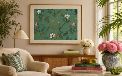
For those drawn to drama, a deep plum or burgundy accent wall against light gray is a combination that feels both current and timeless. It works especially well in bedrooms, where the richness of the color creates a sense of enclosure and warmth. Blush pink, once considered a trend, has proven its staying power as a genuinely sophisticated partner for gray, particularly in living rooms and home offices where a touch of warmth is welcome without the full commitment of a bolder hue. If you are looking for art to anchor an accent wall, abstract line art can pull multiple tones from the room into a single cohesive focal point.
Color palettes that combine gray walls with accent colors across design styles
The palette you choose should reflect not just the color but the entire visual language of the room.
Modern and minimalist: Light gray walls with a single matte black accent wall, white trim, and brass hardware. The restraint is the point. Every element earns its place, and the contrast between the black and gray does the work that pattern or texture might do in a more layered space.
Warm contemporary: Mid-tone warm gray walls paired with a terracotta or mustard yellow accent, natural wood shelving, and linen textiles. This palette draws on biophilic design principles, grounding the space in organic materials and warm color temperatures. It suits open-plan living areas where the goal is comfort over formality.
Traditional and layered: Deep warm gray walls with a navy or plum accent, paired with antique brass fixtures and rich textile patterns. This combination has the visual weight of a classic interior without feeling dated. The gray acts as a sophisticated neutral that lets the jewel tone accent carry the room’s character.
Soft and serene: Pale cool gray walls with a dusty lavender or sage green accent, white woodwork, and natural fiber rugs. This palette creates what designers call “visual rest,” a quality particularly valuable in bedrooms and reading rooms. The colors share a muted, slightly desaturated quality that keeps the space from feeling busy.
For hands-on inspiration before you commit to paint, exploring how CGI communicates design concepts can help you visualize how these palettes translate into a real room. And if you want to go beyond paint entirely, gallery wall ideas offer another way to bring color and personality to a gray backdrop without touching a brush.
Key Takeaways
The most successful accent wall colors for gray walls are those that match the gray’s undertone temperature, contrast deliberately in value, and connect to colors already present in the room.
| Point | Details |
|---|---|
| Match undertone temperature | Cool grays suit navy, emerald, and pastels; warm grays suit terracotta, mustard, and olive. |
| Contrast value deliberately | Choose an accent a few shades lighter or darker than the gray to read as intentional. |
| Pull from existing elements | Artwork, rugs, and textiles already in the room are the most reliable source for accent color ideas. |
| Test samples on the wall | Observe swatches at different times of day, since lighting shifts how both gray and accent colors appear. |
| Use finish and texture | Matte accents absorb light for softness; brass and metallic details add warmth without a full wall commitment. |