Make your bookshelf look intentionally curated by using simple styling formulas, an edit-first reset, and layered vignettes. No expensive shopping required. Start with one shelf, empty it completely, then apply a single formula and watch the whole unit read as pulled together instead of accumulated.
TL;DR:
- Applying a single styling formula to one shelf can quickly make the whole unit appear cohesive and pulled together.
- Resetting a shelf by removing all items and limiting what goes back based on its role helps prevent clutter and chaotic arrangements.
- Grouping books by size or subject and removing dust jackets creates a calmer, more intentional look, especially when mixed with horizontal stacks for display.
- Incorporating greenery in varying textures and pots, especially trailing or small plants, softens hard surfaces and enhances visual interest.
- Using targeted lighting, like puck lights or picture lights, can significantly elevate the appearance of styled shelves and highlight their layered depth.
Table of Contents
- Bookshelf Styling Ideas That Actually Repeat Well
- How to Reset a Cluttered Shelf Before You Style It
- Arranging Books by Color, Size, and Orientation
- Vignettes and the Rule of Three
- Bringing In Greenery Without the Guesswork
- Choosing Materials That Complement Your Books
- Common Bookshelf Styling Mistakes and Fast Fixes
- A Stylist’s Take on Maintenance and Longevity
- Choosing the Right Color Palette for Bookshelf Styling
- Incorporating Personal Items and Memorabilia Thoughtfully
- Lighting Options to Highlight Styled Shelves
- Seasonal and Themed Styling Ideas
- Where to Go for More Bookshelf Inspiration
- An Editor’s Note on Styling Shelves You’ll Actually Live With
- Sources
Bookshelf Styling Ideas That Actually Repeat Well
Most shelves look chaotic not because the objects are wrong, but because there’s no underlying logic holding them together. Designers rely on a small set of reusable formulas precisely because they remove the guesswork. Once you learn four combinations, you can apply them to any shelf, in any room, with whatever you already own.
Formula 1: Stack and top. Lay 2 to 3 books flat, spines facing out, and set a small object on top: a paperweight, a smooth stone, a miniature bust. The stack becomes a pedestal. Swap: if your object feels lost, add a second thinner book underneath to raise the height.
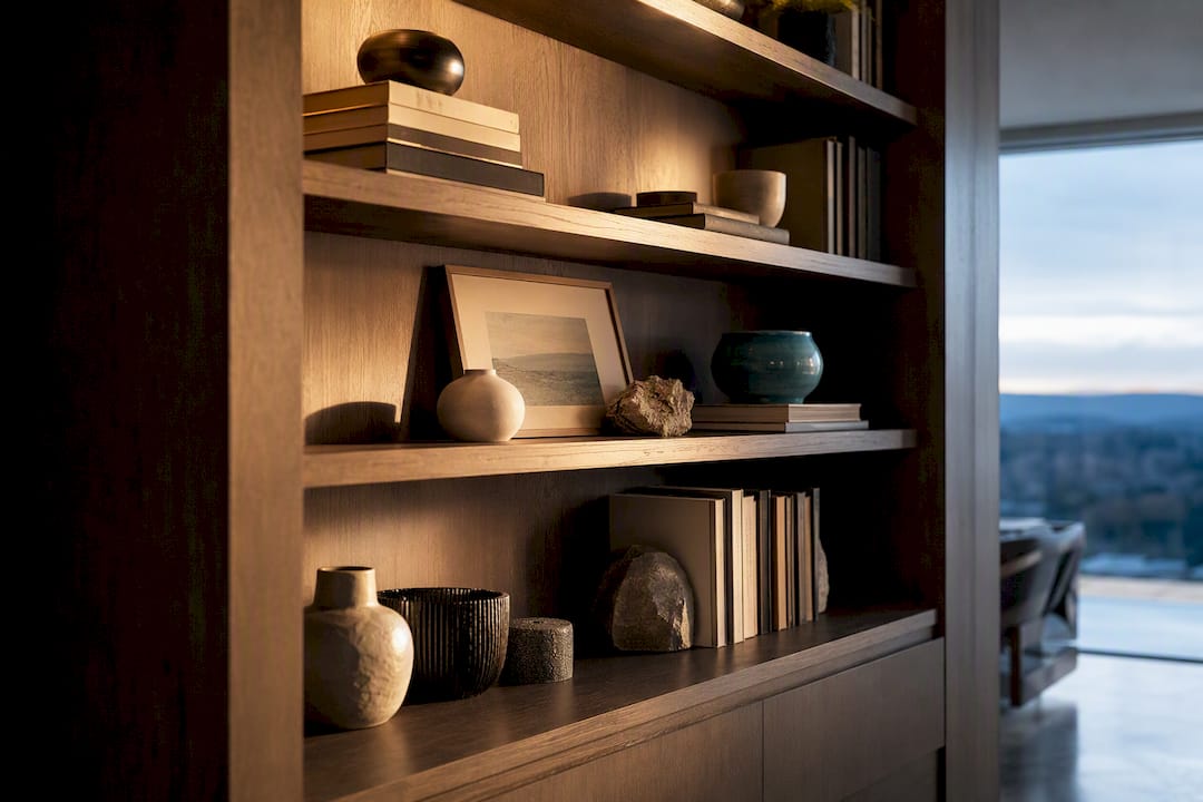
Formula 2: Lean and layer. Prop a piece of art or a framed print against the back wall of the shelf, then layer smaller objects in front at staggered heights: a small vase, then a shorter trinket in front of that. This mimics a gallery-wall approach shrunk down to shelf scale, and it’s an easy way to borrow ideas from a gallery wall arrangement you already love. Swap: no art on hand? A textured ceramic plate leaned upright works the same way.
Formula 3: Curate a collection. Group similar objects, pottery, glass bottles, small frames, but vary their height and spacing so the eye moves instead of stalling. Uniform rows of identical items look like inventory, not decor. Swap: if three matching vases feel flat, remove the middle one and replace it with something taller.
Formula 4: Flank the verticals. Group a small group of books standing upright, then anchor one end with a bookend or a small sculptural object. This punctuates the vertical line and stops a run of spines from looking like an afterthought. Swap: a heavy stone or a chunky ceramic piece works better than a lightweight bookend, since weight reads as intentional.
Mix and match these across a single unit. A five-shelf bookcase might use Formula 4 on top, Formula 2 in the middle, and Formula 1 on a lower shelf, which keeps the whole piece from feeling like a repeated pattern.
How to Reset a Cluttered Shelf Before You Style It
Skip this step and every formula above will fight against whatever is already crowding the shelf. The reset comes first, always.
- Empty the shelf completely. Pull everything off and sort into three piles: keep, store, and remove. This three-pile method stops you from just rearranging clutter in place.
- Assign each shelf a job. Decide if it’s for display, storage, or a hybrid, then limit what goes back based on that role. A display shelf might hold six objects; a hybrid shelf might hold three plus a basket.
- Protect negative space. Aim to leave 20 to 40 percent of each shelf empty. Fuller shelves (more books, less decor) sit near 20 percent; airier, gallery-style shelves sit closer to 40 percent.
- Do a final walk-through. Step back ten feet and check that no single shelf feels denser than its neighbors.
Arranging Books by Color, Size, and Orientation
Color-coded shelves photograph beautifully, but they can slow you down every time you need to grab a specific title. If the shelf is purely decorative, group by color. If you actually use the books, group by size or subject instead and let color happen naturally.
- Start with a 70/30 split. Keep roughly 70 percent of books vertical and 30 percent horizontal as a baseline, then adjust shelf by shelf depending on how tall your collection runs.
- Pull some dust jackets off. Underneath most jackets is a cloth or matte binding in a neutral tone, and removing the jacket instantly calms down a busy shelf without touching a single book’s content.
- Turn a few books spine-inward. Pages-out creates a soft, textured block of cream and off-white that reads as intentional, not messy, especially between louder decor pieces.
- Use horizontal stacks as platforms. A stack of three books instantly becomes a stand for a candle, a small plant, or a photo frame, and it raises smaller objects to a height where they’re actually visible.
Vignettes and the Rule of Three
Small groupings, not single objects, are what make a shelf feel styled. Odd-numbered clusters of three, five, or seven read as more natural and balanced than pairs or even sets, because the eye can’t split them symmetrically and instead moves across the whole group.
Build each vignette with a height hierarchy: one tall piece (a vase or framed piece), one mid-height object (a small sculpture or stack of books), and one low, wide piece (a dish, a small box). That triangle shape is what makes three random objects look composed instead of scattered.

Pro Tip: Repeat one material or color across two or three shelves, the same brass tone, the same ceramic glaze, and the whole bookcase reads as one cohesive collection instead of shelf-by-shelf improvisation.
Bringing In Greenery Without the Guesswork
Books and hard surfaces need something soft to break them up, and greenery does that job better than almost any other object. Trailing plants like pothos spill over shelf edges and soften the hard horizontal lines books create, while small ferns and succulents work well as compact accents that don’t demand much space.
- Low light or heavy dust? A quality faux trailing vine or small faux fern holds up better than a struggling real plant, and modern faux leaves have enough texture variation to pass for the real thing from a normal viewing distance.
- Match placement to shelf height. Trailing varieties belong on upper shelves where they can hang; compact pots suit mid-height shelves where you want stillness instead of movement.
- Choose pots that echo other textures. A matte terra-cotta pot works with woven baskets nearby; a glossy ceramic pot pairs better with glass or metal accents.
Browse a few potted plant options built for indoor shelves if you want a starting point beyond the standard nursery pothos.
Choosing Materials That Complement Your Books
Books already bring plenty of visual weight and color, so the objects around them need to add texture without competing for attention. A shelf that mixes ceramics, glass, metal, and woven material almost always looks more finished than one filled with objects made of a single material.
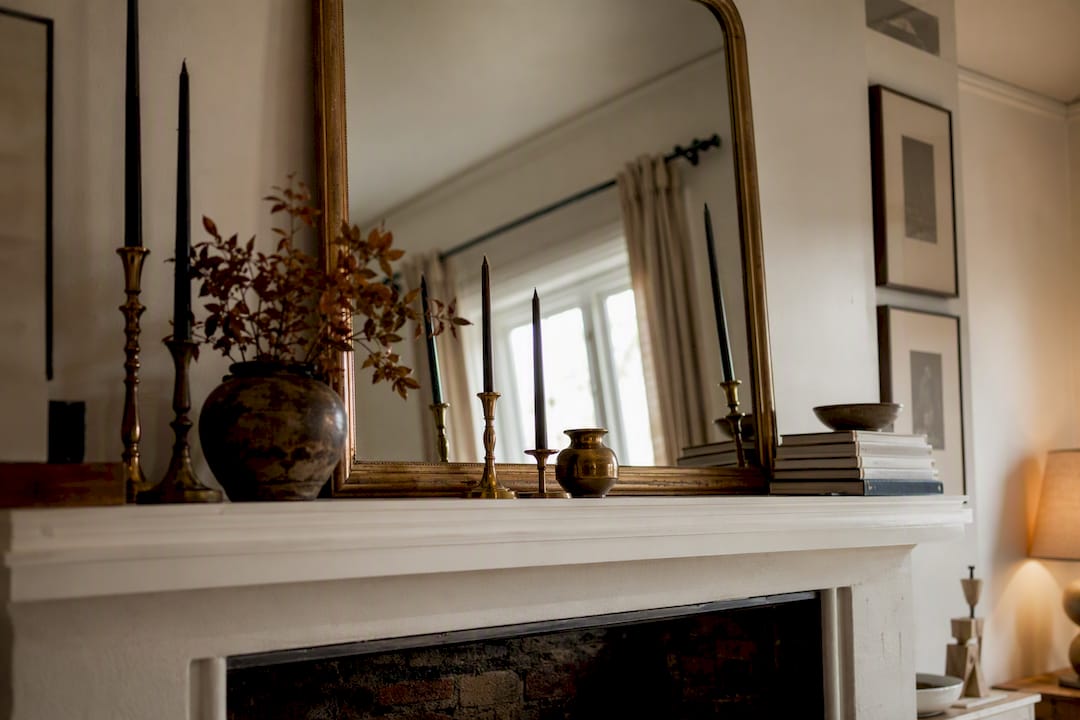
- Aim for three textures per shelf. A ceramic vase, a woven basket, and a brass candlestick together read as curated; five ceramic pieces in a row read as repetitive.
- Use baskets and boxes on lower shelves. They hide clutter, add visual weight where the eye expects grounding, and create a natural home for remotes, chargers, or mail.
- Limit metal finishes to one or two. Mixing brass, chrome, and matte black on the same shelf creates visual noise; pick one metal tone and repeat it.
- Shop secondhand for sculptural pieces. Thrifted objects and inexpensive accents frequently deliver more character than new mass-produced decor at a fraction of the cost.
Common Bookshelf Styling Mistakes and Fast Fixes
Even a well-edited shelf can go wrong in a handful of predictable ways. Here’s how to spot and fix the most common ones.
- Flat horizon line. If every object sits at roughly the same height, the shelf reads as one long strip instead of a composition. Fix it by swapping in one taller piece and one shorter piece per section.
- Too many tiny objects. A cluster of small trinkets often looks busier than a single larger sculptural piece. Consolidate three small items into one statement object.
- No breathing room. If you can’t find an empty patch of shelf anywhere, you’ve overfilled it. Remove two items, then reassess from across the room.
- Everything facing forward. Turning a few books or objects at slight angles, rather than lining everything up flush, adds depth that a stiff, symmetrical row can’t.
A Stylist’s Take on Maintenance and Longevity
Styled shelves aren’t a one-time project. Most designers plan for a periodic full restyle every several months (https://www.sicotas.com/blogs/blogs-sicotas-brand-story/how-to-style-a-bookshelf-10-designer-rules), with smaller seasonal swaps in between to keep things feeling current without redoing the whole unit.
Artinlifestyle’s own approach to shelf styling borrows heavily from gallery-wall thinking: treat a leaned frame or small art piece on a shelf the same way you’d treat a hung piece, giving it room to breathe and something at a different height nearby to balance it.
Save this for your next reset: empty every shelf, sort into keep and store, protect 20 to 40 percent negative space, apply one formula per shelf, then swap one or two objects seasonally instead of rebuilding from scratch.
That five-step loop is really the entire practice condensed into something you can repeat without relearning it each time.
Choosing the Right Color Palette for Bookshelf Styling
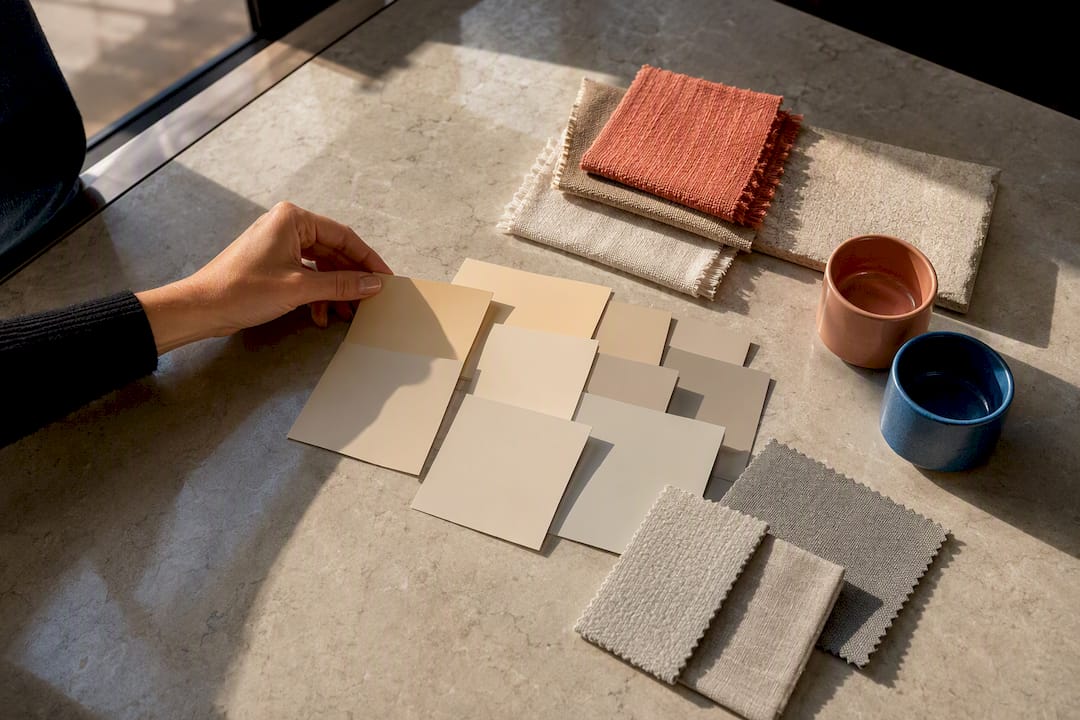
A shelf’s color palette should echo, not fight, the room around it. Pull two or three tones already present in your rug, art, or upholstery and repeat them across your books and objects. That’s the fastest way to make a shelf feel built into the room rather than bolted onto it.
Neutral palettes, creams, tans, soft grays, tend to age best because they let the shapes and textures of objects do the work instead of relying on bold color to hold interest. If your books arrive in every color imaginable, removing dust jackets or turning a portion spine-inward mutes that visual noise instantly.
For a bolder approach, pick one accent color and let it appear three or four times across the shelf: a book cover, a small ceramic bowl, a candle. Repetition in small doses reads as intentional; a single bold object standing alone often looks like a mistake.
Warm woods and brass hardware pair naturally with earthy palettes, while cooler grays and blacks suit a more modern, gallery-like shelf. Whatever direction you choose, consistency matters more than the specific colors. A shelf with five colors, each used once, will always look busier than a shelf with three colors, each repeated.
Incorporating Personal Items and Memorabilia Thoughtfully
Travel souvenirs, family photos, and inherited objects give a shelf meaning that store-bought decor can’t replicate, but they need the same editing discipline as everything else on display. Not every memento earns shelf space at once.
Choose a rotating handful, maybe five or six pieces, rather than displaying an entire collection simultaneously. A single framed photo says more than six crowded together, and it leaves room for the object’s story to actually register with anyone looking at the shelf.
Group personal items using the same rule of three that governs the rest of your styling: a photo, a small keepsake, and a travel object together form a vignette instead of a scattered assortment. Height variation still applies here. Lean a photo frame against the back, then set a smaller keepsake in front of it at a lower level.
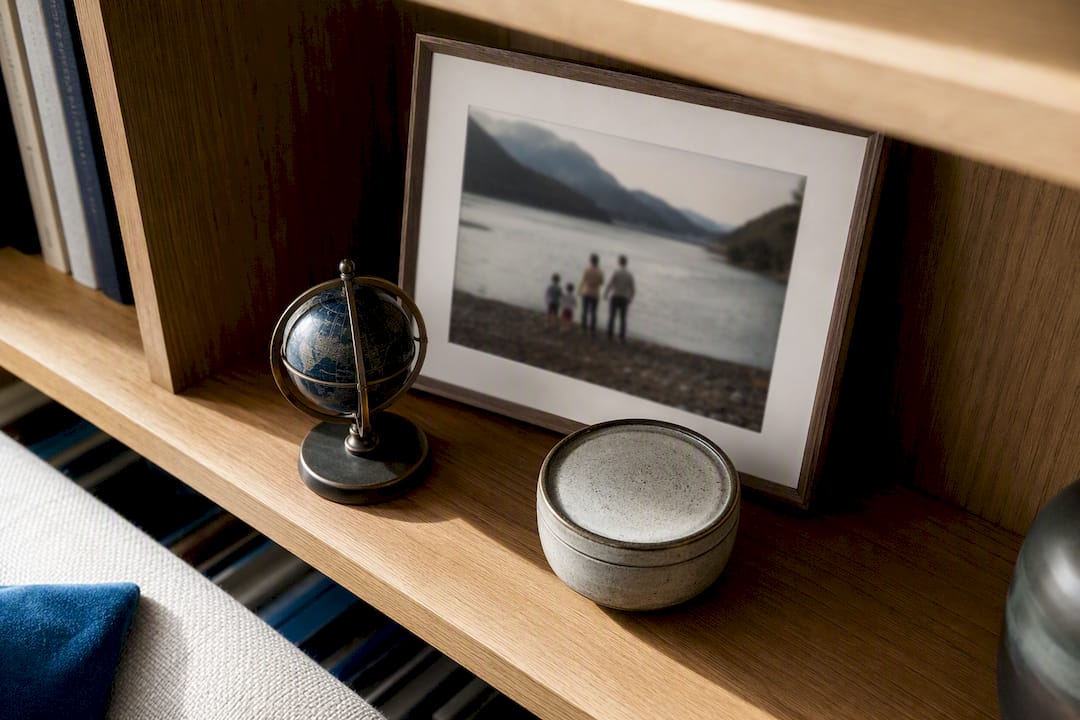
Rotate seasonally or whenever a shelf starts feeling stagnant. Store the rest in a labeled box so swapping takes minutes instead of a full afternoon search through drawers. This is also where a personal book collection earns its place. A few titles chosen for how they make you feel, not just their spine color, belong on display. If you’re building out that kind of curated, mood-driven shelf, a list like cozy, character-driven picks is worth a look for titles that double as good reads and good decor.
Lighting Options to Highlight Styled Shelves
Even a perfectly styled shelf loses impact in flat, indirect room lighting. Dedicated shelf lighting does more to elevate a display than almost any single object you could add.
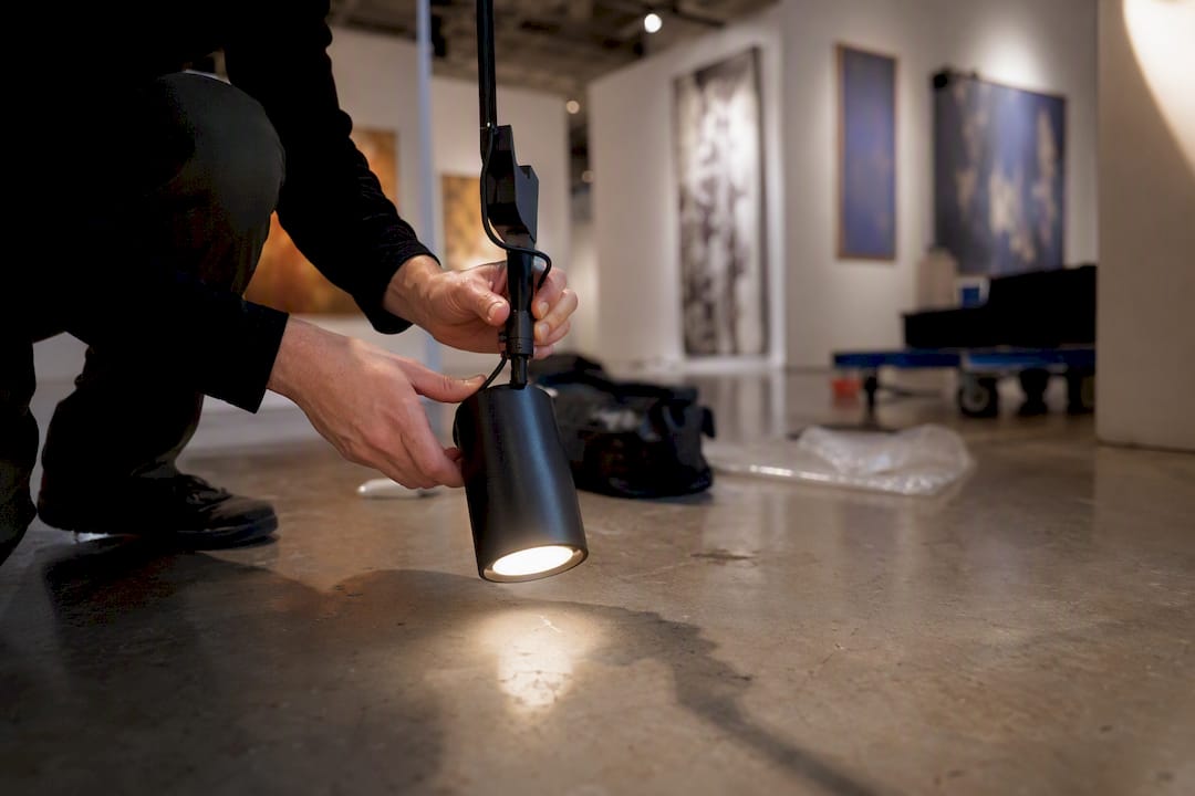
Puck lights are the easiest entry point. Small, battery-powered or plug-in LED pucks tuck under the shelf above and cast a soft downward glow on the objects below, highlighting texture and depth that overhead lighting flattens out.
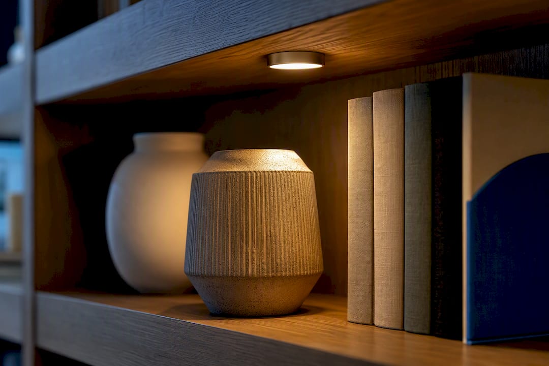
LED strip lighting works well for built-in units or floor-to-ceiling bookcases, since a continuous strip along the underside of each shelf creates even illumination without visible fixtures. It’s a common choice for the kind of larger home library installations where lighting needs to feel architectural rather than added on.
Picture lights mounted just above a leaned art piece direct focused light exactly where Formula 2 needs it, making the layered depth of leaned art and foreground objects far more visible after dark.
Warm white bulbs, generally in the 2,700 to 3,000 Kelvin range, flatter most wood tones, book bindings, and skin-toned ceramics better than cooler daylight bulbs, which can make a shelf feel clinical. Whatever fixture you choose, aim the light source slightly forward and down rather than straight ahead, since that angle creates shadow and dimension instead of a flat wash of brightness across every object.
Seasonal and Themed Styling Ideas
A full shelf overhaul every season isn’t necessary, but small swaps keep a bookcase from feeling frozen in time. This is exactly the kind of light, iterative update designers rely on between major resets.
Fall and winter call for warmer textures: add a small wool or knit texture element, swap a glass vase for a ceramic one, and bring in pinecones or dried botanicals in place of fresh greenery that’s harder to maintain in colder, drier air.
Spring and summer favor lighter palettes and real greenery. Swap faux stems for fresh-cut branches in a simple vase, and lean into whites, pale greens, and natural materials like rattan or light wood.
Holiday styling works best in small doses. Tuck a single seasonal object, a small ornament, a themed book cover, into an existing vignette rather than adding an entirely new display. This keeps the shelf’s underlying structure intact while still feeling festive.
Rotating art is one of the simplest theme changes available. Swap the leaned piece in your Formula 2 setup for something seasonal, then swap back, borrowing the same rotation logic you’d use for a living room art display. The formula stays constant even as the specific piece changes, which is precisely why these formulas hold up across an entire year of small updates.
Where to Go for More Bookshelf Inspiration
- Emily Henderson’s four-formula breakdown for a visual walk-through of stacking and leaning techniques.
- Home Decoria’s designer tricks for negative-space and orientation guidance.
- Stevie Storck’s open-shelf styling guide for plant placement examples.
- Sicotas’s designer rules for maintenance cadence and reset routines.
Ready to put any of this into practice? Browse space-saving decor pieces that double as art for objects sized right for shelf vignettes, whether you need a sculptural anchor for Formula 4 or a small leaned piece for Formula 2.
An Editor’s Note on Styling Shelves You’ll Actually Live With
My take on shelf styling, after years of watching trends come and go, is simple: keep it personal and keep it editable. The shelves that age best in a home aren’t the most symmetrical ones or the most color-coordinated ones. They’re the ones that still have room for a new photo, a new book, a new object picked up on a trip.
Pro Tip: Pick one shelf right now and rework it using Formula 1, stack two or three books, top with something you already own. You’ll see the difference in five minutes, and that’s usually enough to convince you the rest of the bookcase is worth the afternoon.
— Nealda
Sources
- Make Your Shelves Look Better With These 4 Easy Bookshelf Styling Formulas — Emily Henderson
- How To Style A Bookshelf: 7 Designer Tricks That Work Every Time — Home Decoria