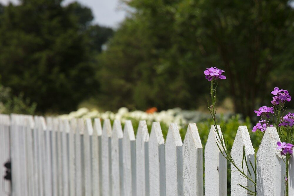
Muted, nature-inspired tones are the best fence paint colours for homeowners who want to lift curb appeal without clashing with their garden or home exterior. Sage greens, mid-tone greys, warm taupes, and deep charcoals consistently top designer recommendations because they blend with landscaping, complement most architectural styles, and hold their visual appeal across seasons. Choosing the right shade is less about personal taste alone and more about reading your outdoor space as a whole composition. The fence is the quiet frame around your garden’s portrait, and the colour you choose sets the mood for everything inside it.
1. Sage green: the nature-blending classic
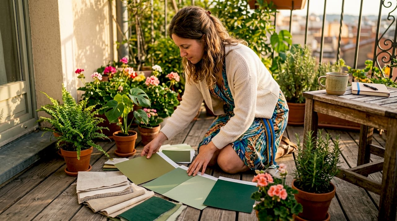
Sage green is the most universally flattering fence colour available. It mirrors the tones already present in foliage, so the fence appears to recede rather than compete with your planting. Muted, nature-inspired palettes like sage green rank among the best-selling and most recommended shades in 2026 for increasing curb appeal and property value. That means choosing sage is not a trend risk. It is a proven, long-term investment.
- Works with: cottage gardens, naturalistic planting, and painted brick homes
- Best application: full fence panels and garden outbuildings for a unified look
- Avoid pairing with: orange-toned brick, which creates a colour clash
2. Mid-tone grey: the safe neutral with real sophistication
Mid-tone grey sits in the sweet spot between too light and too dark. It reads as neutral without feeling cold, and it pairs cleanly with timber decking, stone paths, and most exterior paint colours. Property experts cite mid-tone greys as the safest neutral option for homeowners preparing for a quick sale. That dual function, good design and good resale, makes it one of the most practical fence paint options available.
- Works with: modern and transitional home styles, cool-toned siding
- Best application: horizontal slat fences where the colour reads as a design feature
- Pairs well with: white trim, black hardware, and silver-toned outdoor furniture
3. Warm taupe: the earthy bridge between indoors and out
Warm taupe carries the same grounding energy as a well-chosen interior wall colour, which is exactly why it works so well outdoors. It connects the tones of natural timber, stone, and soil without looking muddy. Matching fence colour temperature to the home’s siding, roof, and hardscaping prevents visual clashing and creates cohesive outdoor design. Taupe achieves this naturally because it contains both warm and cool undertones in balance.
- Works with: warm-toned brick, sandstone paths, and Mediterranean-style gardens
- Best application: panel fences and close-board styles
- Pairs well with: terracotta pots, linen-coloured cushions, and bronze fixtures
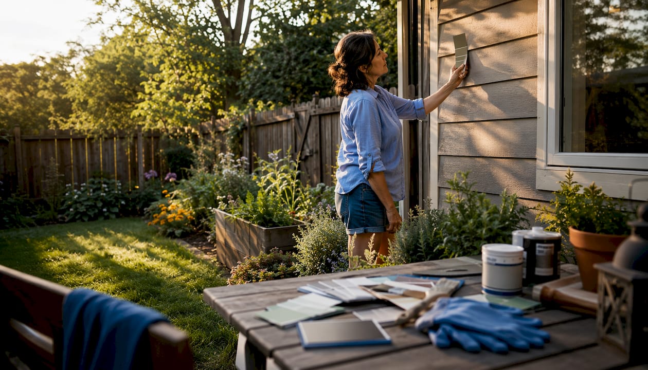
Pro Tip: Hold a paint chip against your exterior wall in both morning and afternoon light before committing. Taupe shifts noticeably between warm golden light and cooler midday sun.
4. Charcoal: the high-contrast backdrop that makes greenery pop
Charcoal is the fence colour that makes everything around it look more alive. Dark tones create a sophisticated backdrop that enhances the vibrancy of surrounding greenery and outdoor furniture. The effect is similar to a dark gallery wall that makes art colors sing. Charcoal works especially well in gardens with bold planting or brightly coloured outdoor furniture.
- Works with: contemporary homes, urban gardens, and architectural planting
- Best application: solid panel fences where the full colour field creates maximum contrast
- Avoid pairing with: dark-toned furniture, which flattens the contrast effect
5. Anthracite: the modern alternative to black
Anthracite sits just one step lighter than matte black, which gives it the drama of a dark fence without the intensity that can feel oppressive in smaller spaces. Deep, grounding colours such as charcoal, anthracite, and matte black are favoured for modern, high-end aesthetics in 2026. Anthracite reads as intentional and considered, the kind of choice that signals design confidence.
- Works with: Scandinavian-style homes, zinc-roofed outbuildings, and minimalist gardens
- Best application: metal-look composite fences or smooth-planed timber panels
- Pairs well with: white gravel, ornamental grasses, and black-framed windows
6. Soft blue-grey: the coastal calm for relaxed outdoor spaces
Soft blue-grey occupies a unique position in the fence colour spectrum. It reads as neutral from a distance but carries a quiet personality up close. Cooler or nature-blended tones recede visually and open up small garden spaces, making this shade ideal for compact yards. The colour also ages gracefully, fading to a weathered, driftwood-like tone that many homeowners find even more appealing than the original.
- Works with: coastal homes, shingle siding, and gardens with white or silver planting
- Best application: picket fences and slatted designs where the colour shows through gaps
- Pairs well with: lavender, white roses, and pale stone paving
7. Greige: the low-maintenance middle ground
Greige, a blend of grey and beige, delivers warmth without the upkeep demands of white or the boldness of a saturated tone. Soft ivory and greige are better low-maintenance alternatives to white for homeowners who want a light, airy fence without constant repainting. Greige also works as a tonal layering anchor, the base note around which furniture and accessories can build. For homeowners who want cohesion without drama, greige is the most forgiving choice available.
- Works with: almost any home style, especially traditional and transitional exteriors
- Best application: full panel fences and garden walls
- Pairs well with: natural rattan furniture, linen cushions, and earth-toned decor
How to choose fence paint colour based on your home’s exterior
Colour temperature is the most overlooked factor in fence paint selection. Warm-toned homes, those with red brick, terracotta tiles, or honey-coloured timber, need warm fence colours to maintain visual harmony. Cool-toned homes with grey siding, slate roofs, or white render suit cooler fence shades. Garden design consultants emphasise matching fence colour to permanent structural materials for long-term visual harmony. Getting this wrong is the single most common fence colour mistake.
Tonal layering uses variations of the same colour family across fences, furniture, and accessories to make an outdoor space feel larger and professionally curated. The approach works because the eye reads the space as unified rather than assembled from competing pieces. A charcoal fence paired with dark grey planters and slate-coloured cushions creates depth. A sage fence with olive furniture and forest-green throws creates a garden that feels like a living room.
Common pitfalls to avoid:
- Choosing a fence colour in isolation without holding it against your siding and roof
- Selecting a colour based on a small paint chip rather than a full test panel
- Ignoring the colour of your paving, decking, or gravel when making the final call
- Painting the fence a different colour family from the garden shed or outbuildings
Pro Tip: Paint a large piece of cardboard or plywood with your shortlisted colours and lean it against the fence for 48 hours. Check it in morning light, midday sun, and evening shade before deciding.
For homeowners considering a professional painter for the project, sharing a photo of your exterior alongside your shortlisted colours saves significant back-and-forth on site.
Best types of paint for fences and practical maintenance tips
Choosing the right product matters as much as choosing the right colour. Paint and stain behave differently, and the condition of your fence determines which one to use.
- Solid-opacity paint covers imperfections and weathered grain completely. Use this on older fences with rough or uneven surfaces. Acrylic latex formulas offer the best balance of flexibility, durability, and colour retention for outdoor wood.
- Semi-transparent stain lets the natural wood grain show through. Semi-transparent stains are ideal for highlighting grain on new wood, while solid paints better cover imperfections on weathered fences. Use this on newer, smoother timber when the grain is worth preserving.
- Solid-colour stain sits between the two. It provides more coverage than a semi-transparent product but still allows some texture to read through. Good for fences in moderate condition.
- Preparation determines how long any finish lasts. Clean the fence thoroughly, allow it to dry for at least 48 hours, and apply a wood primer before the topcoat on bare or stripped timber.
- Maintenance cycles vary by colour. Dark colours show dust and pollen more readily than mid-tones. Light colours show algae and dirt faster. Mid-tone grays and taupes require the least frequent repainting of any fence colour family.
Fence paint opacity and formula type must be chosen to suit wood condition and climate to deliver durability and optimal appearance. In humid or high-rainfall climates, a fungicidal additive or a paint with built-in mold resistance extends the finish life significantly.
Which fence paint colours to avoid and why
Some colours look appealing on a chip but create real problems at full scale or over time.
- Bold primary colours (red, yellow, bright blue): Bold primary colours and deep dark browns tend to hinder house sales because buyers perceive them as expensive to repaint. They also draw the eye aggressively, which makes the garden feel smaller and busier.
- Bright white: Classic in appearance but punishing in practice. White fences require high maintenance and quickly show algae, dirt, and chipping, especially in humid climates. Professionals consistently discourage white for this reason.
- Deep dark brown: Reads as dated in most contemporary contexts and absorbs heat in sunny gardens, which accelerates paint breakdown on the surface.
- High-contrast neons or accent colours: These draw attention to the fence rather than the garden, which reverses the entire purpose of a well-chosen fence colour.
“Sales-focused experts advocate calm, well-maintained fence appearances over personal expression to attract potential buyers. A fence that reads as neutral and cared-for signals that the whole property has been looked after.”
The underlying principle is restraint. The fence is a supporting character in your outdoor space, not the lead. Colours that demand attention undermine the garden’s ability to breathe and feel cohesive. A virtual staging tool can show you how a bold fence colour reads against your actual home before you commit to a full paint job.
Key takeaways
The most effective fence paint colours are muted, nature-inspired shades that complement your home’s exterior, support your garden’s planting, and require the least maintenance over time.
| Point | Details |
|---|---|
| Choose nature-inspired tones | Sage green, mid-tone gray, taupe, and greige deliver the best curb appeal and resale value. |
| Match colour temperature | Warm-toned homes need warm fence colours; cool-toned homes suit cooler shades. |
| Use tonal layering | Repeat the fence colour family across furniture and accessories for a cohesive, professional look. |
| Pick the right product | Use solid-opacity paint on weathered wood and semi-transparent stain on newer timber. |
| Avoid high-maintenance whites | Greige and soft ivory offer similar brightness with far less upkeep in most climates. |
Homeowners spend months choosing interior paint colours and then pick a fence shade in five minutes at the hardware store. The result is a garden that feels assembled rather than designed.
The second mistake is chasing trends without reading the space. Anthracite looks extraordinary in a modern urban garden with clean lines and architectural planting. In a cottage garden with rambling roses and a timber pergola, it reads as jarring. The colour has to serve the space, not the other way around.
Try starting with the permanent materials: the roof, the siding, the paving. Those are the colours you cannot change without significant cost. The fence colour should harmonize with all three before you even think about what you personally love. Personal style comes in through the furniture, the pots, and the planting. The fence is the canvas, not the art.
The trend toward neutral, nature-blended palettes in 2026 is not arbitrary. It reflects a broader shift toward outdoor spaces that feel like extensions of the interior, calm, considered, and liveable. That shift rewards restraint. The homeowners who get it right are almost always the ones who tested samples, waited 48 hours, and chose the colour that disappeared into the garden rather than the one that shouted from it.
FAQ
What are the best fence paint colours for small gardens?
Cooler, nature-blended tones like soft blue-grey and sage green visually recede, making small garden spaces feel more open. Bold or high-contrast colours draw the eye forward and make compact spaces feel cramped.
How often should you repaint a fence?
Most exterior fence paints require repainting every 3–5 years, depending on climate and color. Mid-tone greys and taupes tend to hold their appearance longer than white or very dark shades.
Does fence colour affect home resale value?
Bold primary colours and deep dark browns can hinder sales because buyers perceive them as costly to repaint. Mid-tone greys and muted naturals are the safest choices for resale appeal.
What is the difference between fence paint and fence stain?
Paint provides full opacity and covers imperfections, making it best for weathered or older wood. Stain allows the natural grain to show through and suits newer timber in good condition.
Is white a good colour for a fence?
White is high maintenance and shows algae, dirt, and chipping quickly, especially in humid climates. Soft ivory or greige offers a similar brightness with significantly less upkeep.