
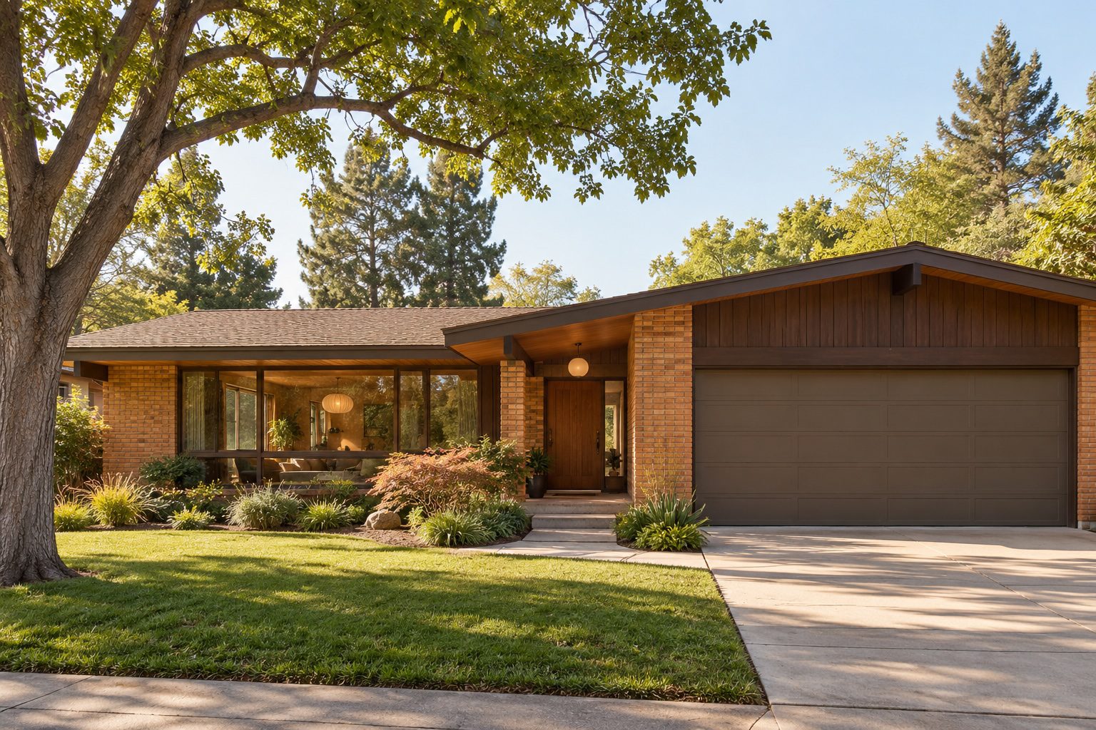
The defining characteristics of 1970 house styles are low-pitched roofs, attached garages, earthy brick exteriors, and open floor plans that blurred the line between indoor and outdoor living. These homes represent a meaningful shift in American residential architecture, moving away from formal, compartmentalized spaces toward casual, expressive environments. Ranch houses, split-level homes, mid-century modern variations, and late-decade playful modern designs each carried their own visual language. Together, they captured the spirit of a generation that valued flexibility, comfort, and a closer relationship with the natural world.
What are the key architectural features of 1970s ranch houses?
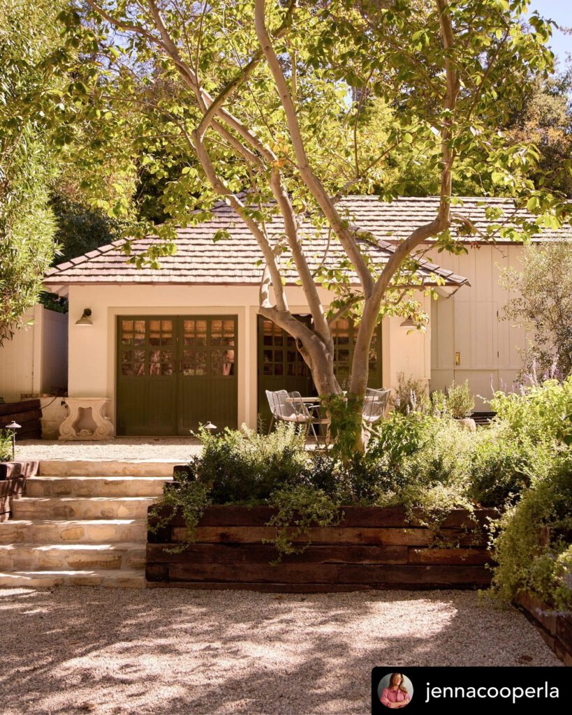
The ranch house is the defining residential form of the postwar American suburb, and its peak expression arrived in the 1970s. Ranch-style homes dominated American construction from the 1940s through the 1970s, built as single-story structures with attached, street-facing garages and open-concept floor plans. That long run of popularity produced millions of homes still standing today, making the ranch the most recognizable of all 70s house styles.
The floor plan is the ranch’s quiet backbone. Rectangular layouts spanning 1,500–2,500 sq ft with low-pitched gable or hip roofs at slopes of 3:12 to 5:12 gave these homes their signature horizontal silhouette. That low roofline is not just aesthetic. It reduces construction costs, simplifies framing, and creates a grounded, unpretentious presence on the street.
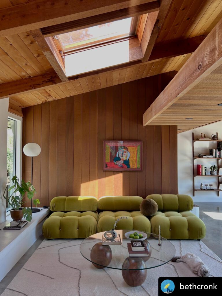
Exterior materials tell the decade’s story in texture and color. Earthy face brick in orange-brown, tan, and salmon tones paired with aluminum, vinyl, or wood siding on upper walls was the standard palette. These combinations were practical and warm, connecting the home visually to the earth beneath it.
Key features of the 1970s ranch house include:
- Low-pitched roof: Gable or hip configuration at 3:12 to 5:12 slope
- Single-story layout: No stairs, maximizing accessibility and flow
- Attached garage: Street-facing, often occupying a significant portion of the facade
- Open floor plan: Living, dining, and kitchen areas flowing together
- Earthy brick and mixed siding: Orange-brown, tan, and salmon tones
- Minimal ornamental trim: Clean lines with small stoops rather than grand porches
Split-level homes: family zoning in three dimensions
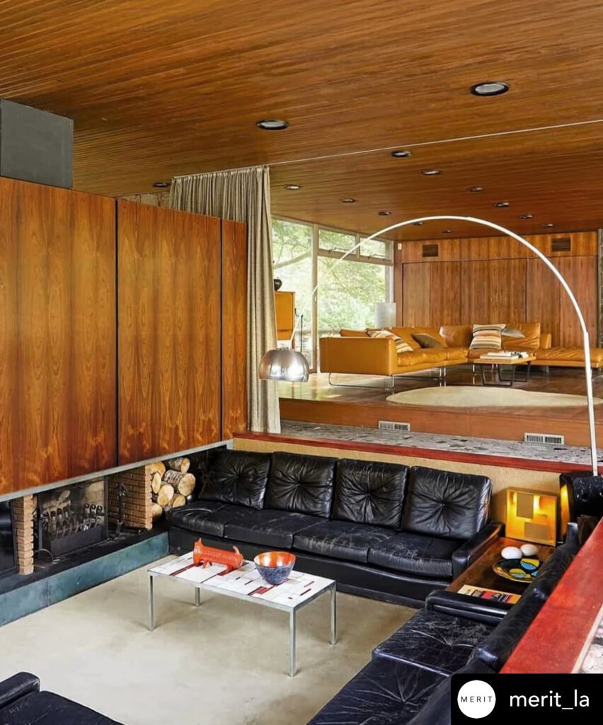
The split-level home solved a specific problem: how to give a growing family distinct zones without building a full two-story house. Split-level designs combined brick, vertical siding, large front windows, and attached garages to create homes with short level changes that separated sleeping areas, living spaces, and utility zones. The result was practical and surprisingly sophisticated.
The typical split-level places the entry at ground level, with the living room a half-flight up and the bedrooms another half-flight above that. The lower level often housed a family room, laundry, or garage. This stacking allowed parents and children to occupy the same footprint while maintaining acoustic and visual separation. It was a spatial solution born from the realities of postwar family life.
Late 1970s playful modern: geometry takes center stage
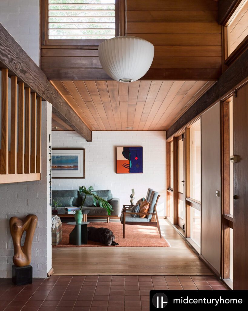
By the late 1970s, a more expressive architectural mood had taken hold. Late-decade playful modern homes featured bold geometric shapes, expansive glass surfaces, and strong volumetric statements that broke decisively from the horizontal restraint of the ranch. These homes were confident, even theatrical, in their ensemble.
Shed roofs, angular overhangs, and asymmetrical facades replaced the predictable gable. Clerestory windows and large sliding glass doors pushed natural light deep into floor plans. The effect was a home that felt more like a statement than a shelter, reflecting the decade’s growing appetite for personal expression in architecture.
Mid-century modern’s role in 1970s home design
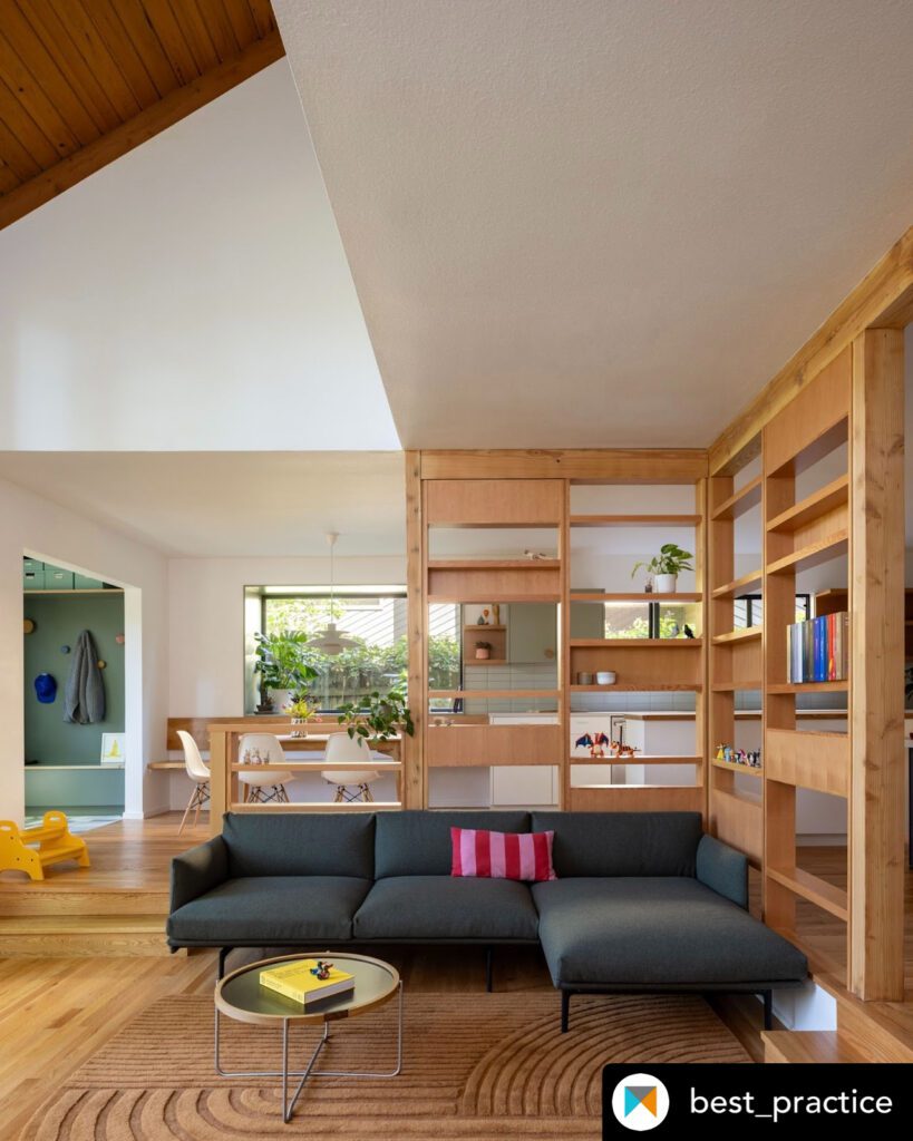
Mid-century modern architecture, formally associated with the period from 1945 to 1970, cast a strong influence over 1970s home design. Its core principles, flat or shed roofs, floor-to-ceiling glass, and a deliberate blurring of indoor and outdoor boundaries, remained influential well into the decade. Mid-century and 1970s architecture used materials like steel, concrete, and aluminum window frames to replace the wall separating the interior space and the garden or landscape beyond.
The mid-century modern influence in 1970s homes shows up most clearly in the use of glass. Floor-to-ceiling windows in living rooms, sliding glass doors opening onto patios, and clerestory strips near rooflines were all inherited from the earlier movement. These features made rooms feel larger and connected residents to seasonal light and outdoor views.
How 1970s design is shaping interiors in 2026
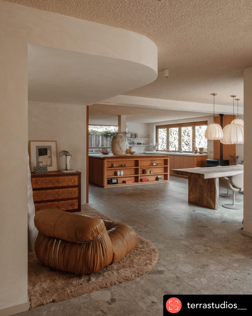
The 1970s are not just a historical reference. Interior design trends in 2026 reinterpret 1970s styles through curvy furniture, chunky silhouettes, and statement lighting like globe pendants and Sputnik chandeliers. That revival is not nostalgia for its own sake. It reflects a genuine appetite for warmth, personality, and sensory richness in spaces that minimalism left feeling cold.
Earthy color palettes are central to this return. Ochre, avocado green, deep brown, and burnt sienna are appearing in paint choices, upholstery, and tile. These colors carry emotional weight. They read as grounded, generous, and alive in a way that white-on-white interiors rarely achieve.
Textured materials complete the picture. Velvet upholstery, shag-style rugs, rattan furniture, and woven wall hangings all carry the tactile warmth that defines the 1970s aesthetic. Adding earthy texture to modern interiors is one of the most effective ways to channel the decade’s spirit without committing to a full period restoration.
Practical considerations for preserving or updating a 1970s home
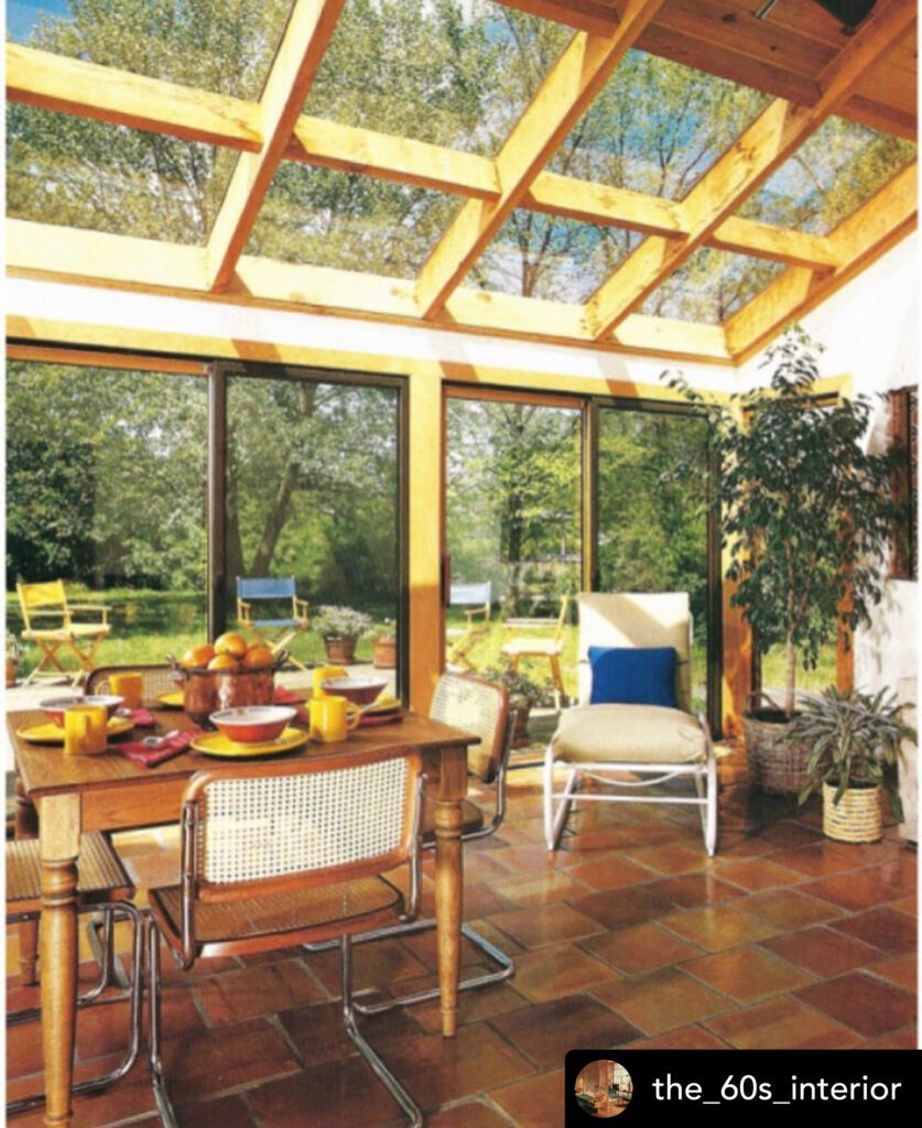
Updating a 1970s home requires a clear sense of what to protect and what to improve. The most common mistake is erasing the very features that give these homes their character. Authentic restoration respects the original material palette and avoids irreversible changes.
Preserving unpainted earthy brick is the single most important rule in 1970s exterior restoration. Painting brick white may feel like a refresh, but it destroys the texture and color that define the home’s identity. Once painted, brick is nearly impossible to restore to its original state.
The attached garage presents a specific challenge. Garages on 1970s ranch facades often occupy 30–40% of the front facade width. That proportion can make the home feel dominated by the car rather than the living space. Mitigation strategies include color-blending the garage door with the brick, adding architectural screening like trellises or plantings, and installing carriage-style doors that appear less industrial.
Key restoration principles for 1970s homes:
- Preserve original brick: Never paint earthy-toned face brick
- Address the garage facade: Use color blending or screening to reduce visual dominance
- Expand the entrance: A proper porch suits the low roofline far better than a narrow stoop
- Match window proportions: Replace windows with units that maintain original sightlines
- Avoid fake gables: Added decorative gables clash with the horizontal grammar of the style
- Skip over-decoration: Minimal ornament is a feature, not a flaw